Comic Anhs, process
Last weekend, I updated my homepage to feature some short comics that introduce different sections of my website.
I made this because I had just attended a local comics festival and was freshly inspired—truly, the level of creativity and craft in comics is mindblowing—and of course, I like to try out weird things. Also, I wanted a change from my previous chat bubble concept.
So here’s the process.
The Idea
In my earliest idea of this, I wanted to introduce a section of my website—my blog, the media diary, etc.—with a comic that shows my feelings about it, and then descriptive text explaining what the section is.
I decided on a 4-panel comic format because I knew I could do it quickly. I’ve always struggled with finishing my side project ideas, and part of that comes from having lofty goals and fleeting attention. So here, I prioritized picking a format that I was confident in: 4 panel comics, quickly drawn in pen.
Drawing
Each comic started as just a quadrant and some text:
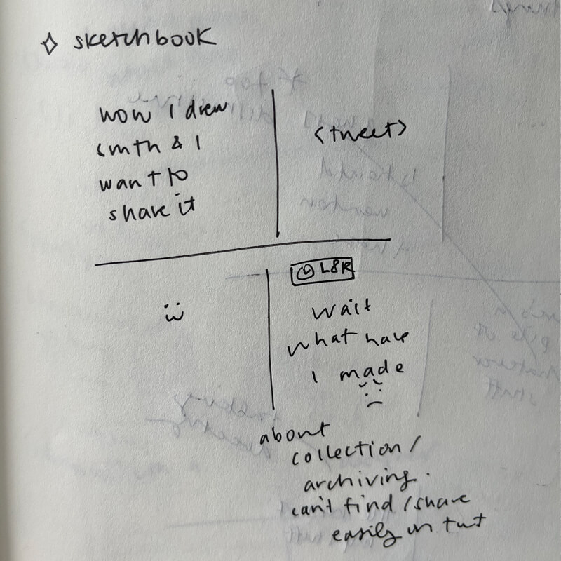
To transcribe my handwriting:
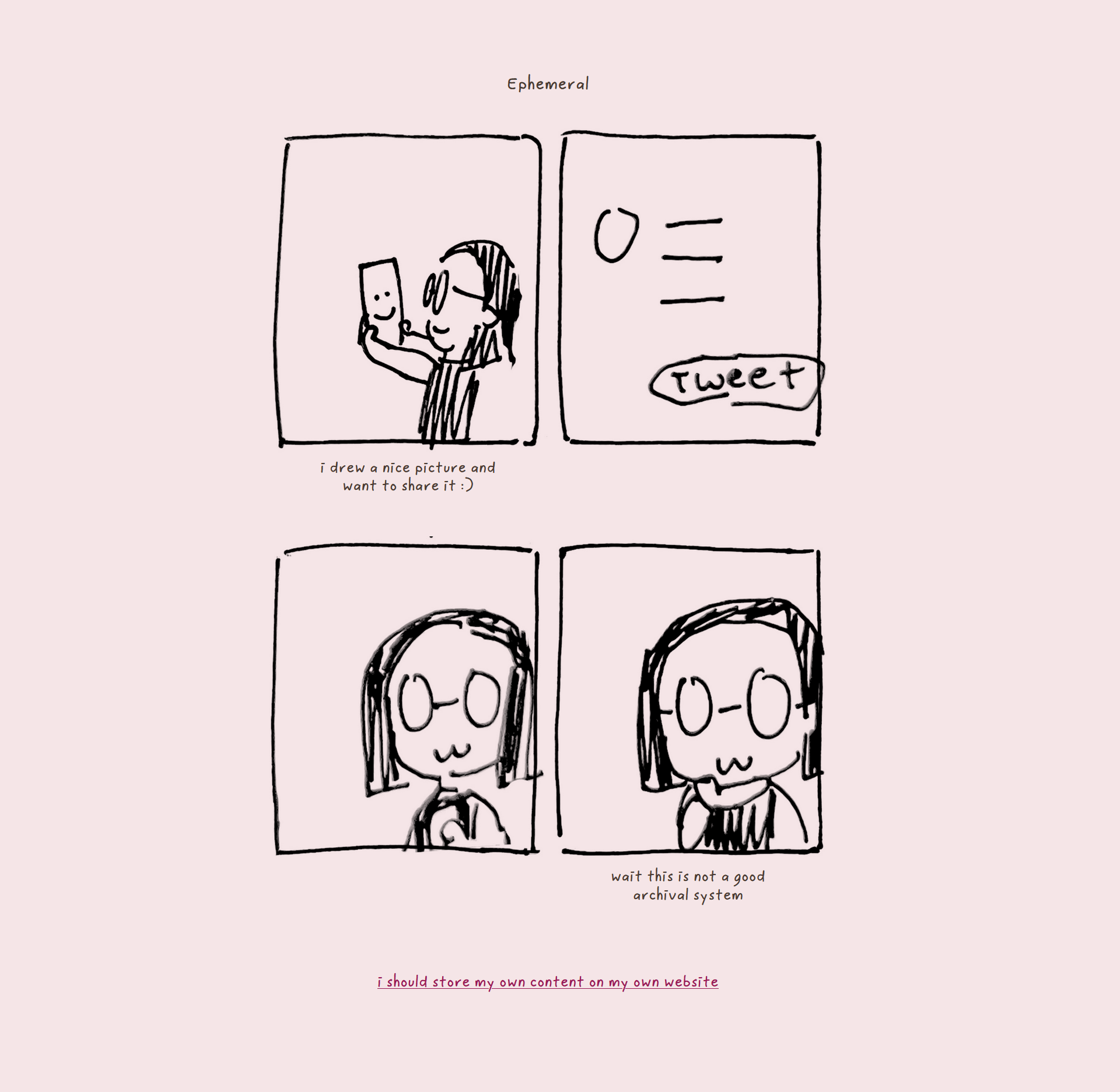
sketchbook
- wow I drew smth & I want to share it
- [tweet]
- :3
- [L8R] wait what have I made :(
about collection/archiving. can’t find/share easily in twt
I didn’t think too hard about this. Each comic basically had one text version, and I didn’t really iterate beyond that. I’m sure they could be better, but the point was to do it quickly.
After I did these text outlines for my comics, I drew them all together:
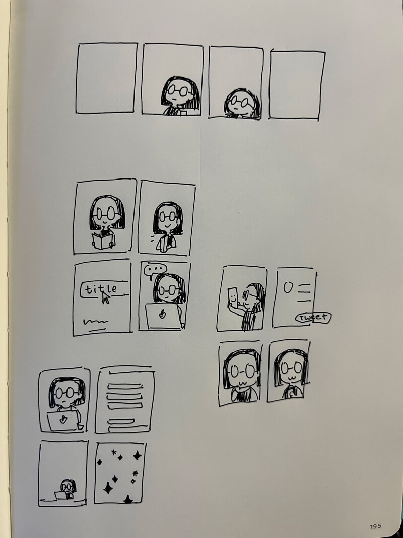
They’re all really small—each panel is about 2.5cm × 2cm (1" × 1/4"). I didn’t use a ruler. The ‘tweet’ bubble extends outside of the panel—technically a Mistake, but really, it adds to the whole casual nature of it.
I omitted the text because I was going to add that in the webpage itself.
I took a photo of this, and then edited it in Photoshop:
- Add black and white filter
- Adjust levels → make the background white, lines black
- Export each panel individually, at the same canvas size
Build and iteration
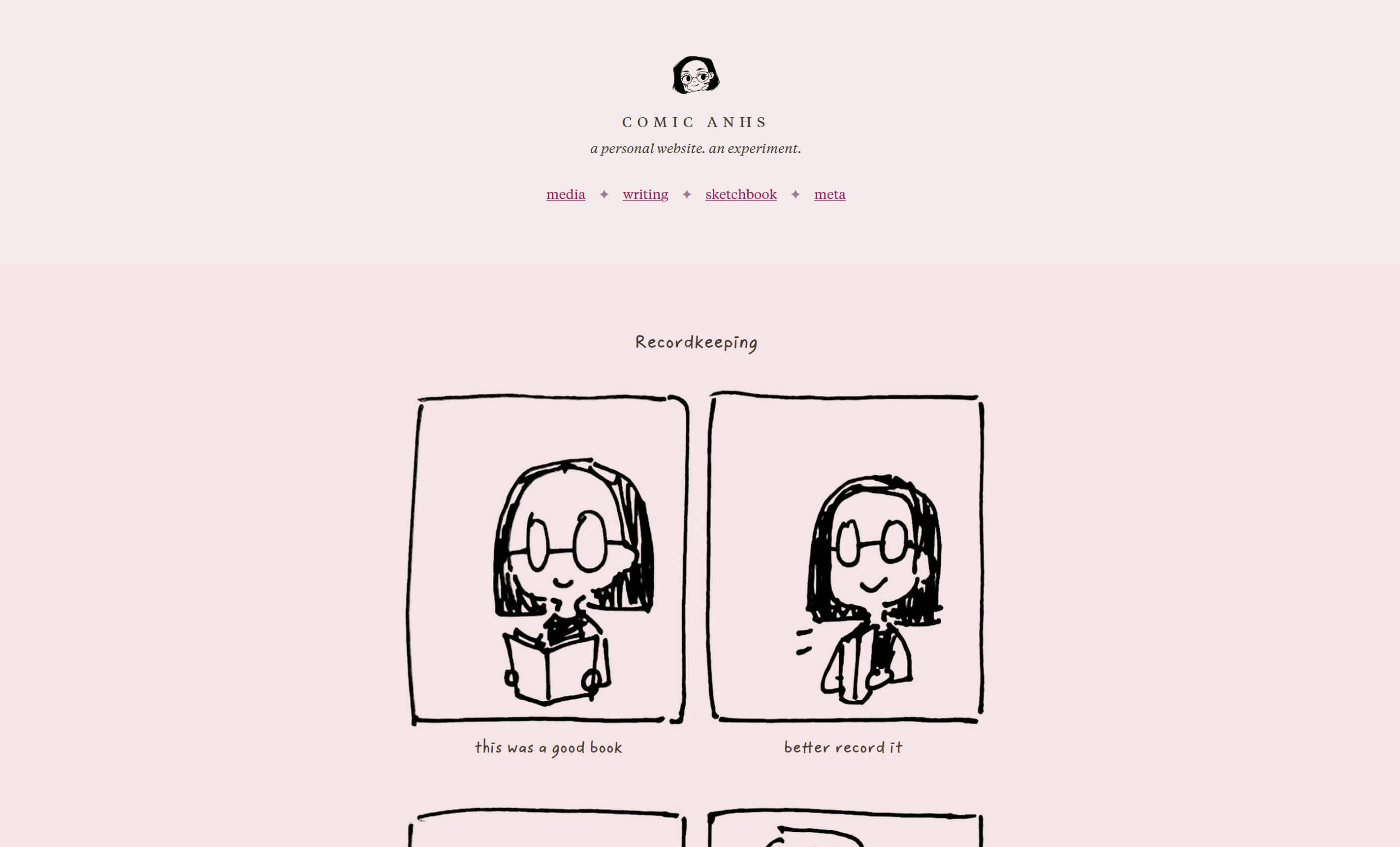
I exported each panel of the ‘Recordkeeping’ comic to test.
Each panel is a jpg with a solid white background. I added mix-blend-mode: multiply so that they would be transparent over my tinted pink background. The panels are laid in a 2-column grid with a fixed height.
My first version looked like this:
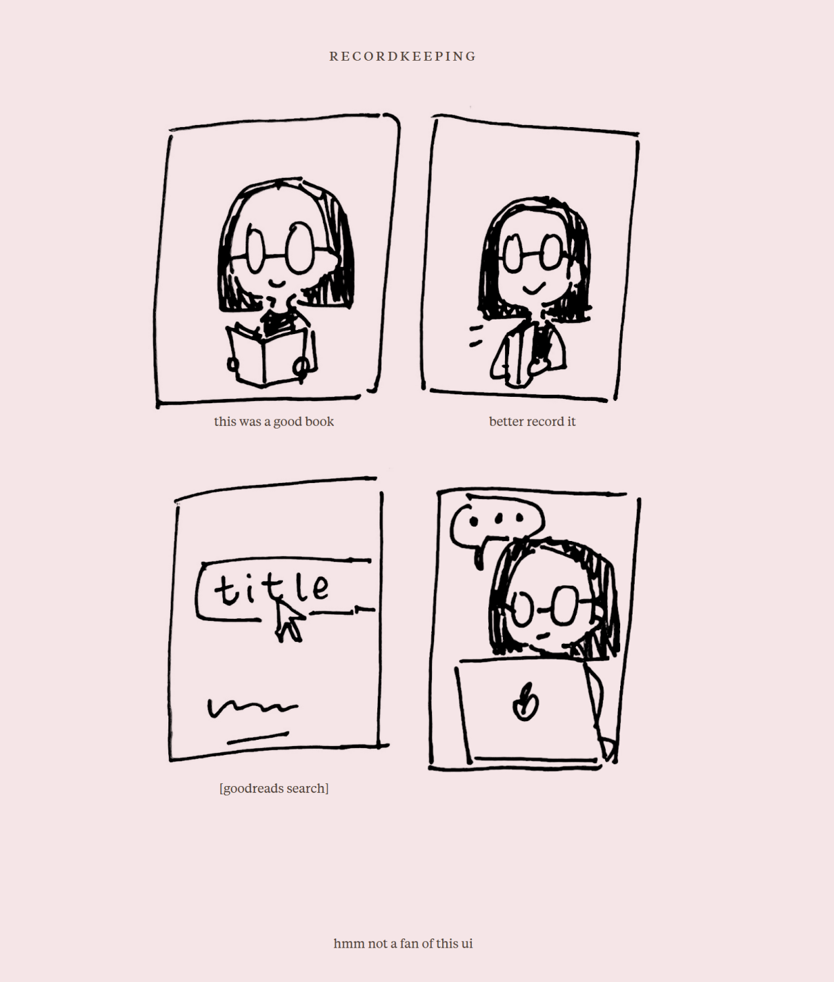
There are a couple of obvious issues:
- Crooked panel lines, while fitting on paper, are distractingly bad here due to the underlying grid and the combination with text.
- The serif font (Tiempos Text, my site’s base font) doesn’t fit
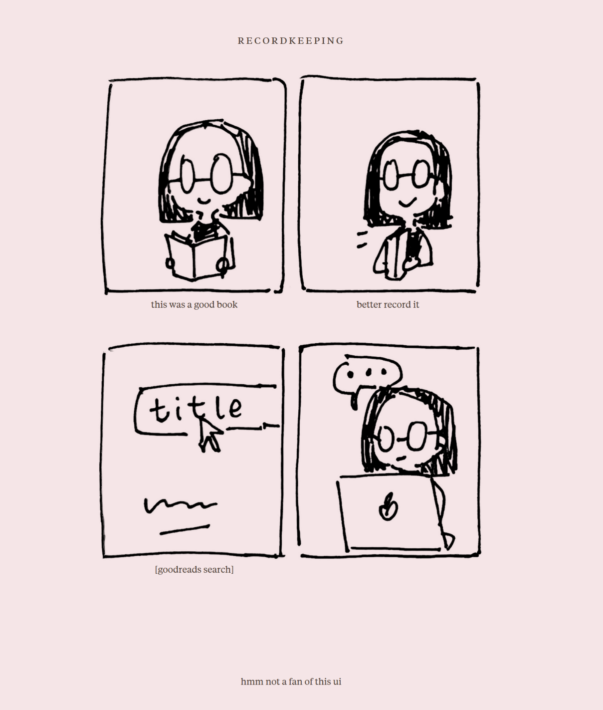
Fix: straightened panels
In Photoshop, I went and straightened out my panel lines with the transform tool. Out of laziness, I only did this for one set of panels because it ended up being more tedious than I thought. I used these same panel lines for all of the comics.
Fix: font change
I went and found a nice handwritten font to use: Poppy Fineliner, by Laura Eddy of TYPEHEIST. It has the right balance of legibility and handwritten beauty that I was looking for. I’ve had TYPEHEIST bookmarked for a while now, so I was excited to finally have a project for it.
I bought the license, swapped it in, and it instantly transformed the comic:
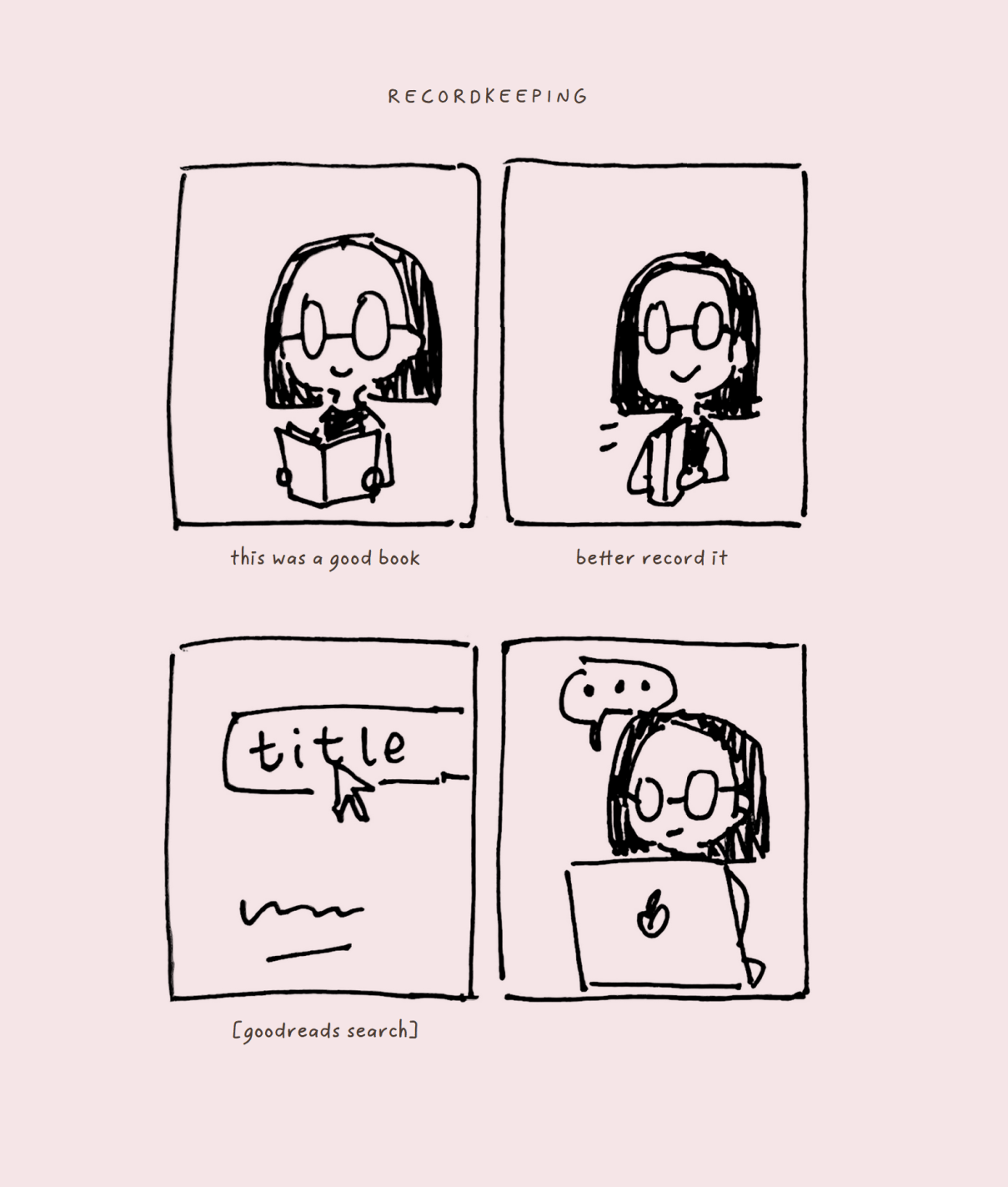
like wow! this looks like a real comic now!!!
Punchline
Each comic (except the last) is punctuated by a closing line that links to the section it’s about. This pattern is based on how comics like xkcd and A Softer World use hover effects, and how ‘read more’ links were used on LiveJournal.
Abandoned ideas
I had a couple of ideas that I ended up not doing.
Descriptions
I had planned on adding descriptive text to all of these sections, to explain them. It looked like this:
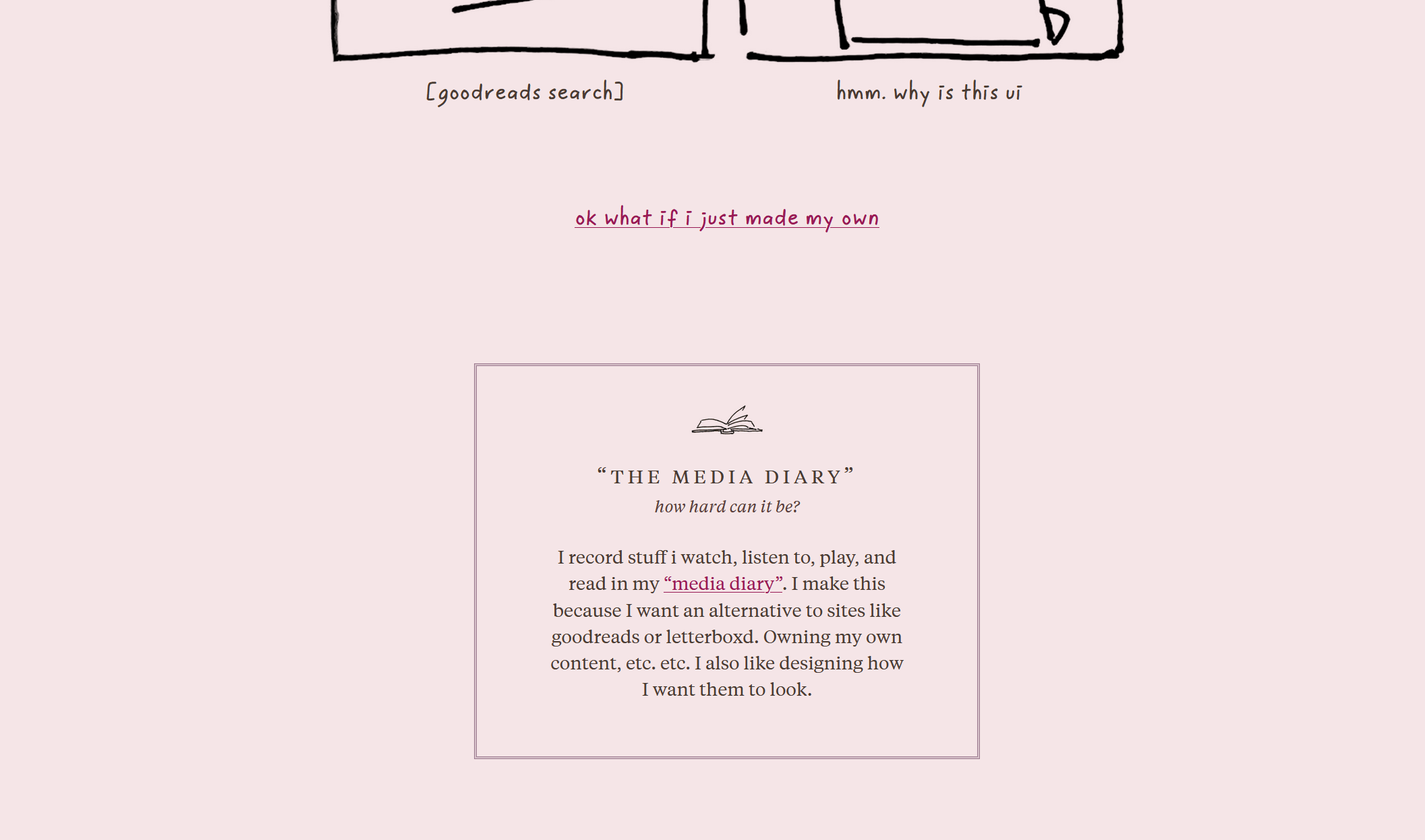
But I removed it because I was having trouble integrating it into the page. Using my site typography was jarring. I tried setting it all in Poppy, but I didn’t like using a handwritten font for a non-comic element. Maybe it’s fine, but in the end I just removed it.
I liked having the description because I know my page can be confusing, and explaining the whole thing helps, but I decided this isn’t important enough for me to spend more time on it at the moment. Maybe I will come back to it in the future? Who knows! In this version, I left it out.
Interaction
I was planning on one of my comics to be interactive, where (to put vaguely) you would click on it and it would change. There was a pun involved. I think I will implement it in a future update because I like the idea and it goes into the territory of integrating web capabilities into the comic medium, but there were just too many steps involved and I wanted to finish and publish this by the end of the weekend.
So, no fun interaction. But maybe this month I will get around to it.
comic anhs
I call this ‘comic anhs’ because haha, comic sans, comic anhs, get it. There are more jokes to make here.
Closing thoughts
I set out to draw comics for my homepage, and I succeeded. Does it fulfill my lofty webcomic goals from last year? Not the slightest. But it meets my intended small scope and I can file it as a completed effort.
I’m trying to let go of the idea that each experiment I do needs to be a big, dramatic thing. There’s definitely More I could do, but I’m working on practicing ‘done is better than perfect.’
Also, my final comic kind of encapsulates my feelings about this:
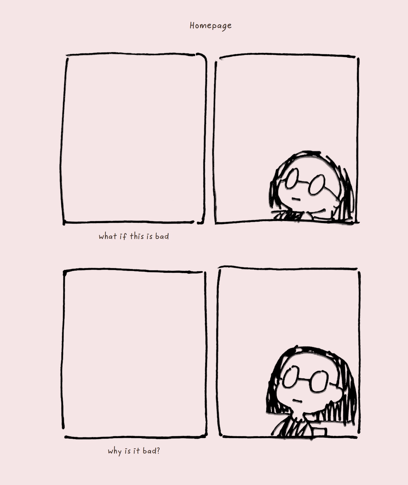
If this whole comic endeavor is bad—why is it bad? Who decides that? Does it matter? Is it bad to me? If you (general you, the reader) think it’s bad—is that important? And many such questions. And it was unproductive to keep pondering this, so I stopped.