Webcomics
April 2024
I’ve sort of tried this out with my version noir homepage. To quote my blog post writeup about it:
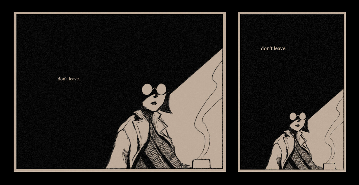
The principle: there’s a lot of negative space in the shadowed area around the figure, and the ‘don’t leave’ text floats in it. To maintain this on a narrow viewport, I stack it above the drawing, making use of the available vertical space.
— making version noir (april 6, 2024)
take scott mccloud’s definition of comics:
Juxtaposed pictorial and other images in deliberate sequence, intended to convey information and/or to produce an aesthetic response in the viewer
— from his book understanding comics
key word: juxtaposed. the relationship of panels/images to each other is essential to the medium.
to maintain the same rhythm / pacing when moving from a wide to a narrow viewport, the rhythm must adopt a more vertical flow. horizontal whitespace becomes vertical whitespace; directional cues move vertically instead of horizontally.
to be clear, this is purely theoretical—the composition is entirely dependent on the artwork. to easily shift your artwork around to fit a differently proportioned panel, to fundamentally change the composition, you would need to storyboard the art to support that. which is the actual hard part here.
at the end of my version noir post, I wrote that I wanted to draw something with a more complex composition to allow for more complex responsiveness. this is what I mean by that.
this is all building on Standards, Semantics, & Sequential Art by Pablo Defendini:
The fundamental unit of storytelling in comics is the full-page layout, not the individual panel. The magic of comics happens in the gestalt of the visual juxtaposition of multiple panels.
and an example of double-page spreads:
But on the iPad, for example, double-page spreads become a nuisance, rather than an enhancement: the reader has to flip their tablet into landscape mode to see the spread at a legible size, and even then, it’s still smaller than the previous page, since the proportions of the artwork designed for the printed page are different from the proportions of the reader’s screen. […] the double-page spread feels smaller and more cramped, rather than bigger and more expansive.
August 2022
Earlier this summer, I started playing around with the idea of ‘responsive comics.’ My output was going to be a homepage redesign on here, but my goal was to experiment with how comics can adapt to the medium of the web in the context of responsive design. How can comic panels rearrange themselves depending on screen size?
Early example
Here’s an old sketch I sliced up to test. One of my goals is to play around with how to rearrange compositions based on screen size.
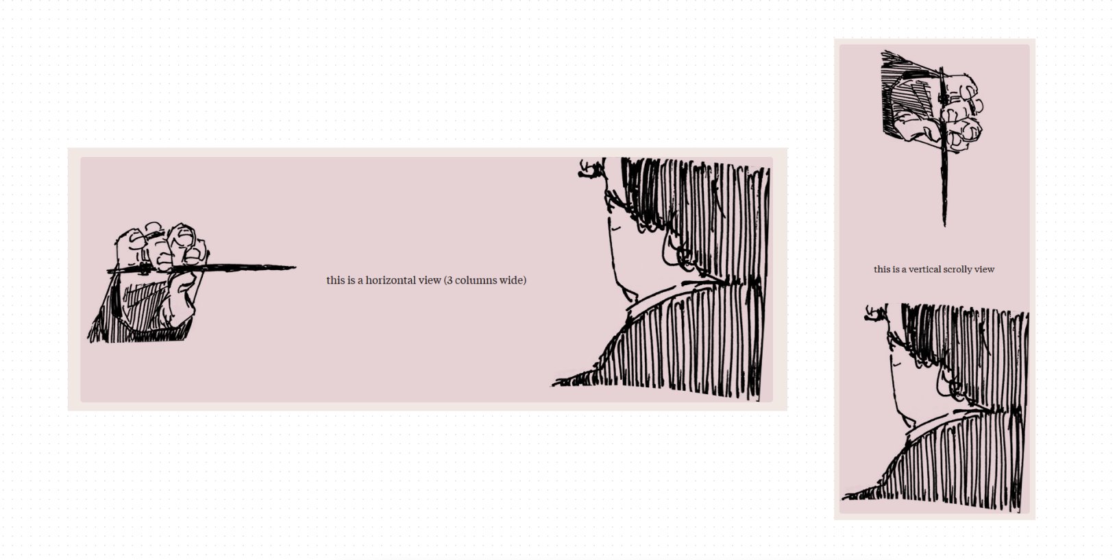
The horizontal panel is the original composition. To convert this to a vertical layout for phones, I want to maintain:
- The needle pointing towards the person
- The distance between the needle and the person
- The text separating these two elements
So to rotate this vertically, the hand, the text, and the person all need to be separate elements. Like a typical responsive design, they stack on a narrow screen. The one change is that the hand holding the needle rotates so that it points downward towards the person.
This is a crude example that doesn’t really make sense in terms of artwork composition (why would a hand be floating above a head) but introduces the new question of: what is the vertical equivalent of pointing a needle at someone’s neck?
I don’t know, which is probably why I would not draw a comic panel to look like this, because I wouldn’t be able to rearrange it. I would compose it differently keeping this in mind.
Which is the thing I want to explore here: how to compose panels that work both horizontally and vertically.
Reading
I did a cursory search for stuff about responsive comics. Some are more relevant than others; some of these are interesting looking links I found but didn’t fully read. Full list of readings:
- Standards, Semantics, & Sequential Art: Toward a Digital Comics Praxis by Pablo Defendini
- Understanding Comics, and Making Comics by Scott McCloud
- The "Infinite Canvas"by Scott McCloud
- A Comic Introduction to Idyll by Matthew Conlen
- CSS Grid Layout and Comics (as Explained by Barry the Cat) by Ian Yates
- Communicating with Interactive Articles Fred Hohman, Matthew Conlen, Jeffrey Heer, and Duen Horng (Polo) Chau
- Thread by Maggie Appleton: ‘Wish there were way more visual-spatial essays around the web. I think we get hung up on calling them “comics.”’
- Chatting with Glue by Max Krieger
- Thread by Matthew Conlen on authoring tools for interactive documents
- Comics Devices Library