Bloop, aka, writing for chat
This week I redesigned my homepage to look like chat bubbles.
Writing vs. Texting
I initially made this because 1) I was bored of my existing homepage, and 2) I wanted to try a format that made writing easier.
This tweet from David Perell sums it up (highlighted emphasis mine):
Most people are bad writers, but excellent text messagers.
Their writing is bad because they try to sound smart once they open Microsoft Word.
But when they text, they write with clarity and enthusiasm.
If you’re stuck, write like you’re sending an important text message.
— @david_perell, March 19, 2022
I initially planned to just write the HTML directly into the template, as I did for my previous homepage due to the complexity. The markup looked like this:
<section>
<div class="dialogue">
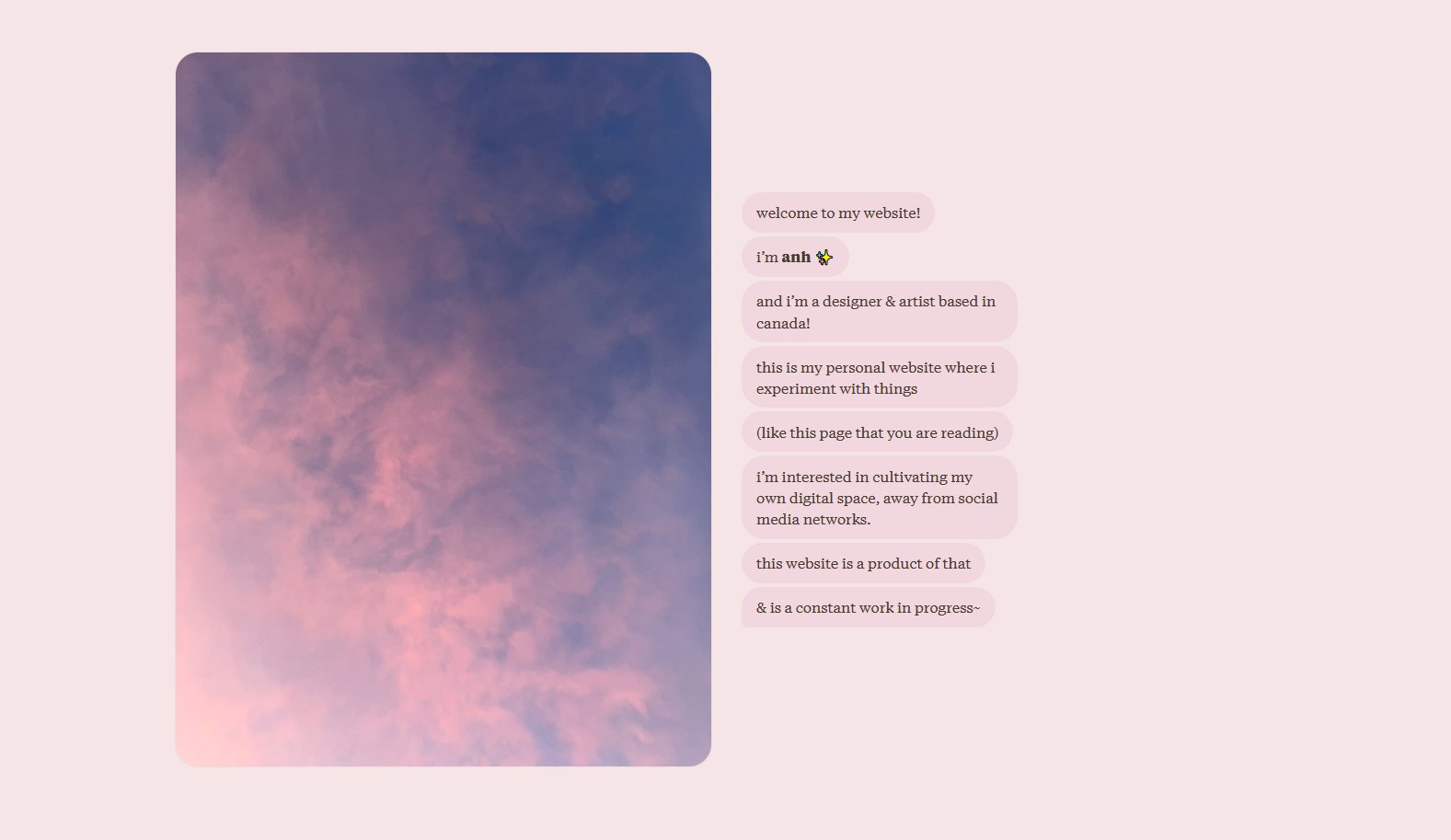
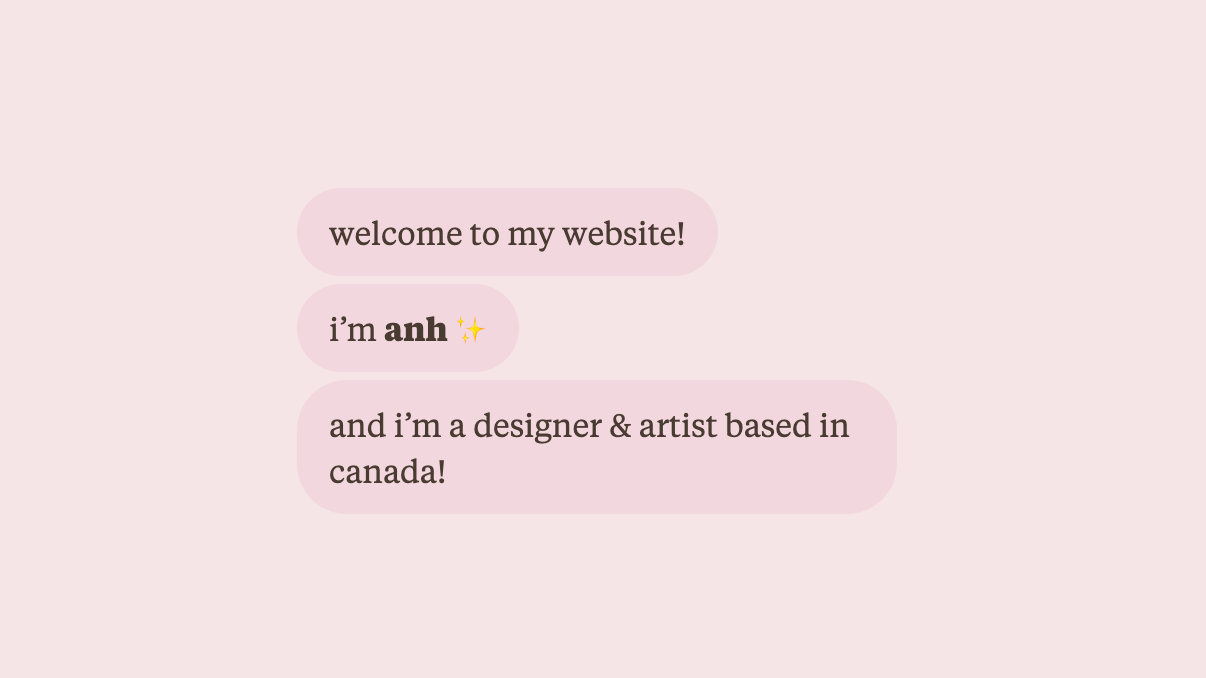
<p class="dialogue__bubble">welcome to my website!</p>
<p class="dialogue__bubble">i'm **anh** ✨</p>
<p class="dialogue__bubble">and i'm a designer & artist based in canada!</p>
</div>
</section>But after writing this out for a couple of sections, I realized it was too unwieldy and I needed to make the authoring experience to be as low-friction as the format implied. Even if I displayed the text in a casual format, if I was bogged down by syntax while writing, I wouldn’t really be getting the casual experience of texting.
So I went back and revised the template to be compatible with markdown.
Now, the above text would be written as a list:
- welcome to my website!
- i'm **anh** ✨
- and i'm a designer & artist based in canada!
And the CSS styles each bullet point to be a text bubble. No extra formatting is needed in the markdown.
Simple! Low-friction! Now I can type away to my heart’s content!
The whole thing is a two-column grid. Images are in the left column, bubbles (wrapped in a <ul>) are in the right, and headings and horizontal rules would span both columns.
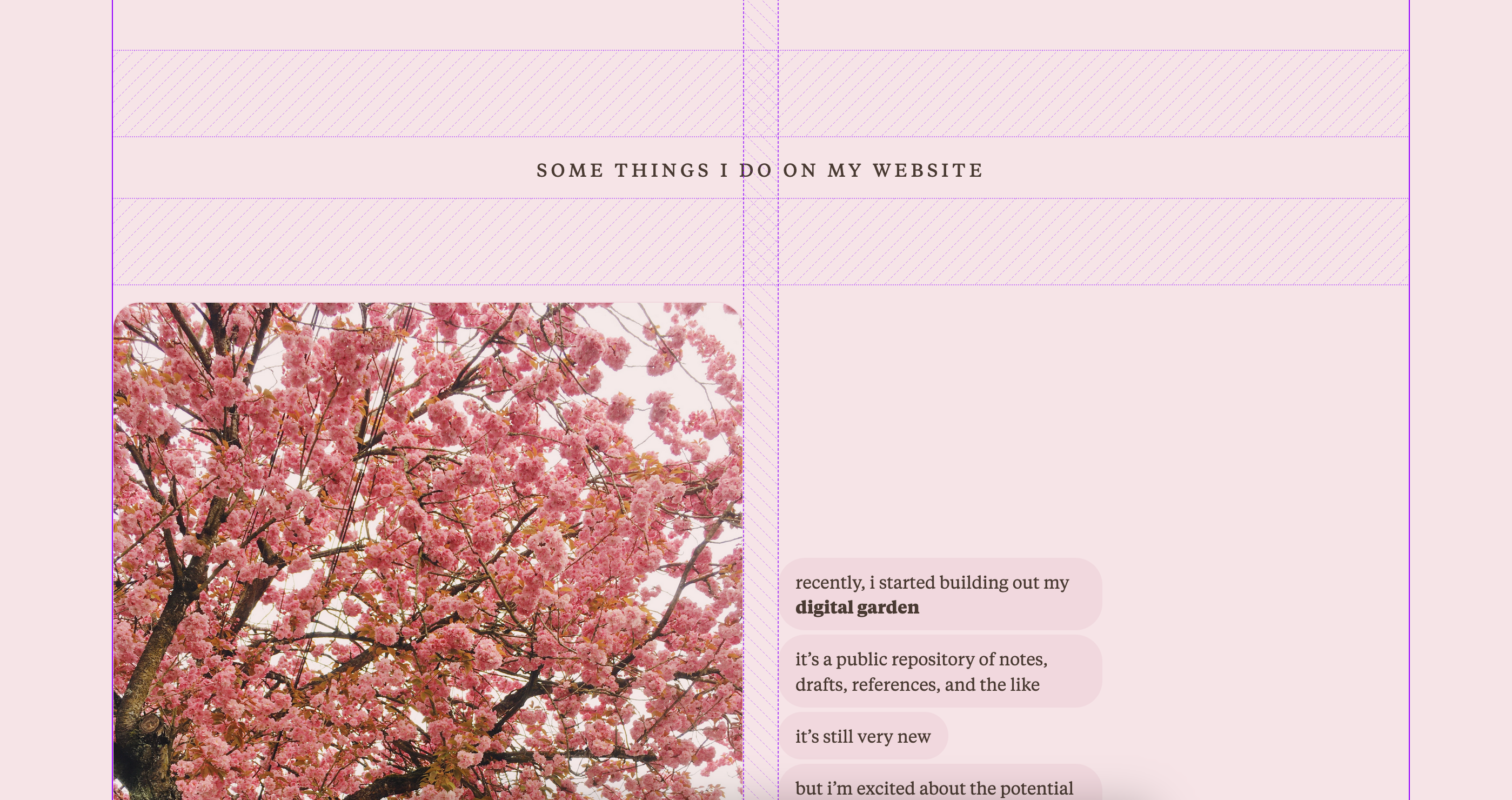
This format is pretty limited; I have to have an image on the left to accompany each section. I’m okay with that though—if I need to expand this, I will. But right now, the whole page (save the header/footer) is a markdown document that’s easy to edit, so I’ve succeeded at my goal.
Ideas considered and discarded
In pursuit of an easy authoring process, I decided against putting in additional UI elements that would fit the theme but not be doable (or would be hacky or cumbersome to implement) in markdown.
For example:
- Metadata for each chat bubble – messaging apps show read status and timestamps, so I was thinking about what kind of metadata would fit here. I think having asides or tangents accompanying relevant bubbles might be interesting—I’m a big fan of sidenotes—so it’s an idea I’d like to come back to in the future, when I feel like complicating things.
- Author icon next to the bubble to indicate who the message is from—in this case, I’m the singular author, so all icons would represent me. But I thought about having a different icon for each section to indicate mood or style, like how you could choose different icons for LiveJournal posts. Maybe my photo section would be an actual photo of me; my sketchbook section would be a cartoon drawing; my journal section would be an emoji of me lying facedown on the floor; etc.
- Opposite chat bubbles, so that these would look like conversations. I considered having conversation options for the reader to pick from, kind of like how you might pick options when talking to a chatbot for customer support. I decided against this because I personally dislike chatbots and didn’t want to impose that feeling upon the reader here. Also, it would have been a lot more work to implement.
- Other chat UI elements, like wrapping the bubbles in a portrait container to look like a screen, or datestamps. It felt too—literal, I guess. This is also why I kept my site’s typography instead of opting for a sans-serif font like a typical app UI.
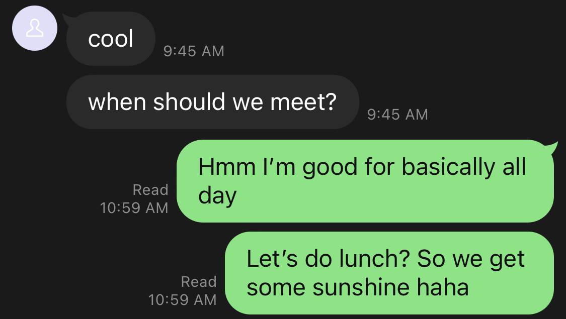
- Chat bubble tail because I was lazy, lmao. I didn’t want to draw an SVG. I reduced the border-radius of the last bubble instead, which is how Twitter DMs style their bubbes. EZ CSS!!
Other implementations of this, and some other tangential inspiration
Some other people have done their own versions of this, which was very cool to learn about:
- Max Krieger’s Chatting with Glue, which is presented in a comic form with chat bubbles and discusses conversations as a medium
- Tyler Angert has a streams section created for the same purpose—to be read casually, and low pressure to publish
- Aaron Z. Lewis published a blog post formatted as a DM conversation
And some other works that were on my mind when I was thinking about this:
- this comic by ghostgods that uses messaging bubbles to narrate the story
- this comic by Jessica Hayworth that uses closed captioning for text. I really love the effect this has.
- Jonnie Hallman’s status page
- Twitter’s current, slow death that made me think about the things that it excels at—dumping unpolished text onto the timeline is the standard behaviour, and I wanted to capture that feeling here
Unpolished by nature
This whole thing feels super incomplete! I barely proofread my words. It rambles. My images are not optimal. The CSS is gruesome.
But, the whole point was to allow myself to publish unpolished content. I tend to die in development hell trying to make things close to perfect, which is just not useful for experimenting. So in the long-term, I hope this enables me to publish more.