Quick notes on the book
I meant to write a comprehensive post about my site redesign, but honestly I’ve run out of steam and instead I’m just going to write some messy notes for the sake of actually publishing it.
Context: I redesigned my site the other week! The visual design was originally intended to look like a printed book: serif font, centered layout, sepia colour scheme. I fell into various rabbit holes while moodboarding though, and ended up spending more energy than expected on my writing and tone, and also easter eggs.
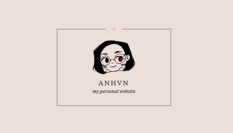
You can look at the homepage here: click me!!!
Initially, I wanted my site copy to be more formal, to emulate the formality of printed books. An early idea I had was to put small inline doodles. And then I decided that it was too…whimsical? I was going for formal book, not whimsy book.
But my print design inspiration hunting led me to reconsider this.
Early on, a major source of inspiration was the thread Book design: advice and examples on Edward Tufte’s site. One of the books mentioned is Concrete Mathematics, a math textbook. It’s full of surprising humour. In the preface, the authors write (highlighted emphasis mine):
Some people think that mathematics is a serious business that must always be cold and dry; but we think mathematics is fun, and we aren’t ashamed to admit the fact. Why should a strict boundary line be drawn between work and play? Concrete mathematics is full of appealing patterns; the manipulations are not always easy, but the answers can be astonishingly attractive. The joys and sorrows of mathematical work are reflected explicitly in this book because they are part of our lives. (vii)
Concrete Mathematics does something very cool and fun, which is include ‘graffiti’ from students in the margins of its pages.
I would have thought mathematics is cold and dry indeed, but maybe it isn’t? This textbook has such personality, and you can tell the authors enjoy their work. So I decided to include doodles in my site, because they’re fun and that can coexist with work.
The doodles are part of the marginalia feature, which I’ve hidden as an easter egg.
⚠️ Spoiler Alert
I explain the hidden marginalia feature here, which I encourage you to discover for yourself before reading!
I had two reasons for hiding it:
- I play too many video games. I did similar hidden feature shenanigans on my visual novel redesign and wanted to continue that spirit here.
- I wanted to experiment with gating access to my ~informal~ content. I haven’t fully executed on this idea but it got me thinking about what kind of content I want available up-front, and what I want tucked into a hidden corner somewhere.
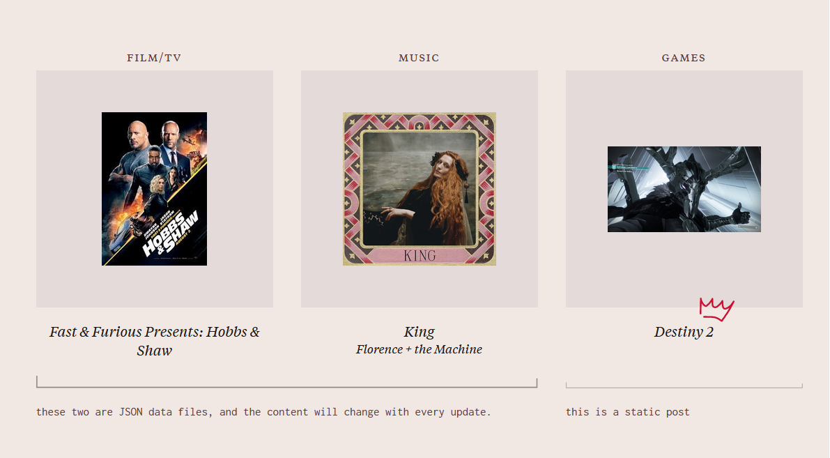
The video game influence is clear in the hidden mechanic. To reveal the marginalia, you have to click on three diamonds on the homepage.
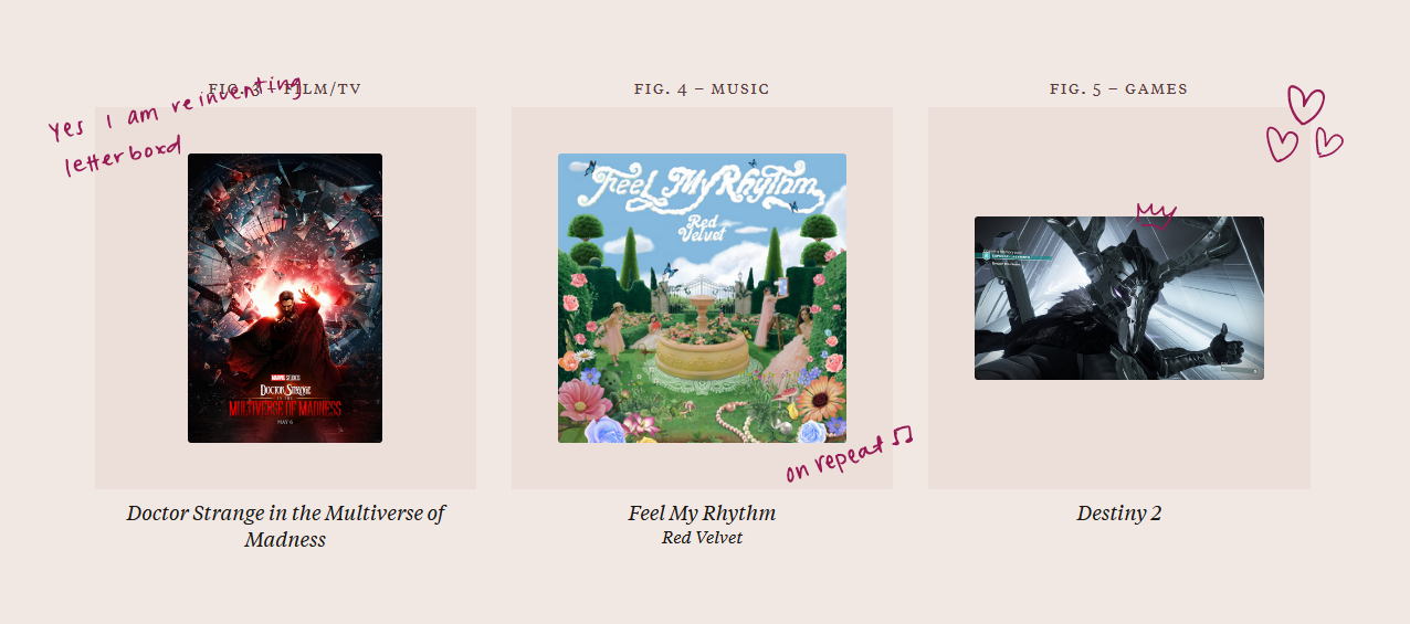
This is blatantly stolen from a typical puzzle mechanic in the game Destiny 2, where you shoot three objects or stand on three plates or the like in order to progress an encounter.
On my homepage, you click on the diamonds, each which animate and send you a little toast notification informing you of your progress, until you’ve hit all three and reveal the next step. To toggle the marginalia, you have to scroll to the top and click the final diamond in my eyeball.
Why require this extra step, instead of enabling marginalia mode upon the third diamond click?
- I want you to be at the top of the page when the mode is enabled.
- I want you to be able to toggle this on/off with ease, without needing to press the three diamonds. There’s no clear ‘turn off’ mechanism if it’s based on activating the three diamonds.
Honestly, this is not discoverable. I sent this to a few friends and none of them found this until I told them that this hidden feature existed. I do want it to be more discoverable, so I need to iterate on this.
I’m considering turning this into an obvious on/off toggle, like how sites will have light/dark mode toggles, and remove the secret aspect entirely.
Marginalia—‘marks made in the margins of a book or other document’ (Wikipedia)—is a really fun concept. It adds personality in ways that typical site copy wouldn’t. I think there’s a ton of room for improvement on how I’ve executed on this idea—really, I feel like I’m scratching the surface on how different formats within a webpage can convey information and tone—but I could sit here and iterate forever on it without publishing. So I will accept its imperfect nature and build on the idea in future updates (maybe).
I called it marginalia mode as a reference to the whimsical mouthful mode in the game Kirby and the Forgotten Land.
I considered using actual typed text instead of handwriting for the marginalia, for readability, but I didn’t like it. A couple of things I considered:
- Annotating my homepage like a case study. The marginalia would discuss things like build and design details.
- I didn’t do this because I didn’t have substantial things to say, and it didn’t feel interesting to me. It didn’t embody the spontaneous nature that I wanted ‘marginalia mode’ to have.
- Annotating my homepage like a case study with typed text, and then annotating with handwritten text for fun, whimsical notes.
- I didn’t do this because it required too much thinking on the content. It was too overengineered.
I think part of the challenge was that having actual typed text led me to subconsciously trying to write more ‘formal’ content.
As Mark O’Connell writes in The Marginal Obsession with Marginalia:
Marginalia are supposed to be spontaneous and fluent. “Noting” something on a Kindle feels like e-mailing yourself a throwaway remark. There’s also something attractive about the contrast between the impersonal authority of the printed page and the idiosyncrasies of the reader’s handwriting.
The medium shapes the thought; I was shifting towards writing more formally when I was typing out words versus handwriting spontaneous notes.
The flaw with handwritten text is that it’s unreadable in bulk, so I would have to use it sparingly. This ended up being fine, because I didn’t have much to say and thus didn’t feel inclined to write great blocks of text. But it’s something I was conscious of. Eventually I would like to create my own handwritten font to make this whole process easier.
By the way, my process for turning handwriting → SVG is:
- Write it with pen and paper.
- Take a crappy photo with my phone.
- Edit in Photoshop to black and white, adjust levels.
- Import into Illustrator and image trace.
- Manually adjust kerning, line height, and overall crookedness.
- Paste that vector into Figma.
- Export to SVG.
I did this for all of the little doodles and writing.
When it came to writing, I tried to keep in mind something that Katherine Yang tweeted:
long titles, captions, legends, labels, and/or when the metadata delivers the emotional punch >>>>>
– @bookwormgirl910, April 12, 2022
What meaning can I put in my metadata? I wrote my labels with some dramatic personalization. On my homepage, I have a bullet point for my design projects: my favourite thing about it. My About section is called an introduction to the designer. In my video game section, I tagged Destiny 2 with five million hours gametime.
It’s all very personal and dramatic. Does it work? Who knows! It certainly feels more interesting to me than a blander purpose or highlight label, and I’m fine with erring on the side of overdramatic for now.
Some other visual design notes:
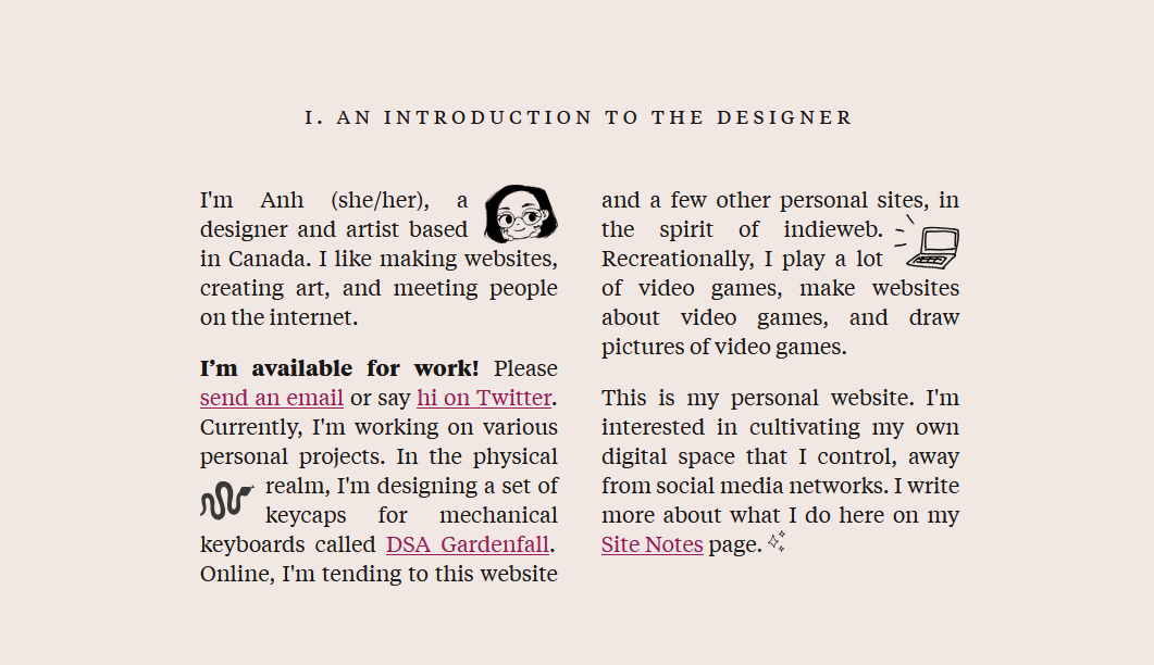
- I like the visual effect of having two-column text (as used in my introduction section on the homepage), but this is, honestly, a bit annoying to read. I used to have a three-column text thing for my design section, to continue the printed book style, but this annoyed me so much I changed it. As much as I like how this looks, it interferes with how I expect text on a website to look.
- I can stand it when it’s short enough the height fits in the viewport and there are enough visual anchors to draw interest (in this case literal link anchors); otherwise it looks like a giant text block.
- I might still get rid of it because my desire for readability is greater than my desire for adhering to the concept.
- Design page headers are modeled after book title pages.
- I really enjoyed using small caps, and had to stop myself from making everything in small caps. They’re just so cute and square and satisfying.
- Designing a centered layout gets tricky when I require having a column for asides. I’m displeased with my ~tablet~-sized breakpoint design, which shifts everything into a left-aligned layout with a right column for asides, because it’s inconsistent with the centered layout on larger screens and phones. I want to revisit this later.
IN CONCLUSION. Here are some things I would like to explore further and build upon!
- Separating types of content by audience, and how to restrict access to them. For example, I don’t necessarily want hiring managers looking at my hypothetical NSFW artwork. (Wait, what?)
- Adding cute hidden mechanics that execute the aforementioned audience-segmented content. (How would my audience for NSFW artwork know to find that artwork but not anyone else, versus how would my audience of hiring managers know how to find the Professional stuff?)
- For example, pointing out directions from Twitter (where informality is the norm) so people already in that audience can find it; however, external folks who land on my site directly from a job application (like hiring managers) would not.
- Obviously, this is not foolproof, but the idea is to add friction.
- Adding cute easter eggs that are actually discoverable.
- Playing with different text formats within a site and how they’re suited for different types of content; i.e. informal marginalia vs. official text. I want you to read my professional words and also my snarky asides and I want them to be distinguishable as such.
- Ultimately, making my website a personal website.
So I meant to write a messy list of notes, but as it turns out, I wrote a messy and long blog post instead. Please forgive the disjointedness. Thank you for reading.