Website Visual Novel
Last week, I got around to turning my website into a visual novel. A visual novel is a type of game similar to a choose your own adventure book: the player chooses actions and dialogue and the story responds to it. (Wikipedia ↗)
I had this idea last year, when I bought the domain anhvn.com and my friend was like ‘lol anh visual novel.’ I started writing out the flow of it and built out a skeleton for how it might look, but quickly abandoned it out of disinterest.
I finally decided to revisit it last week since I just finished my site redesign and wanted to do something ~fun~ instead. So I spent a few days drawing and building it, and I’m happy with how it’s turned out.
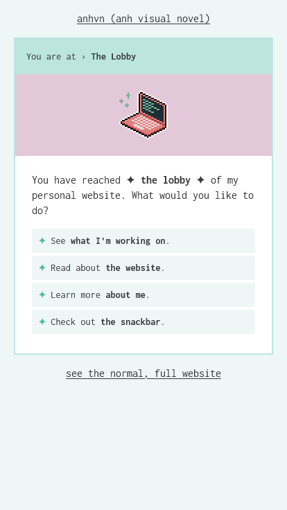
✨ Try the visual novel experience →
Note: this post goes into detail about the ‘secret’ features, so I encourage you to try it out yourself before reading this.
The Content
My main goal was to make something fun. I wanted to include the main pages from my website, but also add in silly or ‘hidden’ features to discover.
The main website pages would be:
- A projects/professional work page, targeted towards potential employers
(I am available for work!). - An about the website page, to quickly address any confusion about the structure.
- An about me page.
In order to keep to a limit of four options per page, I omitted my blog, artwork, and media diary, which are present as top-level navigation items on my regular site.
The snackbar gets top billing along these other three website items because I wanted to prioritize at least one fun thing.
Writing
Some small writing details:
- I initially planned for each option to be an action; i.e. start with a verb. For example: Read about x, learn more about y; check out z. For the most part, this worked, with the exception of my Projects page and the snackbar.
- The object of each choice would be bolded (e.g. ‘Go back to the lobby.’) for emphasis.
- Internal links that go to my normal site are appended with
→, and external links are appended with↗. - I use
youto refer to the reader, andIto refer to myself. At first I wrote in third person for the actions (e.g. ‘Learn more about Anh’), but decided that this sounded unnatural when writing my bio (‘Anh is a designer…’) and changed it to first person.
Opting Out
I’m aware that not everyone desires a whimsical, meandering website experience all the time. This is fine! I included a link to go to my normal website on every page, so you can opt out of the VN experience at any time.
The Art
I drew a bunch of new pixel sprites to go with this, and kept them simple as to not consume all of my time and energy. This was the part I got stuck on last year when I first tried making this—I kept thinking I needed to make lots of high-quality pixel art to go along with every page, and I felt pressured to do that, and then I was using placeholder art that didn’t inspire any direction when building it.
Simplicity
This time, early on in the process I drew a very simple coffee mug for the snackbar, stuck it in the page, and decided that this style was fine. And so I became mentally unblocked on the art.
Keeping things simple also allowed me to create new pages without being stressed about needing to draw accompanying art for each one. While I would love to draw something beautiful and complex for each page to truly emulate a visual novel, that was beyond the scope of this project.
Pixel Art
Pixel art was my first choice for the art style, not only because it relates to gaming, but also because I could create it using my mouse, which made it low-friction to start. While I’m most comfortable drawing with a pen or stylus, doing so requires switching devices. Throughout building this VN, I switched between drawing and writing whenever I got bored or tired of what I was working on. Switching to pixel art only required pulling up an art program, and I would continue drawing with my mouse.
Design & Development
A couple of my early ideas were to style the frame to look like a browser window, or to build a decorative GBA-like console around it. I decided against these in the interest of keeping things simple.
I settled on a two-column layout that would stack vertically on narrow screens.
I didn’t give my layout or styling much thought beyond this. I took the colours from my normal website styling, and used a monospace font for it because my site’s current body font looked unsuitable.
Structure
My site is an Eleventy site, and the VN structure is a bunch of files inside my /vn/ collection. Each page is its own markdown file, and each player option is a list item. Whenever updating any file path, I would update the text links in each relevant file.
Example markup of the lobby:
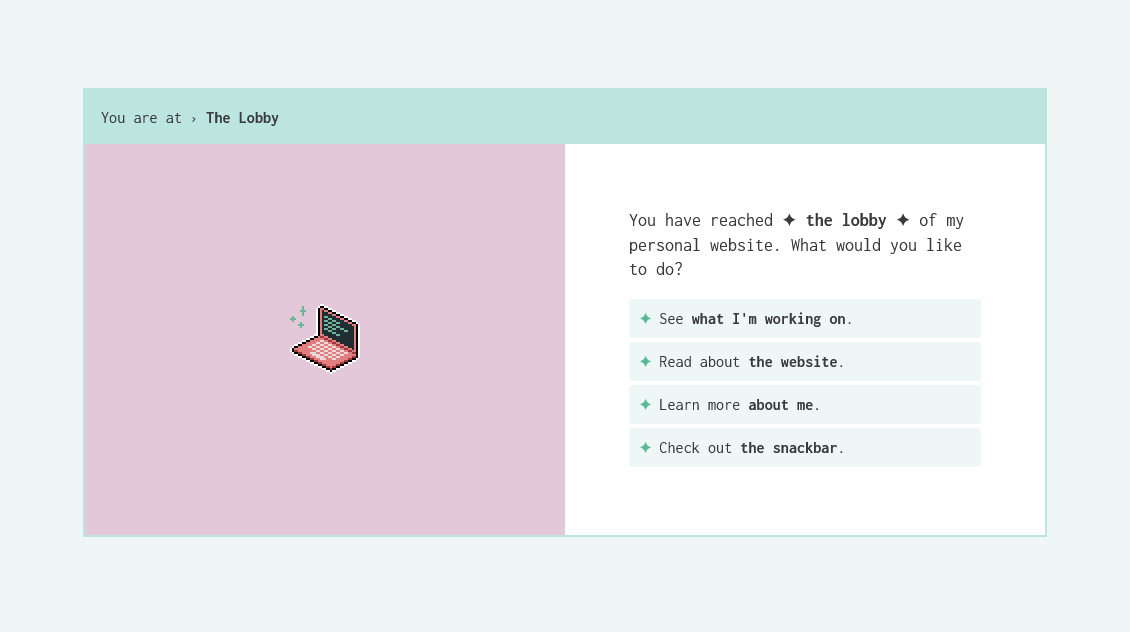
You have reached ✦ **the lobby** ✦ of my personal website. What would you like to do?

- [See **what I'm working on**.](/vn/projects)
- [Read about **the website**.](/vn/the-website)
- [Learn more **about me**.](/vn/about-me)
- [Check out **the snackbar**.](/vn/snackbar)
Since this is manual, any wide-reaching edit would be annoying to do (like if I decided to rename my lobby, I’d have to update every single page that refers to it). Fortunately I haven’t had to do that yet. At this stage, I think it’s more practical to do things manually than to overengineer a system that links everything together and renders stuff via liquid shortcodes.
I also considered nesting the files inside folders and adding breadcrumbs to the You are at › Page Title header, but didn’t because the structure isn’t strictly hierarchical and it was easier to manage everything in one place.
I would revisit these decisions if I had a lot more pages to manage.
Secret Content
⚠️ Spoiler Alert
This section talks about the ‘hidden’ content I put in my VN. Before reading this, I encourage you to discover it yourself if you haven’t already.
I knew I wanted a gratuitous snackbar section from the beginning, but I didn’t come up with anything hidden until I started writing the snackbar pages and thought, what comes next?
This is where, I think, this project gets interesting and really captures the spirit of a fun experiment.
I made two secrets:
- The Dark Lobby section
- The Secret Menu mini-puzzle
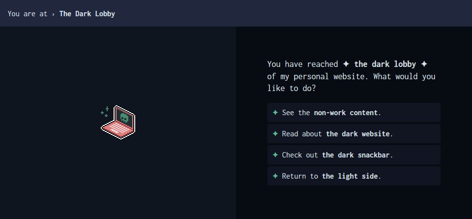
The Dark Lobby
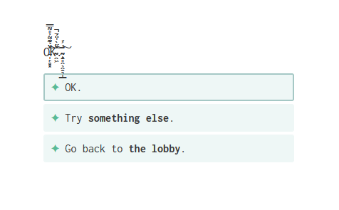
You get to the dark lobby by rejecting my snackbar and then clicking on the OK button a bunch of times. I initially thought about making this OK page a dead end, with an ‘OK’ option that just refreshed the page, to really represent the mood of the nah option. Then I thought about what could happen if you kept clicking on a button that went nowhere—maybe the page would get weirder and weirder, and something would unlock.
nah, the ultimate choice of disinterest → OK. gets weirder and weirder.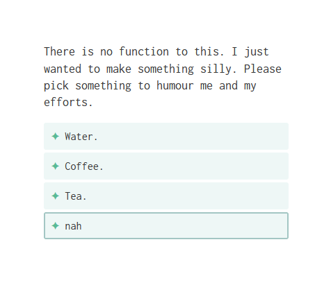
The dark lobby is an 😈 evil version 😈 of my regular lobby. It’s got dark mode, a deathly laptop, and some dark paths to pick from. I thought about what kind of website content would thematically fit in this ‘dark’ version, and settled on placing my non-work/unpolished content here to mirror the professional projects page on the light side.
The Secret Menu
Instead of the dark lobby, you can go to the the secret menu, which is a puzzle of sorts. This started from my desire to include a Konami code Easter Egg. I had one set up on a previous project, so I copied that over and decided the result (a confetti of watermelon emojis) was suitable for the snackbar theme. The watermelon would be the ‘secret’ menu item.
Version B
The Konami code version is called Version A. I created Version B of the puzzle after I realized the sudden confetti effect was inconsiderate of motion sensitivity. I could have kept the same Konami code to output a different, non-moving result, but I decided to use another mechanic. Instead, in Version B you have to look at the source code.
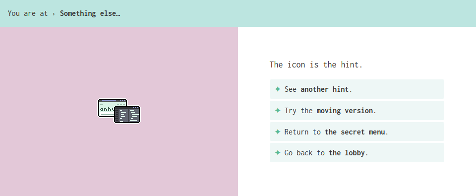
The spirit of Version B draws from Harry’s Online Puzzle Extravaganza, a puzzle I first played more than a decade ago in high school. Checking the page source code for clues was a running theme, so I put in some ASCII art of a watermelon into the page <head>.
Hints and Solutions
I added hints after my partner told me that this was confusing. The problem with the Konami code is that if you don’t know about it, then there’s no way for you to deduce it, and I didn’t want this puzzle to be a dead end.
I think that effort put into a puzzle needs to be matched with the reward for solving it, and this result is so minor that I didn’t want to encourage spending time ‘figuring’ it out, especially if it could be impossible to do so.
Personally, I also enjoy playing all of my video games on easy mode, because if I struggle too much with something, it inhibits my enjoyment of it. I wanted to mirror that philosophy here: if you don’t want to sit and think about what the hints mean, you don’t have to.
The Solution Solution
Knowing what the secret menu item is isn’t the end, though you could stop there. You have to manually type it into the address bar and navigate to the page, the same way you pick one of the drinks and then go to the page where I give you the drink.
The only ‘clue’ I give about this is when I say that you'll have to find and get it yourself in the beginning. I wanted one extra step that would be ~suprising~ if you thought to do it, but not take away from the experience if you didn’t.
Future Improvements
For the most part, I’m happy with how this came out. But of course, there’s always room for improvement and I’m aware of some shortcomings that I’d like to address in the future, if I go back to update this:
- Voice & tone: I think this varies a lot, which keeps it from feeling like a cohesive work. Some parts I wrote last year in my initial draft, some I took from my existing website, and some parts are newly written and not edited.
- Pacing: Going through pages should feel appropriately paced for the content. For example, I think my personal websites page is too long and feels like a big text dump, versus if I had made it multiple pages that you choose to explore, page by page.
- Interactions: Ideally, the flow of the VN should be that you pick an option, and I respond to your choice. Outside of the snackbar, I think my VN is more like you pick something and I show you it in a passive way. I think the conversational element of it is lacking.
Overall, I think I could work on making my content better fit the medium. Right now, it feels more like a website outfitted to look like a VN, but isn’t quite there for really embodying it. This is unsurprising though, since I worked backwards from having a website to making it a VN.