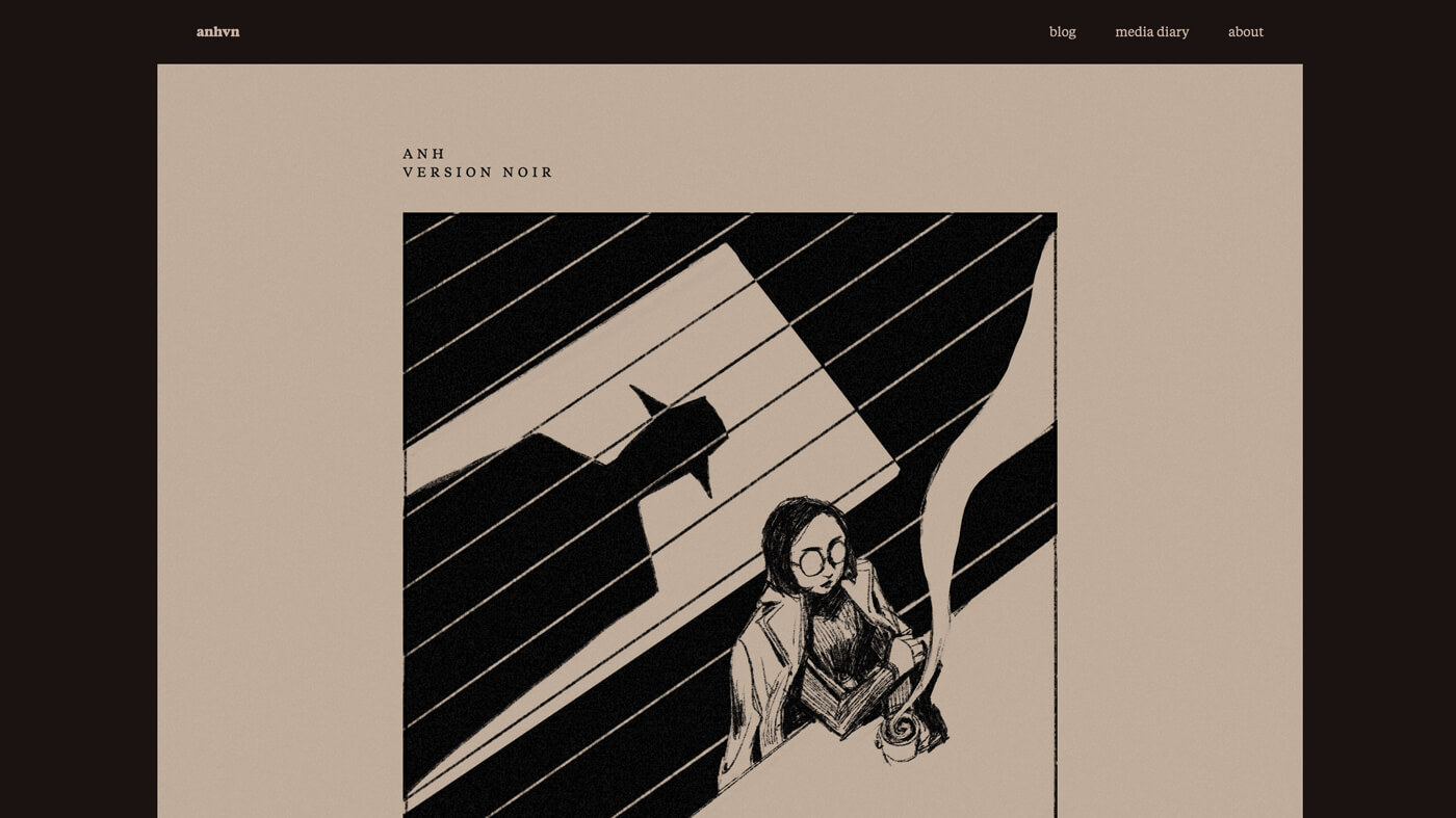
Making version noir
Earlier this week, I published a new homepage (version noir), which takes the form of a comic. Haha, get it, anhvn.com, the vn stands for version noir, but also anh stands for a new homepage, haha hahahaha. I’m hilarious.
Half of my conviction to finish this over the weekend was so I could make this joke. Finish it I did, and now I’m going to tell you all about it, as I like to do.
Context
Comics are, in my opinion, the perfect medium: they combine art and writing in infinitely interesting ways. I’ve had childhood dreams of becoming a children’s book illustrator (didn’t happen, but hopefully sometime in my lifetime) and a novelist (not even in the realm of reality), but these days, creating comics is more of my jam.
My previous homepage featured 4-panel comics. This is the style in which I’ve drawn a lot of my comics lately: a cartoony drawing of me, rough lines, simple and repetitive artwork, a whimsical tone. While I enjoyed this, I wanted to do something different next.
I didn’t initially plan on something noir-inspired. I was actually working on a completely different concept for a new about page, and enough clicking around on Pinterest for inspiration led me to noir detective images, and I thought, huh, that’s an idea.
And thus: Version Noir.
Done is better than perfect
I wanted to finish this over the long weekend—I never finished my first and last attempt at a serious homepage comic—so it was important to keep moving forward. If something was imperfect, I accepted it as is. I prioritized the comic being short and manageable over being well-paced. I didn’t want to leave too much time for self-doubt to take ahold of me, as it is wont to do.
(Even towards the tail end of this all, I started to second-guess myself—no one will like this! it’s too fucking weird and makes no sense! the pacing is off and I need to redo it completely!—and I went to bed feeling a bit less excited about how it turned out, and the next morning I published it without looking it over again. Looking back at it now, I no longer feel those doubts.)
Storyboarding
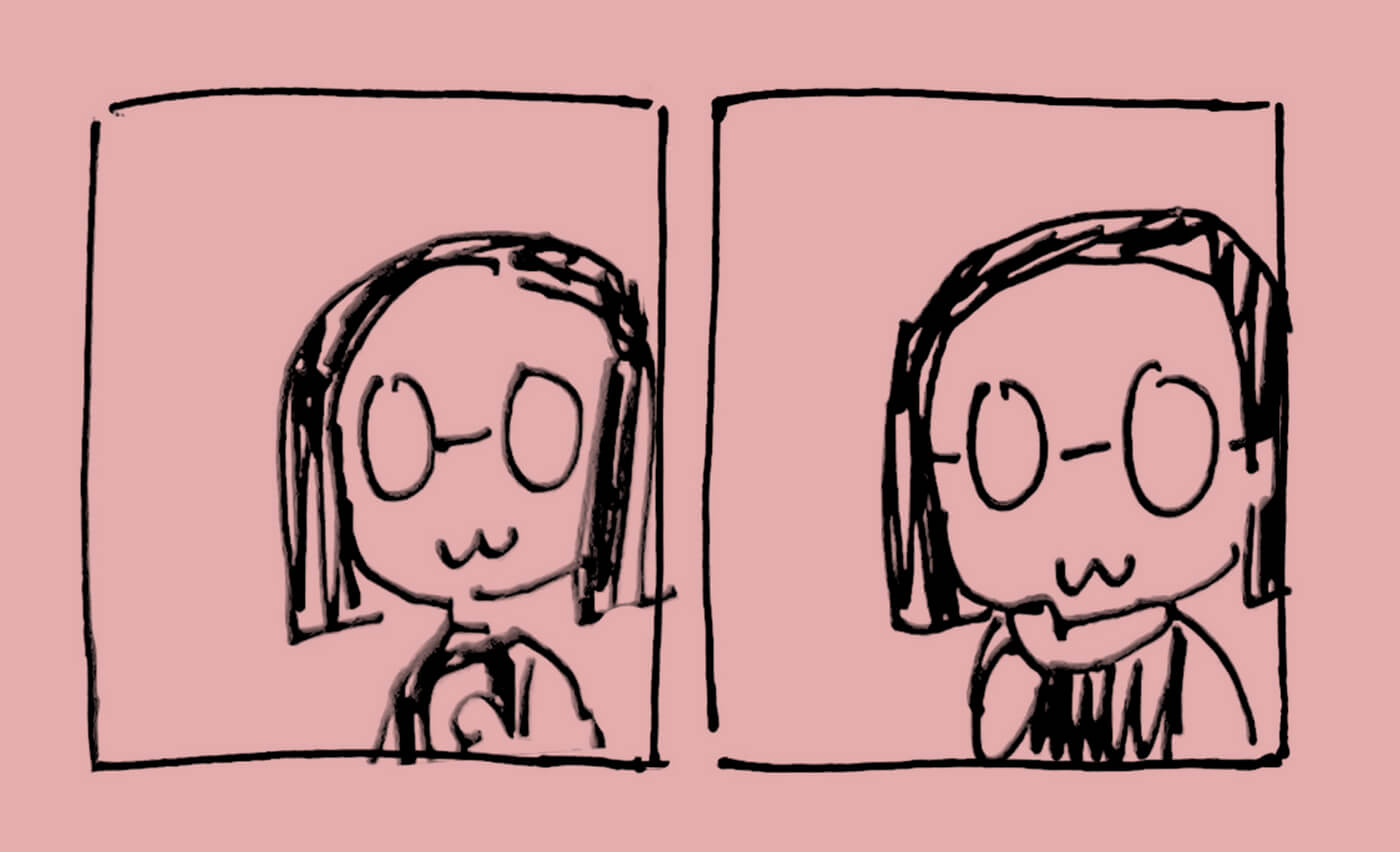
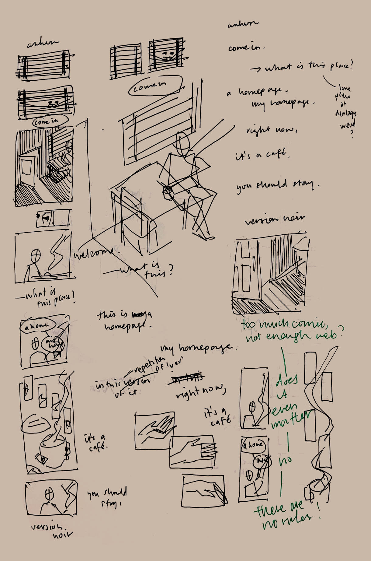
I started by drafting stuff in my notebook. This was the very first thing I drew:
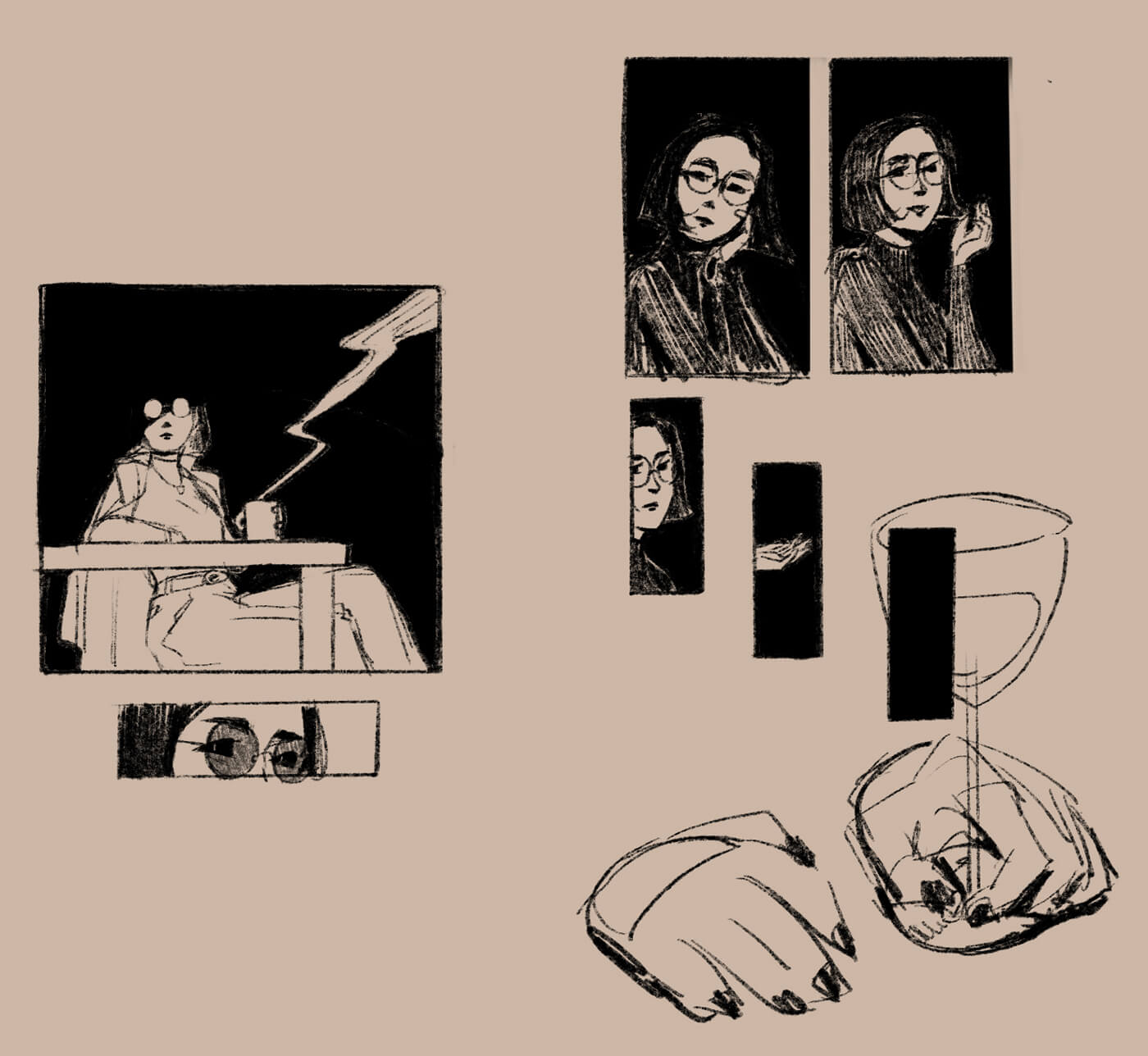
The only panel I kept from this is the closeup of the eyes—this image stayed in all my following sketches.
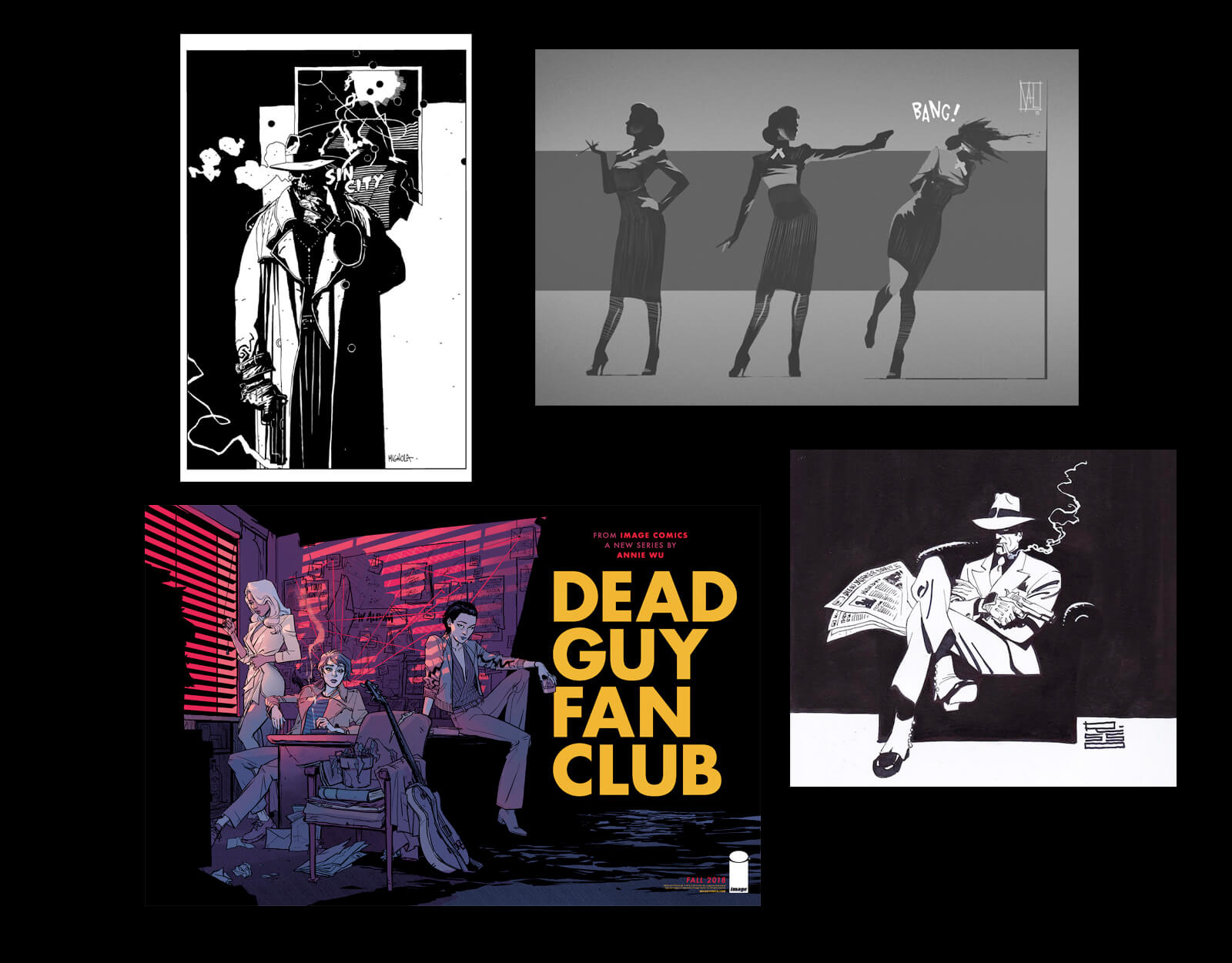
As I explored this, there were several key images/styles I wanted to use, based on the noir theme:
- Heavy shadows and contrast
- A silhouette / shadow of a figure
- Dramatic smoke
- Glasses or eyes reflecting light out of the darkness
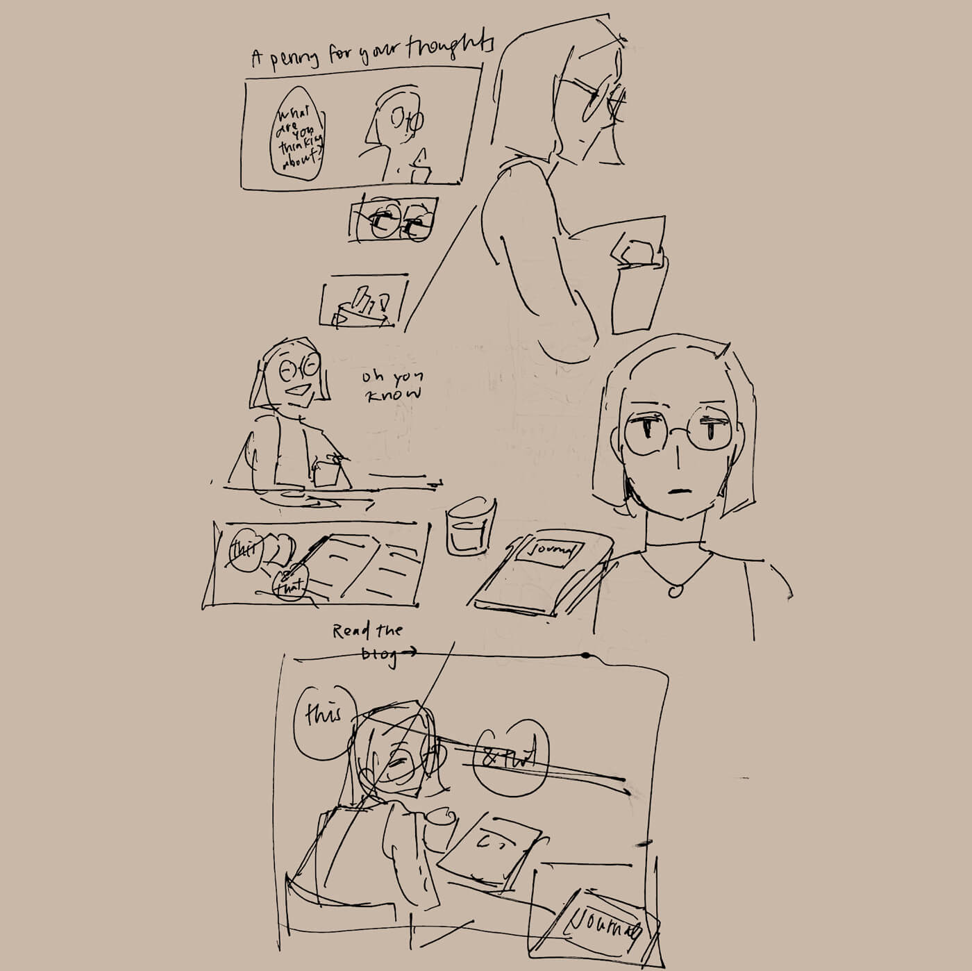
My storyboarding process involved drawing tiny thumbnails and writing the text next to it to test out the flow.
Art style
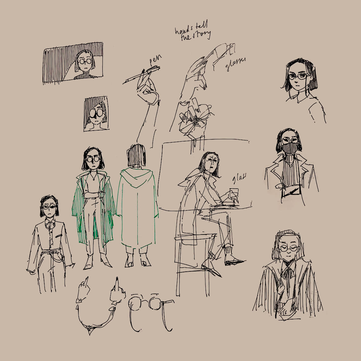
In this comic, I am a cool noir detective in a trench coat. I don’t even own a trench coat, but it’s about style, not realism.
The artwork, annotated
I love a detailed breakdown of the creative decisions that go into something, so I’m going to try that here.
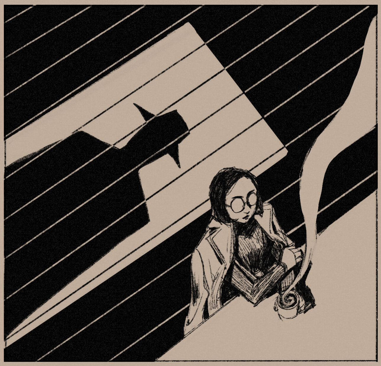
The setting: a coffee bar. A shadow in the doorway. A brooding detective figure?
- It’s a coffee bar because I needed to draw myself drinking coffee, because I wanted to draw smoke, because smoke is a classic part of the noir aesthetic, but I don’t smoke and didn’t want to draw myself smoking, so I settled on dramatic coffee steam.
- I really wanted to draw a dramatic silhouette somewhere. The fedora of this mystery figure (who represents you, the reader) is part of the aesthetic. I couldn’t draw myself in a fedora because I wouldn’t be caught dead wearing one, even as a dramatized noir detective. I’m sorry. You are assigned the m’lady role in my comic.
- I needed an establishing shot of the environment, and also a shot of the floor for the silhouette, hence the top-down angle.
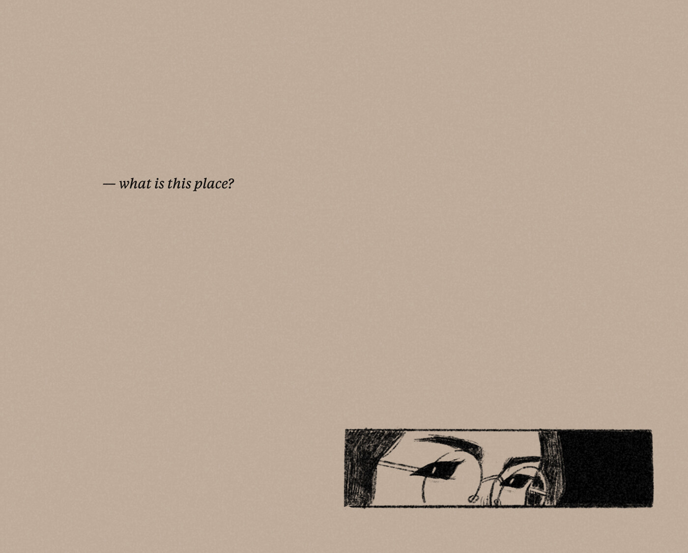
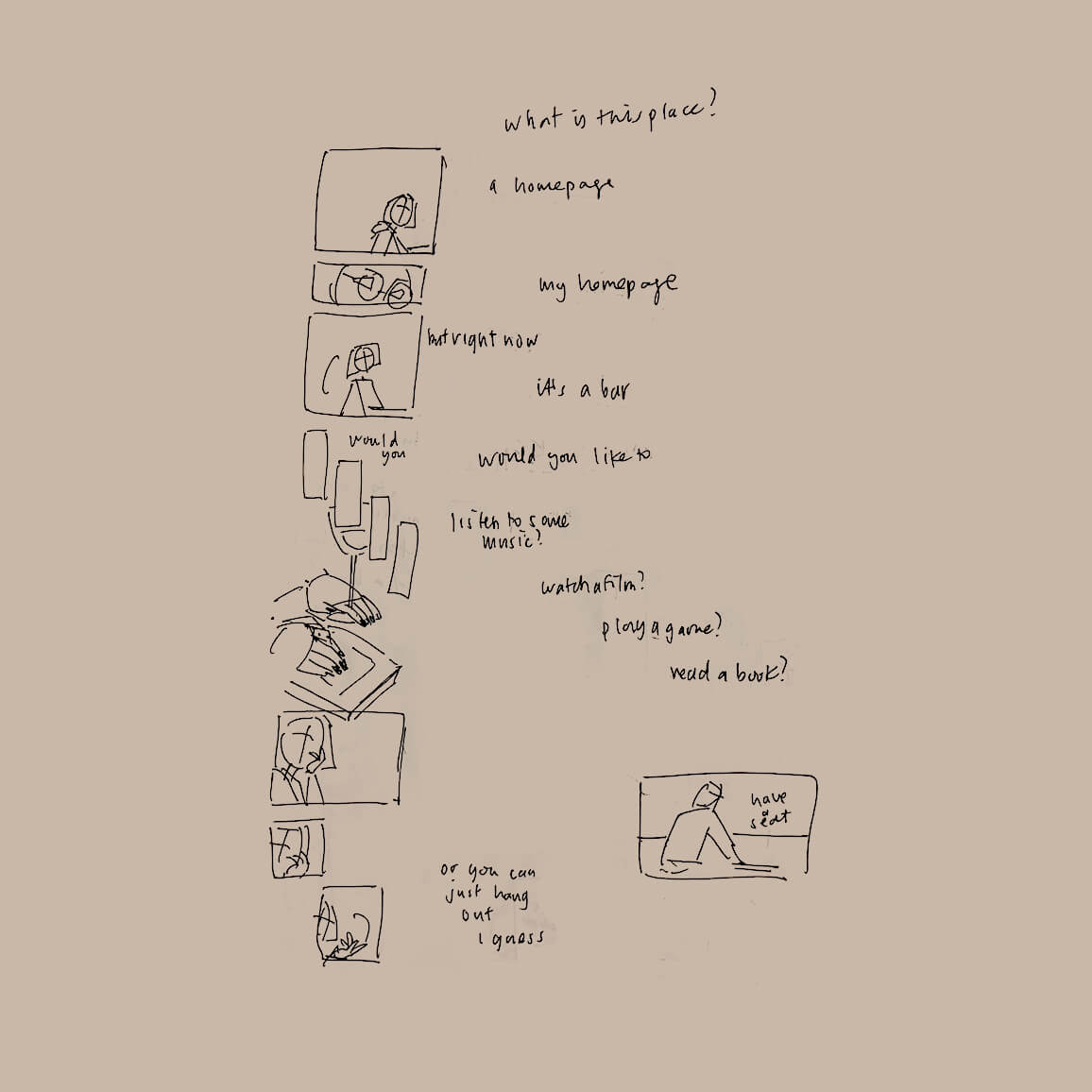
The text—what is this place?—is meant to come from you. There’s a pause—the white space—as I look at you before answering.
I drew creepy eyes like this because, honestly, I didn’t want to draw proper eyeballs, lmao. This continues into the next couple of panels. Sometimes the style choice is due to laziness. My second justification is that it adds a touch of creepiness that ties it together with the final panel. Sure, that tracks!
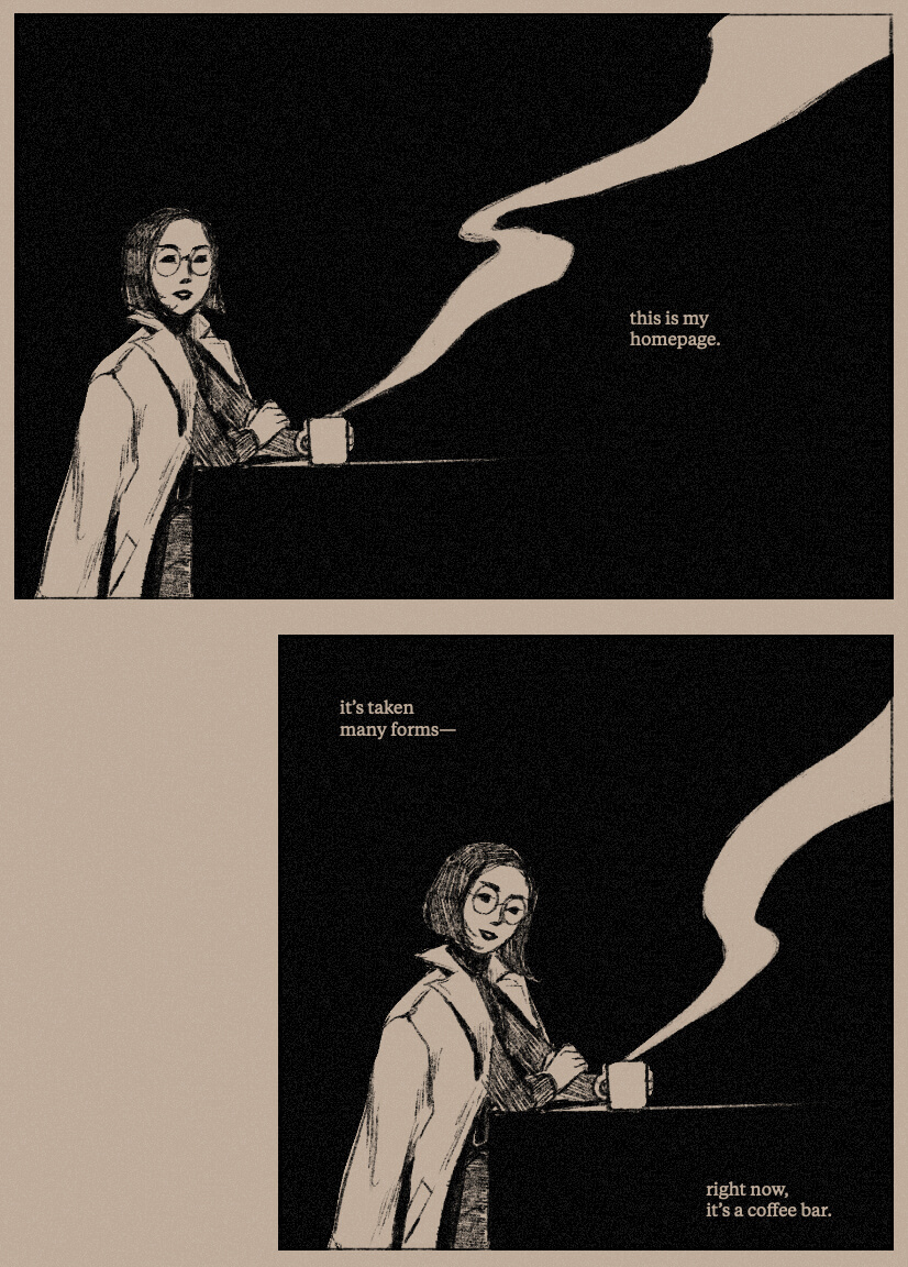
Here are a couple of friendly panels to introduce my homepage :) I look friendly and not creepy :) :) My coffee is making some dramatic smoke.
All of this dialogue could take place in just one panel, but I wanted the slower pacing, so I broke it up into three parts.
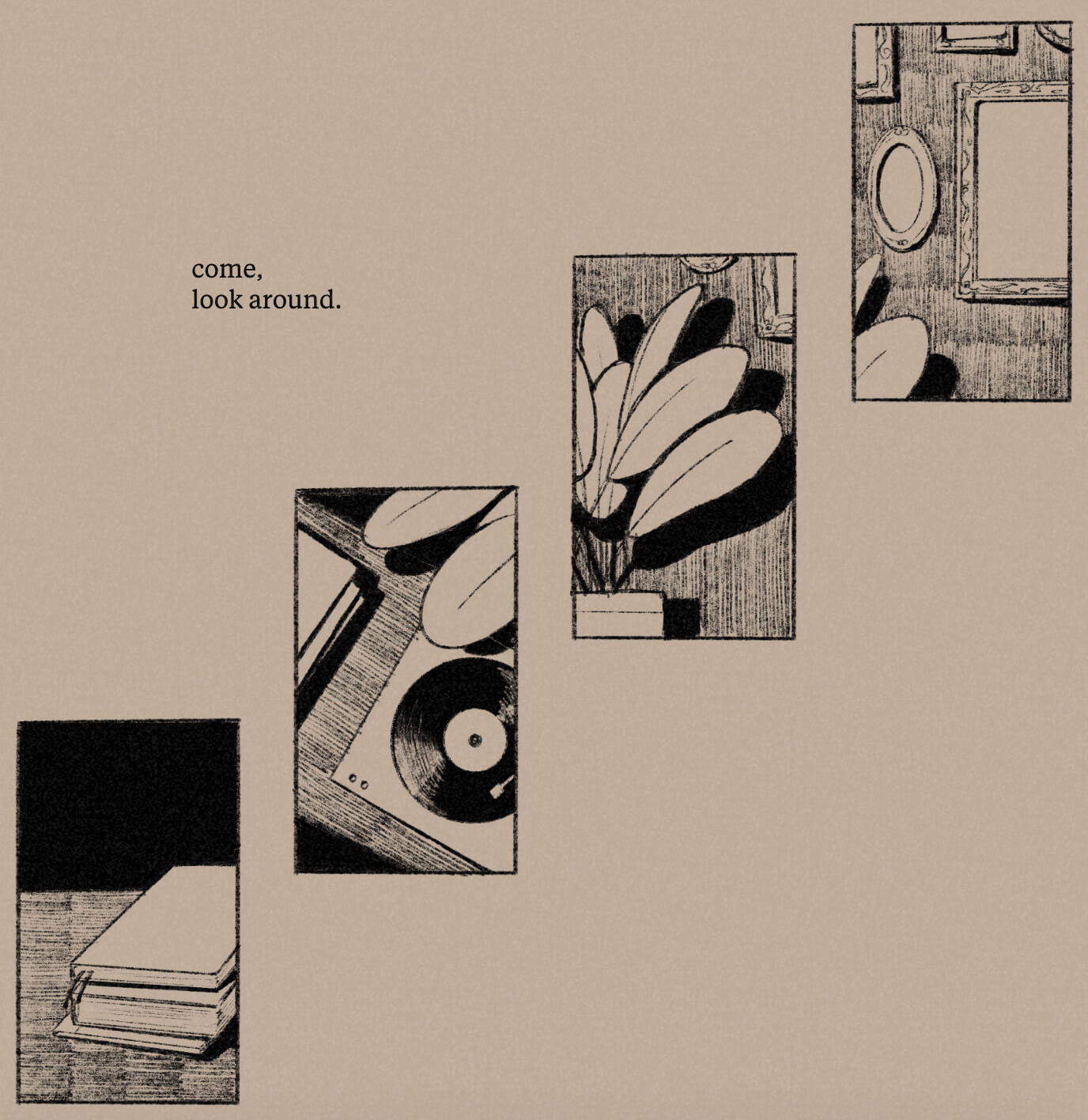
The vertically staggered panels are meant to pull the flow downward. Initially, they were going to show my four media diary categories—film/tv, music, games, and books—but then I decided that was too specific, and I changed it to show the four main sections of my site instead.
I didn’t figure out a good affordance though, so there’s no indication that you can interact with these panels at all—a problem for future me to address.
These also used to be staggered from top left to bottom right, but after I drew the artwork I realized they tied together better going from top right to bottom left. This results in a more confusing right to left reading flow, but alas, I accepted this flaw. I didn’t want to redraw things.
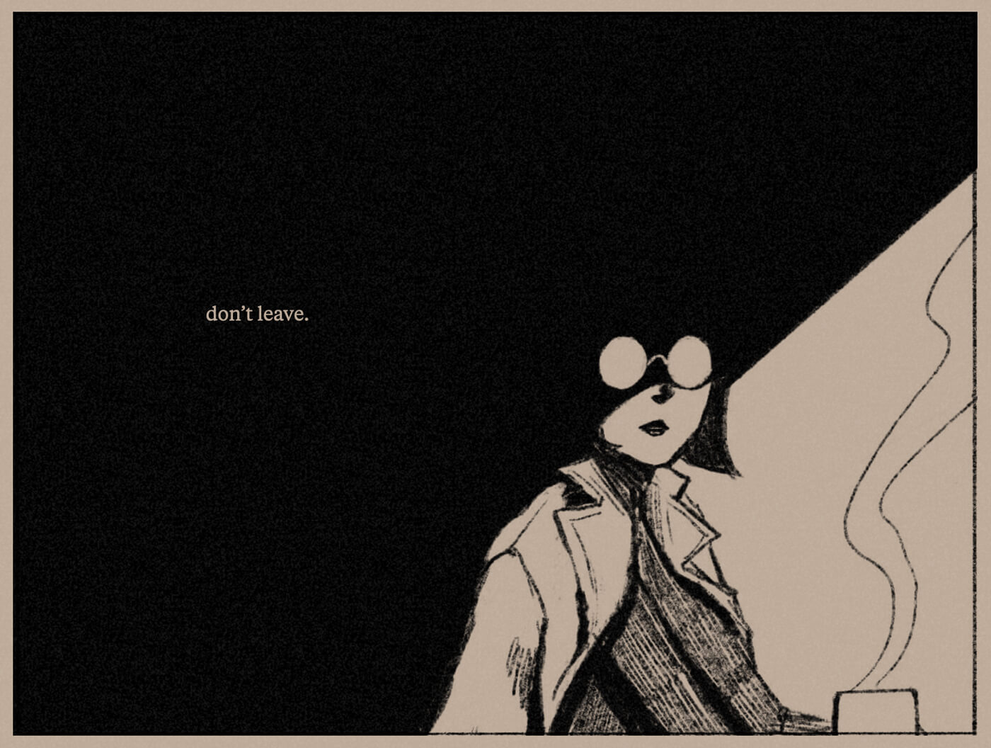
I knew I wanted a creepy, glasses-glinting-in-the-dark panel like this early on. I liked the idea revealing myself as a malevolent character and ending on a spooky note. No. Don’t go anywhere. Stay with me.
With that said, I was unsure about how cohesive this was—the creepiness veers a bit outside of my initial noir concept. But I liked it enough to keep it despite this.
It also touches on a previous failed project of mine—a halloween homepage, which was meant to be creepy. I failed to finish this, but at the time, I wrote:
I’ll come back to these ideas, and use them somewhere else, eventually.
I like to think I did indeed come back to this, even just a little bit, a year and a half later.
Making it responsive
I’ve pondered the idea of responsive comics a long while back, but that musing went nowhere. Version Noir is a bit responsive.
To sum up the CSS:
- I hard-coded a breakpoint for ‘mobile’—I know desktop/mobile aren’t hard and fast categories anymore, but that’s how I built this and how I refer to them here.
- Panels have a fixed aspect ratio, and I used absolute positioning and percentage units to place elements within them. The aspect ratios changed between desktop/mobile.
- The staggered panels use a grid layout.
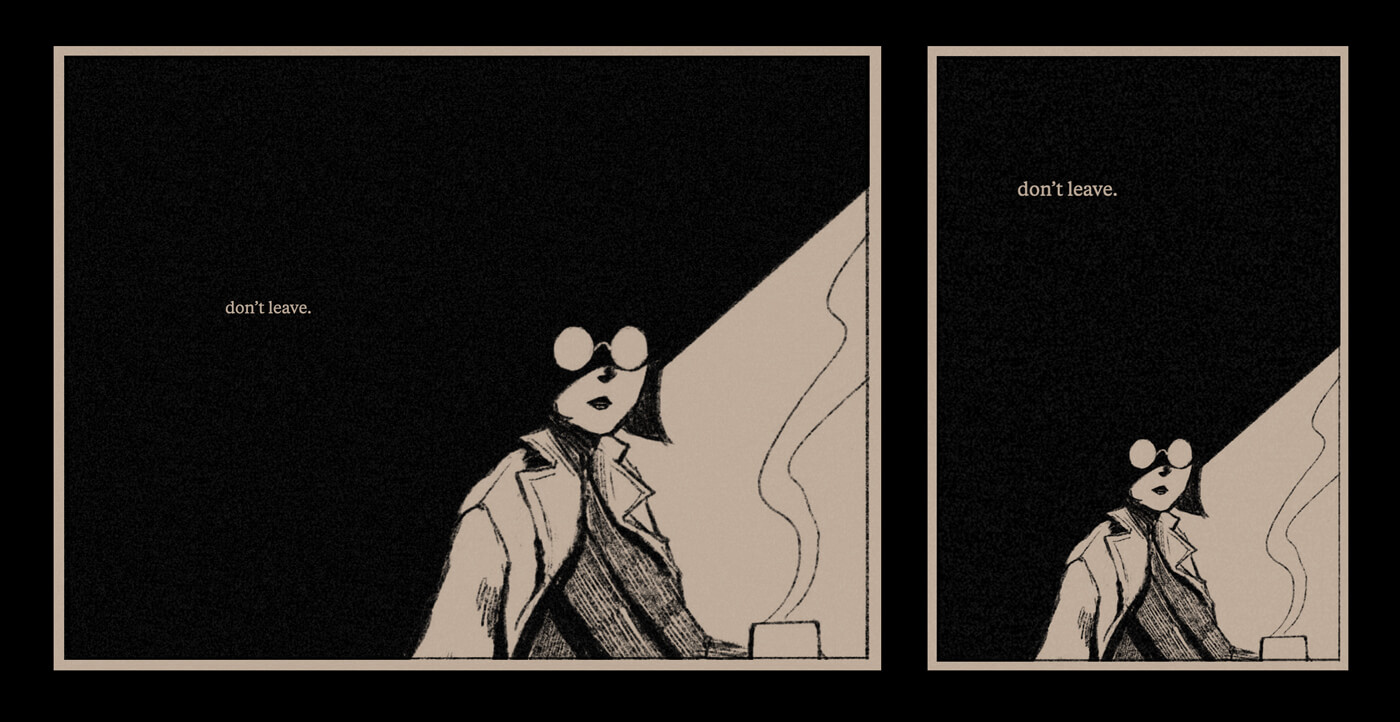
The principle: there’s a lot of negative space in the shadowed area around the figure, and the ‘don’t leave’ text floats in it. To maintain this on a narrow viewport, I stack it above the drawing, making use of the available vertical space.
Other technical details
- I drew everything in Procreate on iPad using the
6B Pencilbrush listed under ‘Sketching’, and then exported it to PSD to edit in Photoshop. - I used Tiempos Text instead of a typical comic font, because I wanted to maintain the serious tone of a serif font. During development I was using Garamond, but ended up switching because I thought it was too serious.
- I added a faint noise texture + sepia overlay in CSS, because the stark black + white was hurting me. (Though I didn’t do this until the very end, so my eyes kept taking damage throughout the whole process, lmao.)
Conclusion
I feel quite satisfied with how this all came together. I’m happy I finally drew a comic with more serious and high-effort artwork. I like the noir vibes and the slight creepiness. In the future, I’d like to draw something with more complex compositions, so I can do more complex responsiveness.
