Starting a new project
I’m starting a new homepage redesign—the concept is ‘responsive comic.’ Here’s an old sketch I sliced up to test. One of my goals is to play around with how to rearrange compositions based on screen size.
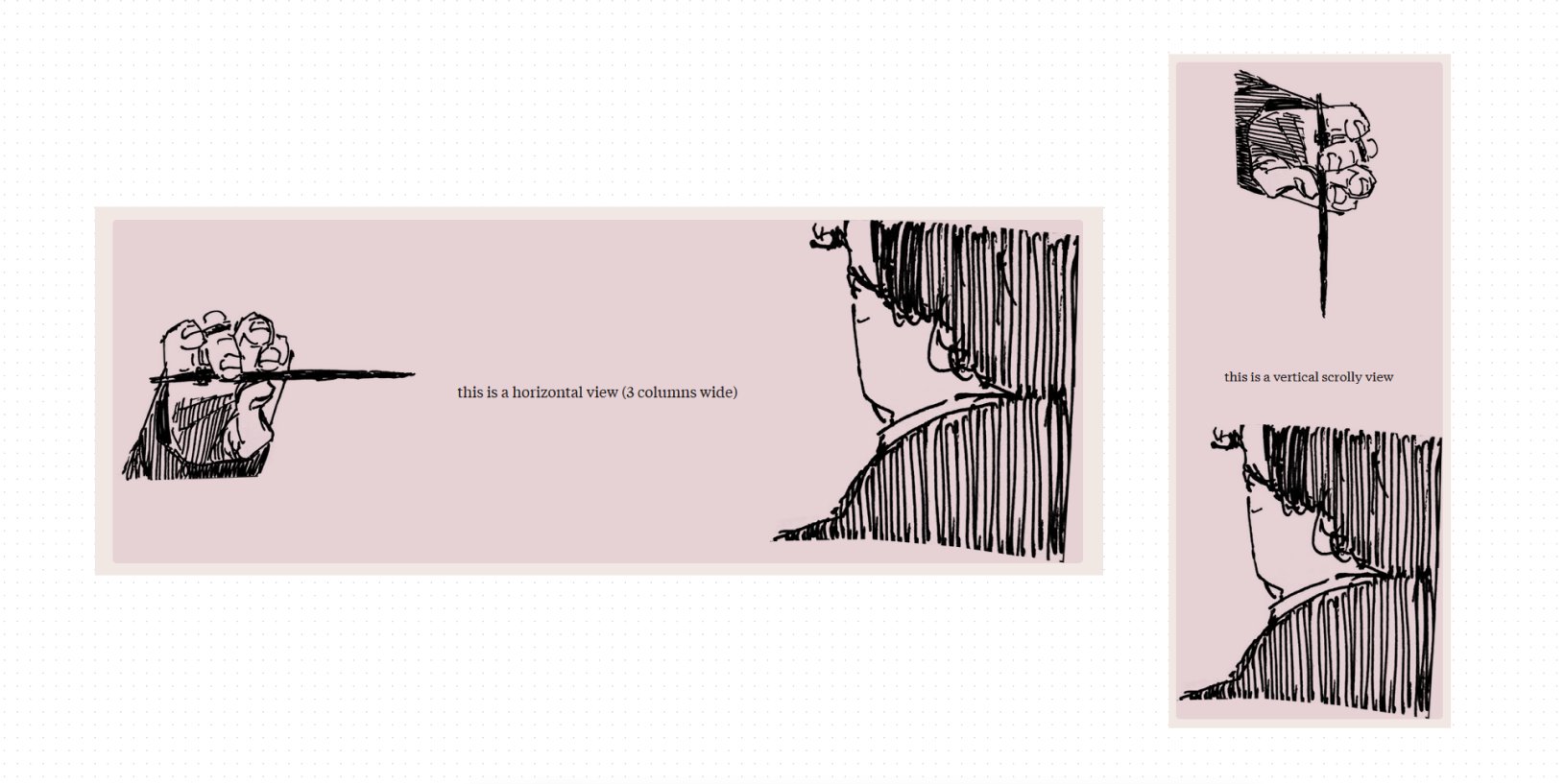
This idea was floating around in my head for years since I learned about CSS grid and wanted to rearrange a comic grid for different screen sizes. I think there’s a lot of cool things you can do!
Beyond simply stacking panels on mobile, I think it’s interesting to explore how you can maintain the pacing/flow/rhythm of panels when they’re rearranged vertically (or however), which can involve changing entire compositions.
I did some very cursory research and found Standards, Semantics, & Sequential Art: Toward a Digital Comics Praxis by Pablo Defendini, which goes into detail about how comics can adapt to the responsive web. It’s really interesting! I’m excited to work on this.