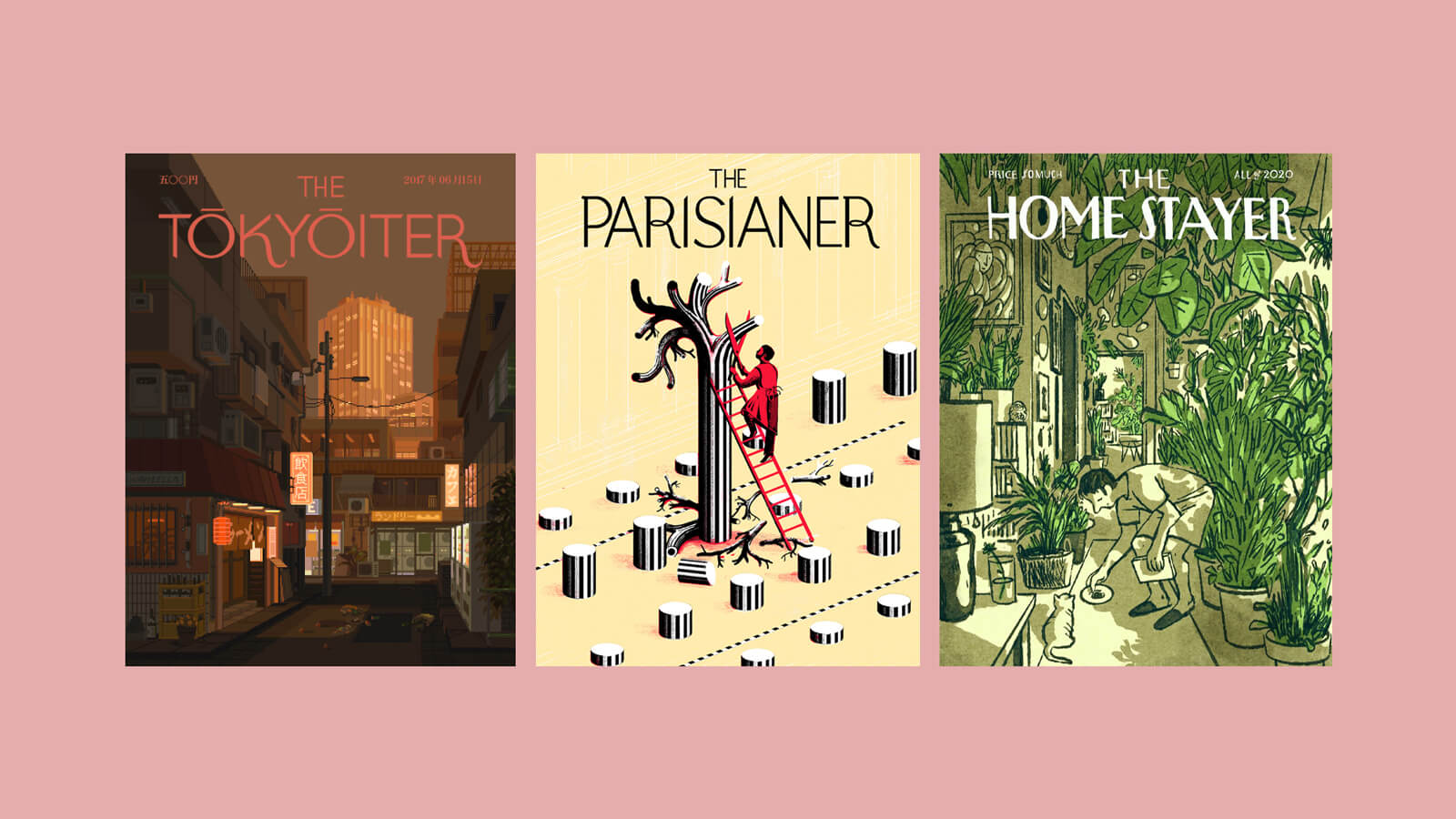
I was clicking around Pinterest and fell into the rabbit hole of editorial illustration (very cool, wish that were me (some day)) and then homage covers of The New Yorker. And I thought, huh, that could be a fun thing to do.
I’ve long been interested in editorial design—i.e. longform writing and mixed media on the web–whereas illustration is a newer and more nebulous daydream. I figured—well, I write these weeknotes regularly, which makes it a good opportunity to play around more since these posts are structured and predictable. Keyword play: I want to make it fun and do something weird! (Admittedly, this post is derivative rather than weird, but maybe in the future!)
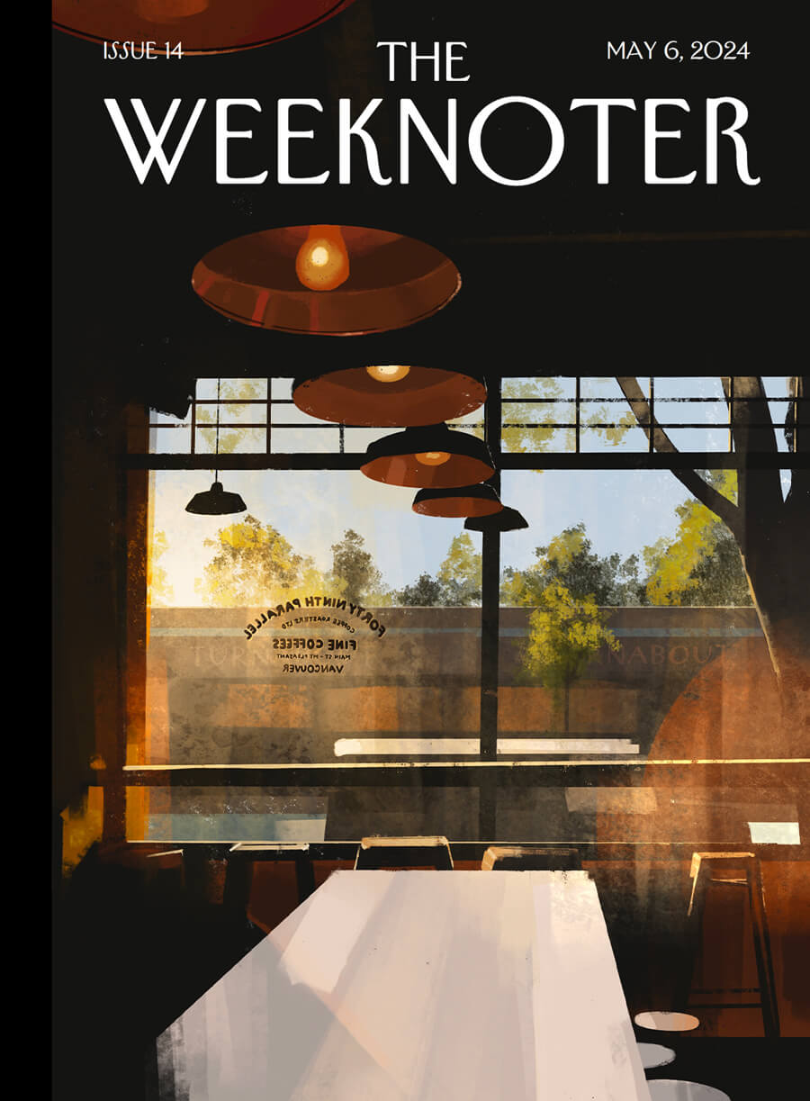
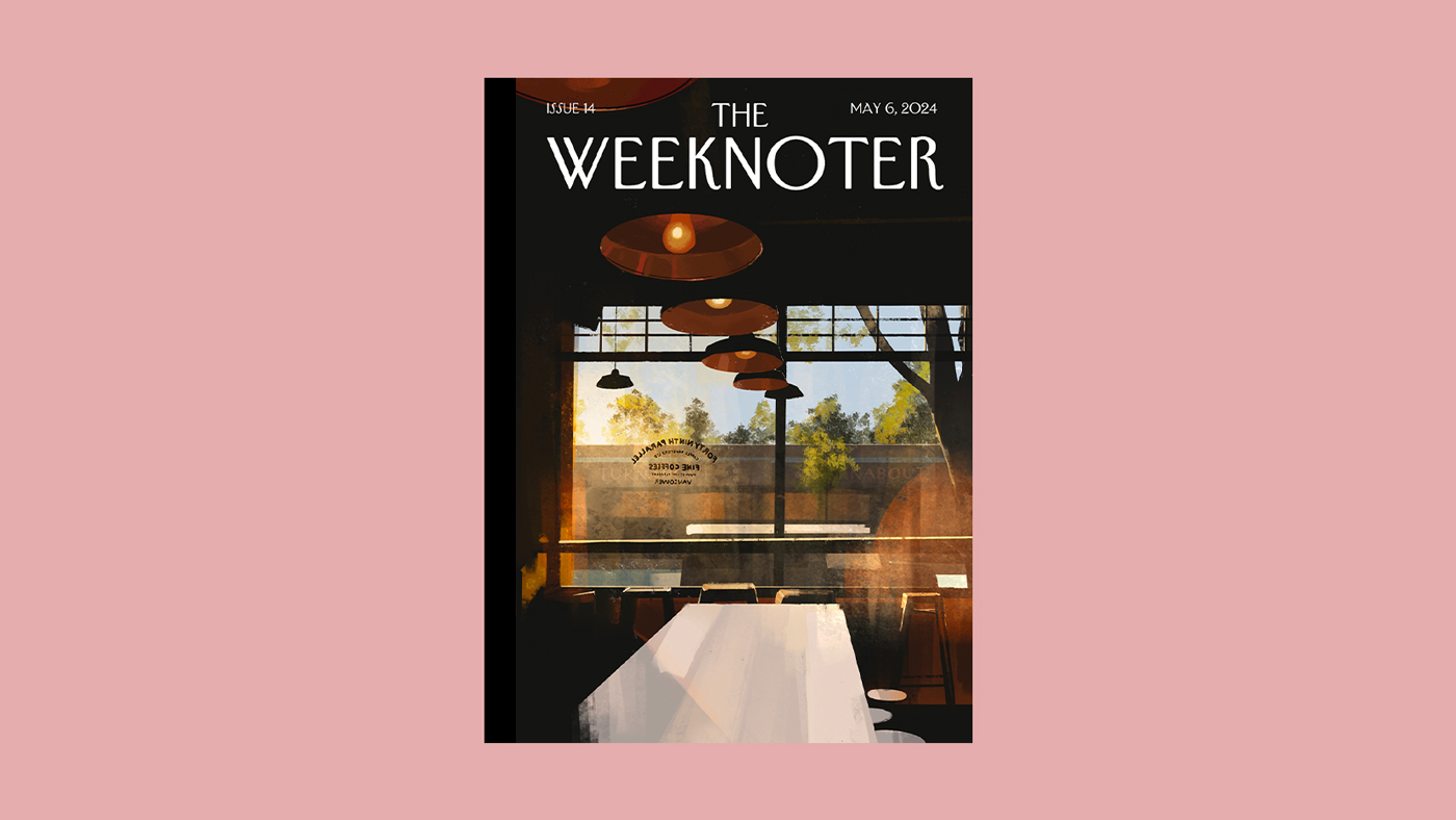
So here is: The Weeknoter, issue 14.
Annals of the web
Some light reading, courtesy of the internet.
AI isn’t useless. But is it worth it?
The A.I. Lie
It has become standard to describe A.I. as a tool. I argue that this framing is incorrect. It does not aid in the completion of a task. It completes the task for you. A.I. is a service. You cede control and decisions to an A.I. in the way you might to an independent contractor hired to do a job that you do not want to or are unable to do.
Designing The Cascade
It’s always so interesting to see someone’s design process. Robin’s cool new CSS blog is so fun.
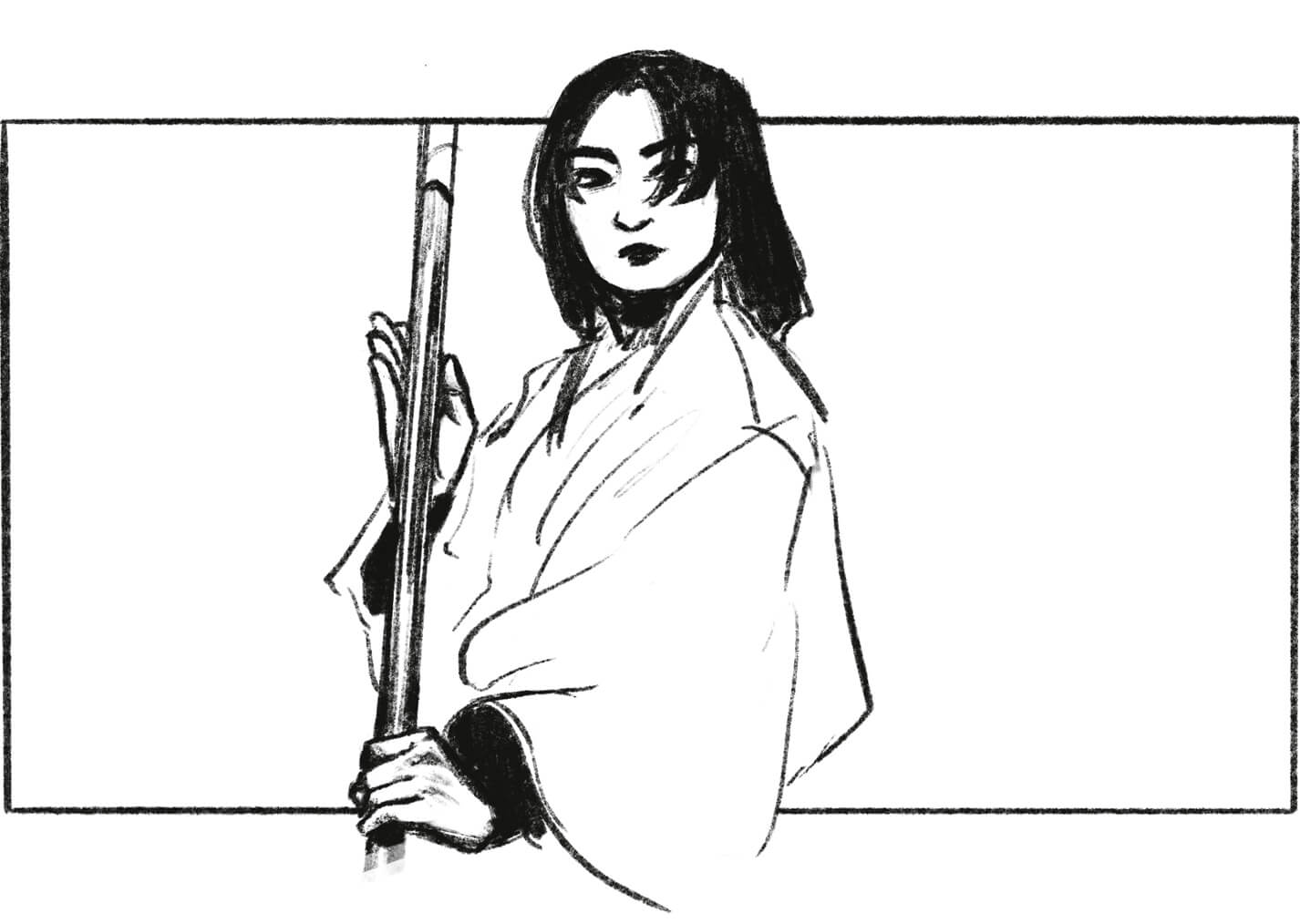
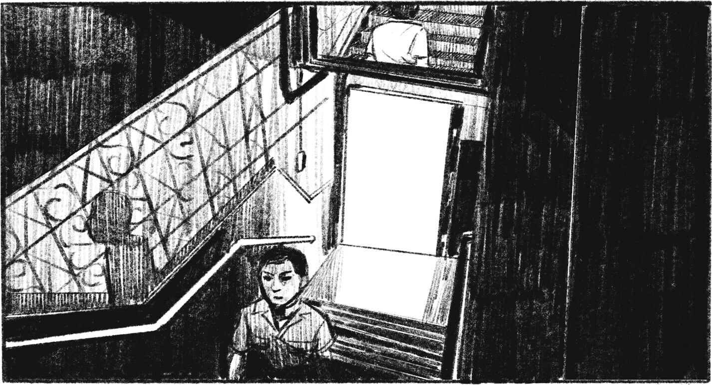
The Era-Defining Aesthetic of “In the Mood for Love”
There is a particular aesthetic floating abroad in the world. You could call it an atmosphere, a vibe, or just an essence of style. It’s made up of a collection of ingredients: humid alleyways in dense cities, neon lights cutting through darkness, quietly flashy fashion, nostalgic music, tragic romanticism, and the smoke of many, many cigarettes.
Hardest Problem in Computer Science: Centering Things
How to use a personal website to enhance your ability to think and create?
Depth over engagement and audience-building. Far better to have one brilliant, knowledgeable person respond strongly and in depth to a piece than to have a hundred thousand respond shallowly.
When you invest time in the design, when something looks and feels beautiful, you take it more seriously yourself.
We think better when the stakes are higher, and one of the best ways of raising the stakes is to make a document into something you’re sharing with people whose good opinion you desire.
Oh the Humanity: Why You Can’t Build Apple with Venture Capital
About the Humane Ai Pin, which was a trainwreck I enjoyed watching.
Goings On
Here are some of the things I’ve been enjoying in the past few weeks.
- All Born Screaming St. Vincent album — Reckless is a bop.
- Destiny 2 video game — The new Pantheon activity—kill four raid bosses!!—is a fun challenge, and the rewards are excellent. I haven’t struggled so much on Atraks since I was new to the raiding. Caretaker gave me day one flashbacks. I’m excited to get destroyed in subsequent weeks as it ramps up in difficulty.
- Dungeon Meshi anime series — this is such a delightful anime about cooking.
- Hades video game — with the new Hades 2 hype, I went back to play a few runs. I’m so excited for the new game, though I’m abstaining from early access and waiting for the full release.
- Shōgun tv show — I didn’t fully pay attention to this (sorry)—my partner watched it while I hung out and worked on this website and drew and whatnot. Mariko though was riveting.
- The Sympathizer tv show — I’ve only watched the first episode but I’ve enjoyed it so far! I’ve seen some comments about how the Vietnamese accents are bad, which is funny to me because I found myself understanding more Vietnamese than expected. Maybe this can be attributed to both myself and the cast having (seemingly) second-generation immigrant accents, lmao. Related reading:
- Park Chan-wook Gets the Picture He Wants by Jia Tolentino — a profile on the director
- The Fascinating Ideas Behind The Sympathizer’s Dazzling Visuals by David Canfield
- THE TORTURED POETS DEPARTMENT Taylor Swift album — I like Fortnight and Florida!!! (Florence, my beloved). The rest, ah, blended together for me.
An artist at large
At the end of March, I wrote that I wanted to make a good attempt at PleinAirpril, which is an online art challenge to do daily paintings in April.
I didn’t start until halfway through the month, and ended up doing ten paintings in total. As someone who barely does digital art, this was thrilling consistency and progress.
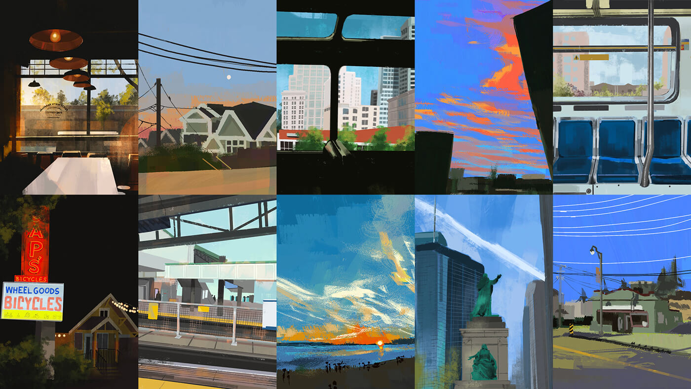
En plein air technically refers to drawing from life outside, but I did all my paintings indoors from photo reference. It was a lot of fun—while I’ve done a lot of plein air sketching of urban environments as well as drawing from photo reference (notably, movie frames), painting is a different muscle. It required different technique.
I struggled a lot with buildings, with their complex lines and windows and reflections. You can see this in #2 Montreal where the cityscape is terrible but the statues are competent—clearly, I have far more experience with drawing people than buildings.
My last painting, #10 Cafe, is definitely the best—partly from me having more experience at this point, but also I think because its composition is a lot simpler. There aren’t complex buildings; the details are scant; the lighting does most of the heavy lifting. But I really like it and feel proud of how it came out—this one feels like I succeeded.
Metacommentary
I’ve collected these in my sketchbook collection with its default post style, but I want to improve on how it’s displayed. I want to build my ideal art archive, with considerations to things like:
- Metadata: tools used (e.g. brushes, programs), time spent, location info
- Commentary/reflections about the work: how I feel about it, why I did x, what inspired me to make it
- Supplementary media: timelapses, closeups, WIP screenshots, references
The record-keeping aspect is important to me. If I write a quick thought about a work when I share it on Mastodon, I want to record it permanently here. But a quick thought is not necessarily the same as a reflection, so the display should reflect that. What would my ideal UI look like for all this?
Looking, seeing
I took pictures of unremarkable sights because I thought, that might be interesting to paint. The corner of a skytrain station, the street I live on, the light out my window at sunset. Everything was suddenly interesting enough to examine and consider: could this be the subject of a painting?
I’ve mentioned this post before, but I think about it all the time:
the difference between you and a zoologist or you and a botanist is that the botanist, when she looks at a flower, has a question in mind. She’s trying to generate questions. For her the flower is the locus of many mental threads, some nascent, some spanning her career. […] That’s the promise: you will live more curiously if you write. You will become a scientist, if not of the natural world than of whatever world you care about. More of that world will pop alive. You will see more when you look at it.
— James Somers, More People Should Write
Extrapolating from zoölogy and writing to art, but you know what I mean. When I went looking for interesting sights, I saw more.
Poems
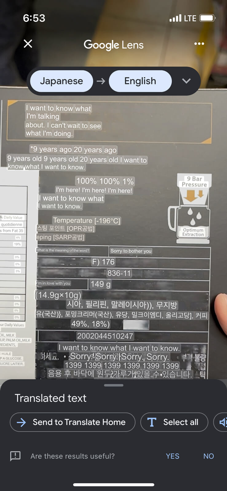
are these results useful?
I want to know what
I’m talking
about. I can’t wait to see
what I’m doing.
9 years ago, 20 years ago
9 years old, 20 years old, I want to
know what I want
100%! 100%! 1%!
I’m here! I’m here! I’m here!
I want to know what
I want to know
What is the meaning of the word?
Sorry to bother you
I’m in love with you
Sorry! Sorry! Sorry. Sorry.
Anh is a designer and artist at anhvn.com. She writes about projects she doesn't finish, media she sort of consumes, and things she finds on the internet. Follow her on Mastodon.