Things I’m Working On
I have a bunch of nebulous ideas for my website bouncing around in my head or splattered horribly across Figma files, which would probably all die in obscurity if I don’t get my shit together, but I’ve been somewhat inspired by Jim Nielsen’s post about his ‘failed’ site redesign, and publicly documenting incomplete work.
Also, I’ve had a bit of wine to drink and I feel like my blog is terribly boring (all it is is just redesigns and weeknotes) so maybe I should change it up and post some INCOMPLETE designs!!! Hell yeah!!!1
So here’s some work in progress stuff! Feel free to yell at me to finish them!
Photo post
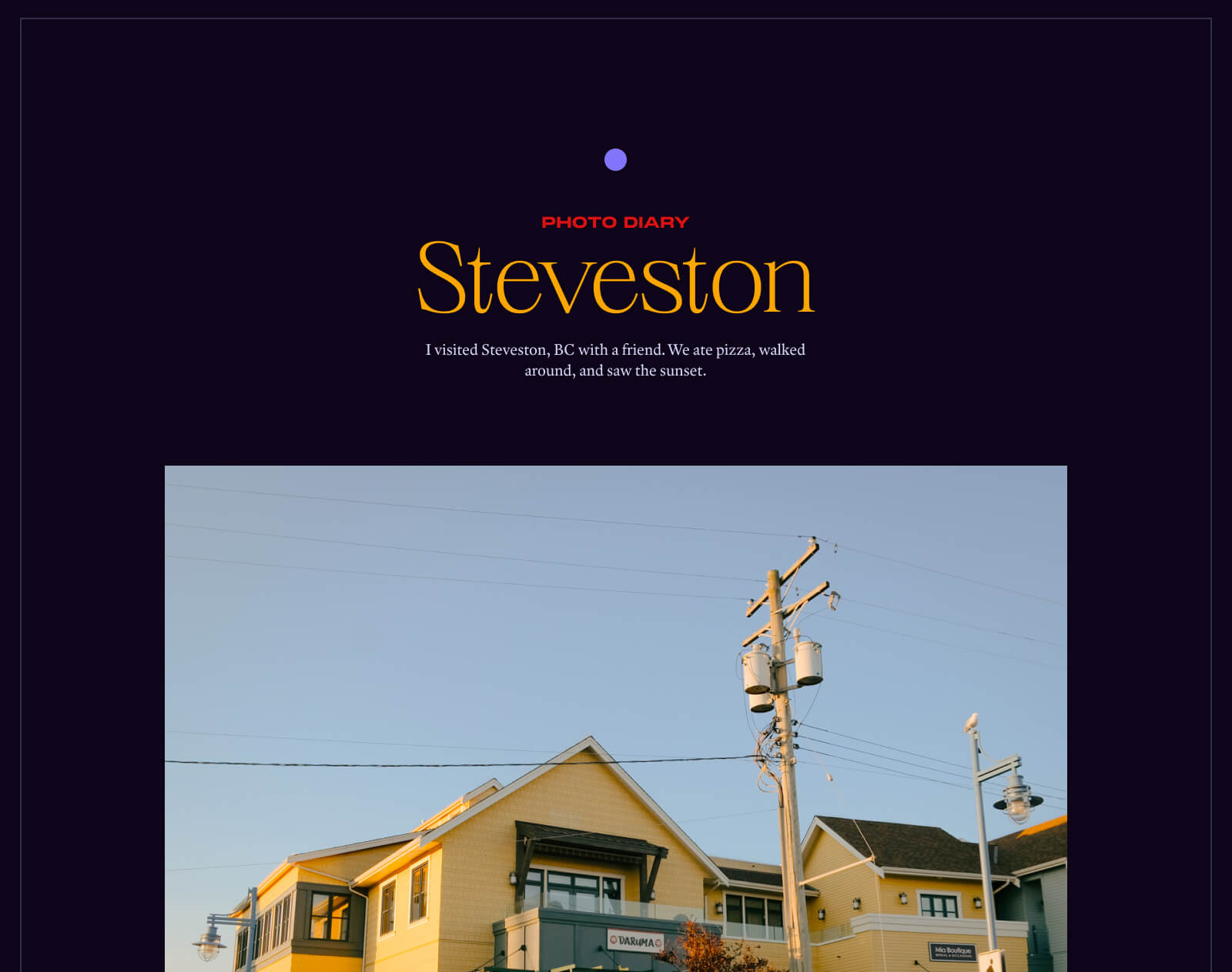
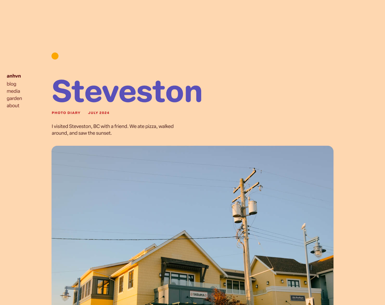
I’m working on a photo post of all the shots I took when I visited Steveston, a cute little neighbourhood in my area. I haven’t posted a photo post in a long time, so I’ve been trying to figure out things like:
- How to best do the markup for a bunch of photos
- What layout best suits it
- Having a custom layout (as seen below) for each, to emphasize the collection’s theme or location or something
New about page
I’ve been wanting to update my about page for a while now. While I like the current messaging app concept, I wanted to do something different!
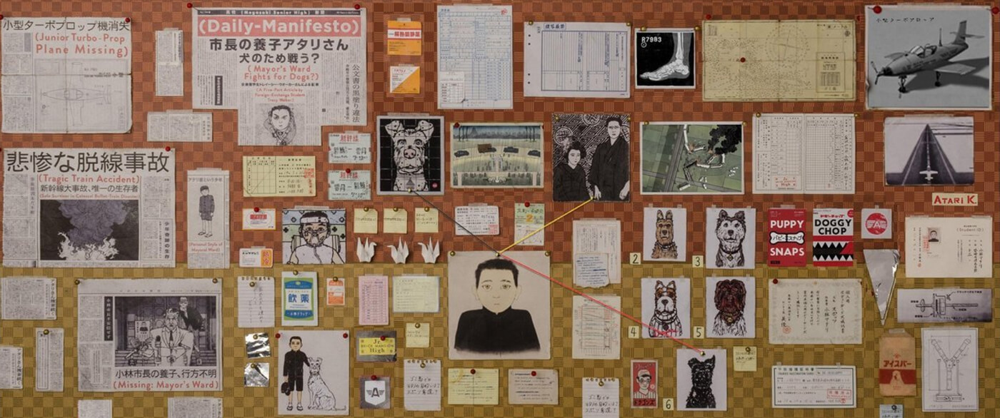
My current idea, which I’ve been punting around since like, December, is based on the evidence board/string theory trope.
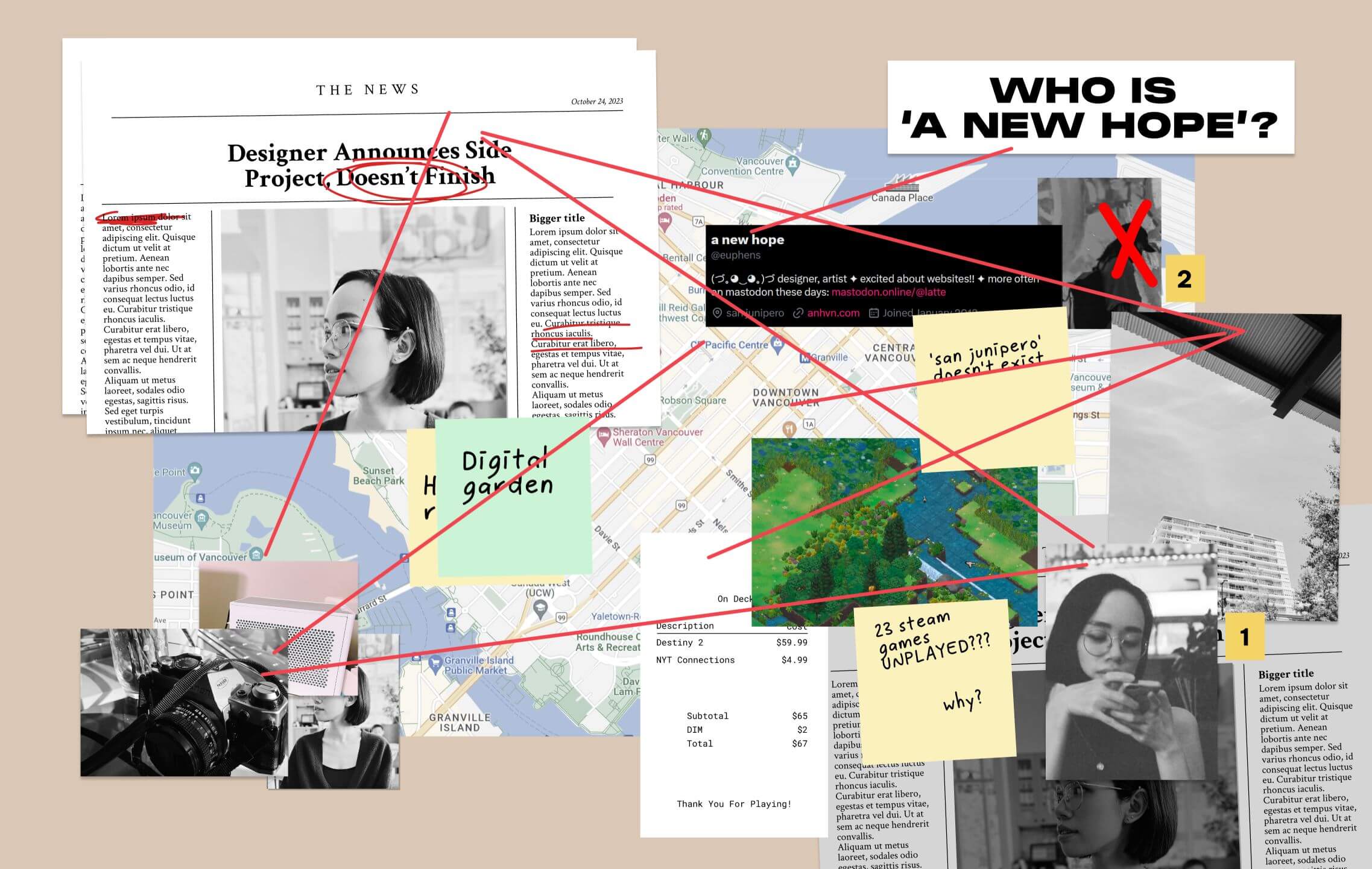
The idea is that I am a mysterious entity that the reader is trying to piece together by pinning things up on a board and connecting them with string, like a conspiracy. When I started this, I was inspired by the show Only Murders in the Building and the Patrick (H) Willems video essay about Who Is Killing Cinema? – A Murder Mystery, which uses an ‘evidence board’ as a framing device, which I thought was fantastic.
I thought the concept would be well-suited for an about me page because of my online ‘branding’—I deliberately have inconsistent names/handles across my social accounts, because I don’t want them to be easily connected. (Of course, in this day and age, this is a somewhat futile effort, but I like to think that this minor obstacle is better than none.)
So, for example—my Mastodon and Twitter accounts both use a new hope as my ‘name’, because it’s somewhat SEO-proof in making me un-Googleable (‘A New Hope’ is the name of Star Wars episode 4, so results for that will likely outweigh any results about myself). My Twitter location is listed as san junipero, which is a fictional place—conspiracy?? My Twitter handle is @euphens (which I don’t use anywhere else); my Mastodon handle latte, which is as generic as names get.
And then the evidence board could be filled with more humourous things like made-up news stories about my incomplete side projects, or my inexplicable unplayed Steam games, or the like.
Technically, this is quite complex, if I go with the type of design mocked up above—a bunch of elements that are haphazardly positioned, with lines connecting them all. That’s been the primary obstacle to bringing this out of Figma: how would I actually build this?
I do like the idea though, because it’s silly and plays on my wannabe-mysterious vibes.
Uses page
I have a half-assed uses page but have wanted to make a more comprehensive one for a while.
I’ve always wanted to do a more updated ‘what’s in my bag’ drawing (I made one like ten years ago), which is an art trend where artists draw themselves and what they carry in their bags. The point is the personal artistic rendition.
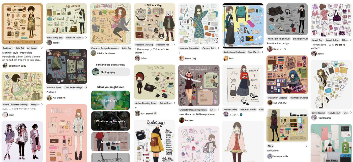
My favourite ‘uses’-type posts to read are the ones with lots of photos, with detailed labels about everything. And I like the personalized nature of ‘what’s in my bag’ drawings (I think these art trends are great at showing how you can take a pattern/template and really make it yours) and want to incorporate that into my own.
But of course that requires drawing and etc. so I haven’t made much traction on this. I had some early ‘what’s on my desk’ concepts that laid out my computer setup, but I got bored of it.
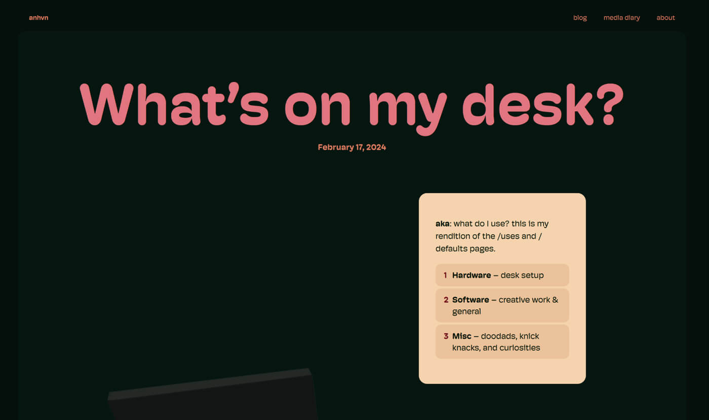
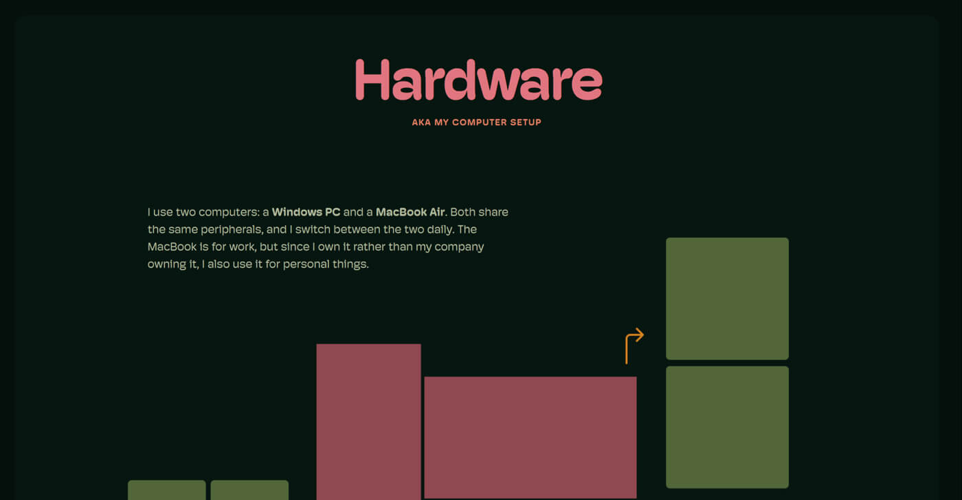
These bore me to tears. I think I need to go back to the literal drawing board and do this in a notebook, rather than dragging pixels on my screen. Back to my artistic roots!
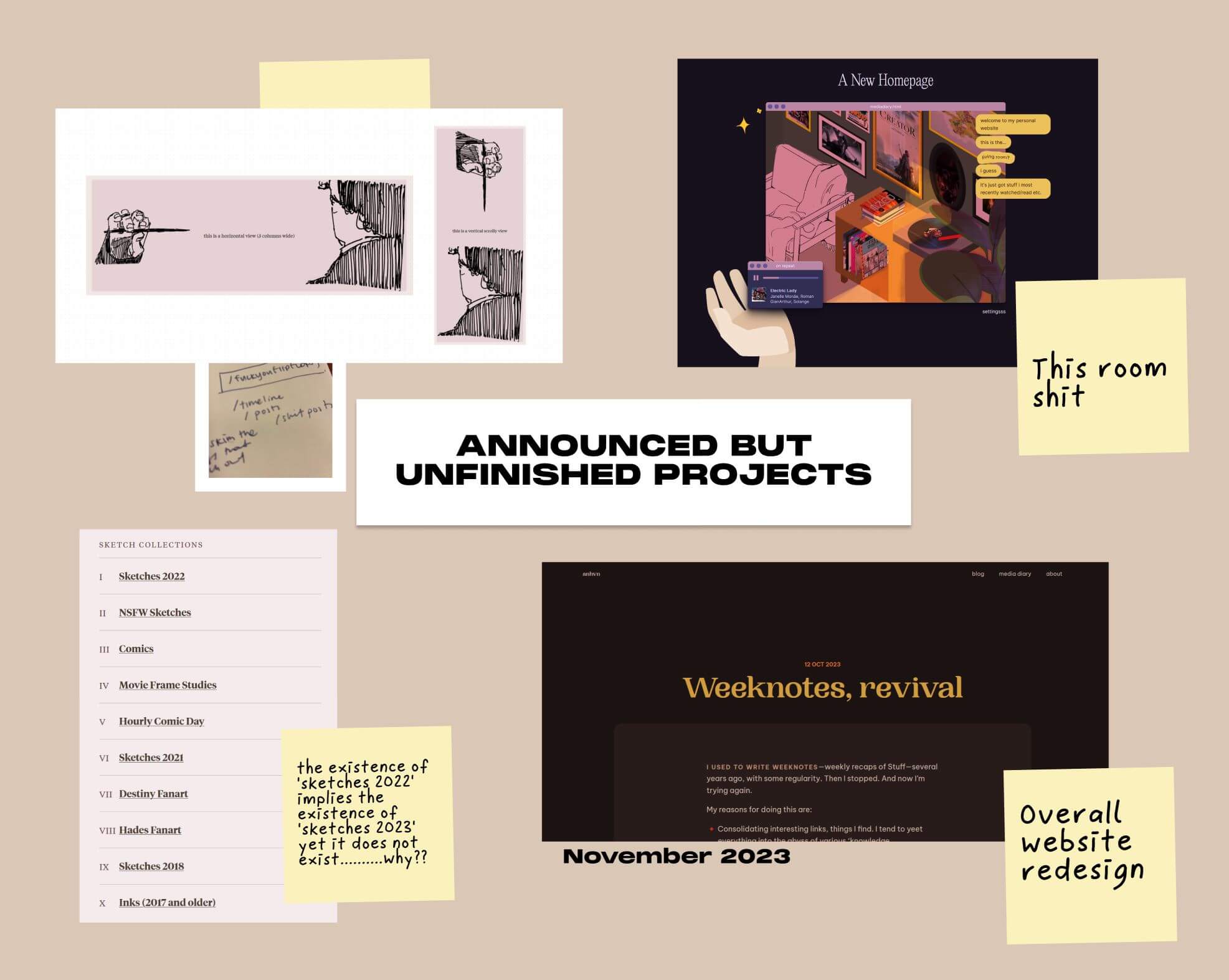
Media diary room
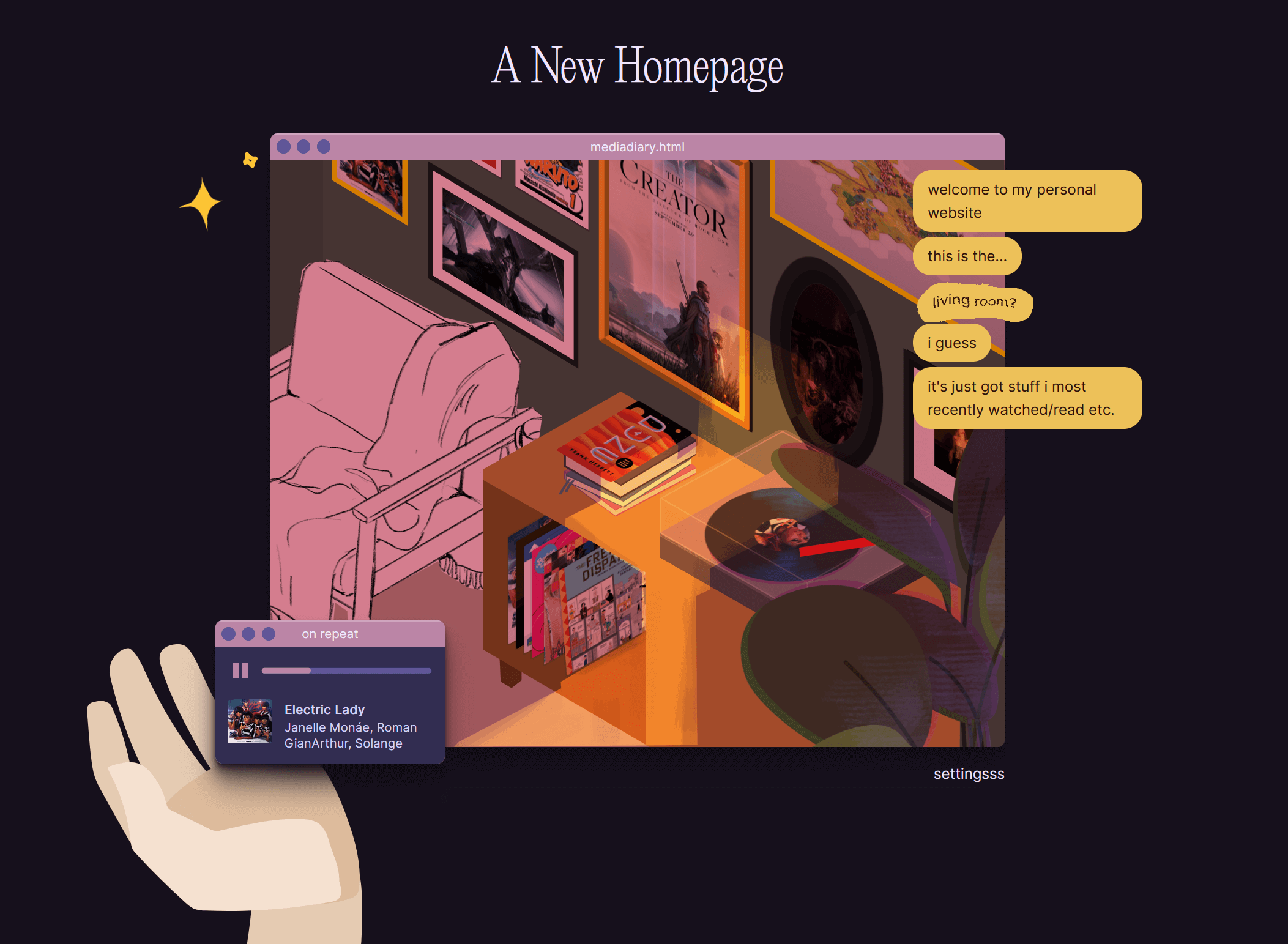
I’ve mentioned this project before but it still floats around in my head every so often.
I wanted to update my media page to display my categories in a room setting, kind of like my listening room for music. It uses a bunch of SVGs to form the setting, and then inserts my most recent media items into it.
I’ve just gotten stuck on the technical details of it—it’s a whole load of hacky positioning stuff—and I lost steam on it long ago. But I do like the idea, and I do want to finish it in some capacity. My listening room uses the concept but is comparatively very simple, which doesn’t satisfy me. This one is at a 3D angle! It’s got better lighting and shading! It’s got more objects!
Other things
I want to make a Halloween version of my site, which has been a dream for several years now (lmao). I want to do more comics for my weeknotes (like #9). I want to finish my Destiny comic. I want to do something—cinematic. Dramatic. I want to incorporate more illustrative elements in general. I want my site to be as beautiful and stylized as artists are, rather than patterned or trendy as corporate web/product design is.