Spooky homepage process
After aspiring to for the past few years, I finally succeeded in updating my site for Halloween! I have a new (spooky) homepage.
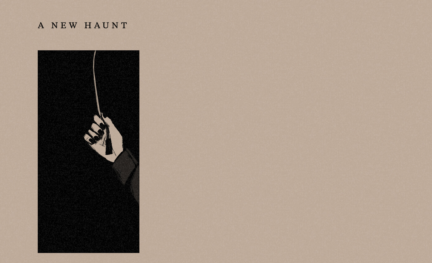
⚠ Note: I discuss the homepage’s easter egg here, so I recommend checking it out before reading this post.
Concept
Making this was a lot less of a linear process than when I was making my previous comic homepage. I started sketching stuff back in late July, but didn’t pick up on it until September. I waffled endlessly about the concept. The storyboard kept changing throughout, even as I was drawing the final art.
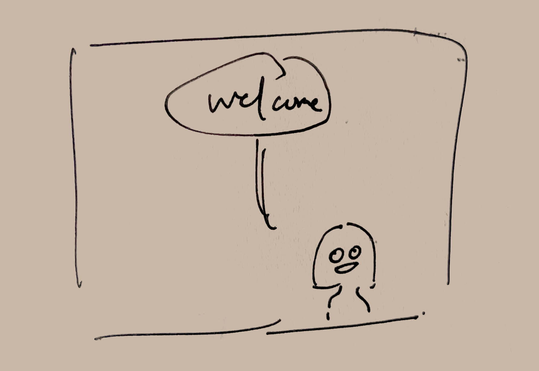
I had a few ideas in mind:
- I knew I wanted to welcome you (the reader) back to my homepage, but with a different setting.
- The setting is vaguely a hotel. I wanted the vibes of of: unwelcome guest, don’t stay (contrast to don’t leave of my previous comic), The Shining, Bluebeard. Welcome back, but also, something is off.
- I went back and forth a lot with how to execute on that and how to build an eerie atmosphere. I thought maybe I would lead you down a dark staircase; I would allow you to visit the public places but forbid you from the private (à la Bluebeard); there would be ghosts on some pages; I would threaten you to not overstay your welcome. A lot of different directions!
- In the end, the setting ended up not playing much of a role—it’s kind of hotel-shaped, but this could easily be a home or a continuation of the coffee bar. It doesn’t really matter.
- I wanted some kind of lights on/off mechanic. I was still attached to my 2022 idea of ghosts existing in dark mode (i.e. spooky mode). This also took various forms when I was ideating. There would be a lamp on the table, and I would switch it on. Or there would be a lamp and you would interact with it as an easter egg. Toggling the lamp would reveal something, or change the comic in some way.
Light mode
I didn’t know how this lights on/off mechanic would take shape until I was in the weeds of sketching. I had those various ideas, but not a clear picture of how they would work in practice.
There were two things that I figured out during the process: the ghosts, and the light mode switch.
Ghosts
I settled on the comic ending by leading you down a dark hallway, and I thought maybe there would be a ghost in the darkness.
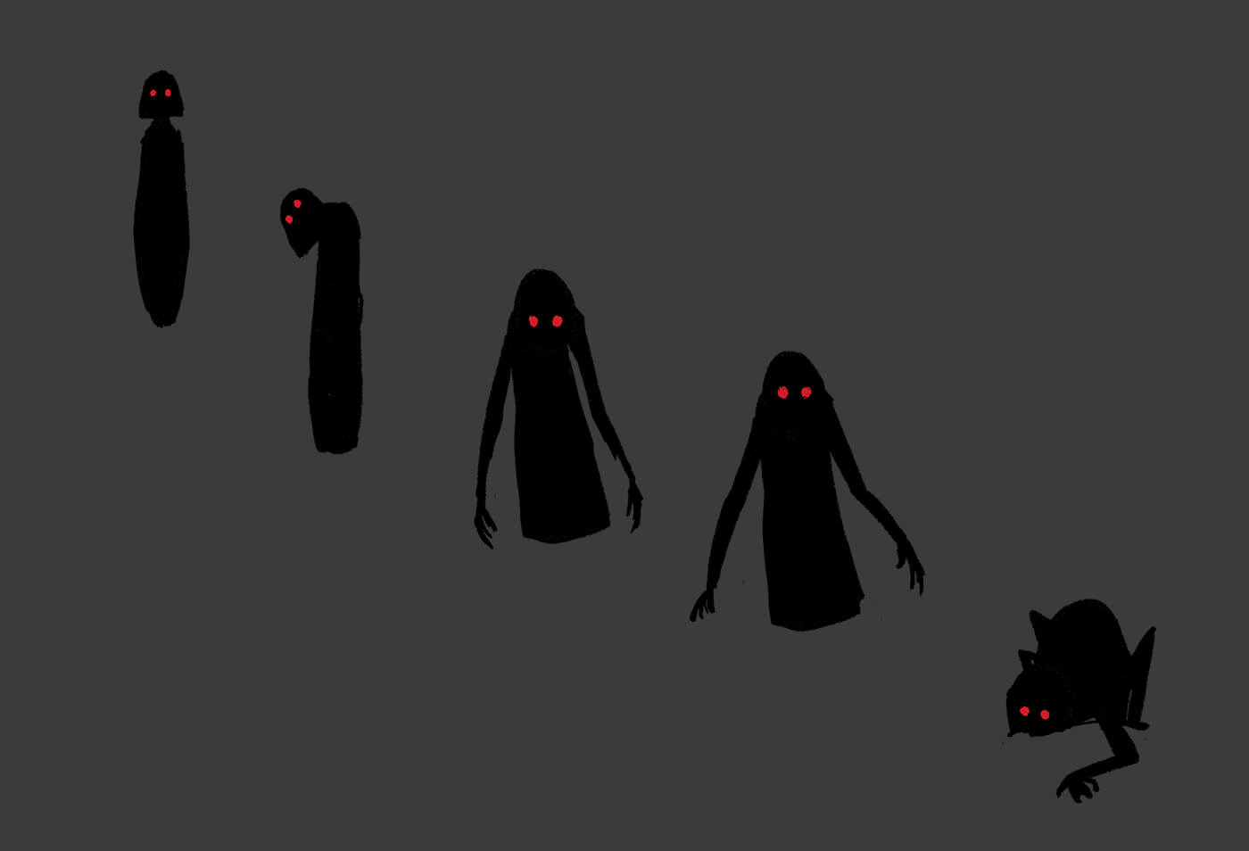
And so I drew the first ghost. Then I thought should draw some variants so I could choose the Scariest Ghost. The problem with being a scaredy cat is that I was too afraid to look up horror visuals, so I had to rely on artwork I could handle and my meager imagination.
But after I drew some various ghosts, I realized they worked as animation frames—I had kept drawing them in a way where they were advancing on the viewer and it occurred to me these could be the same ghost, but getting closer… So that was the first thing I figured out.
Light mode switch
In the beginning, the switch just toggled the lights while the ghost floated around. And then I was thinking about how to end the comic, with the ghost getting up close to the you. It then…kills you? eats you? fade to black? But then the toggle gets disabled somehow? But how? why?
But then in my sketches, I happened to put the toggle in the right corner, in reach of my character, and at some point I looked at this and thought huh. What if—
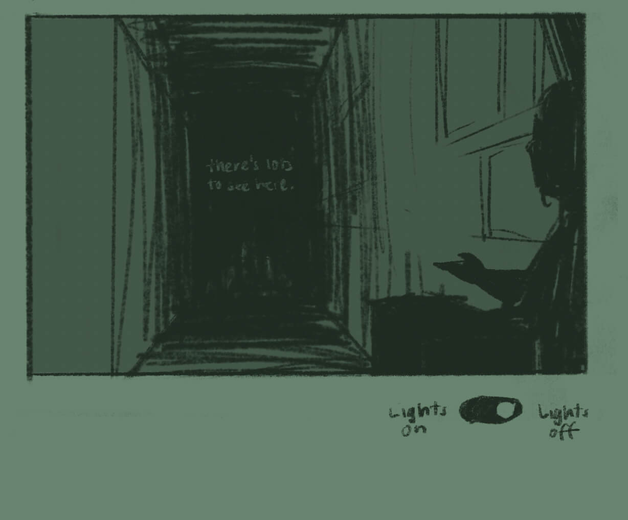
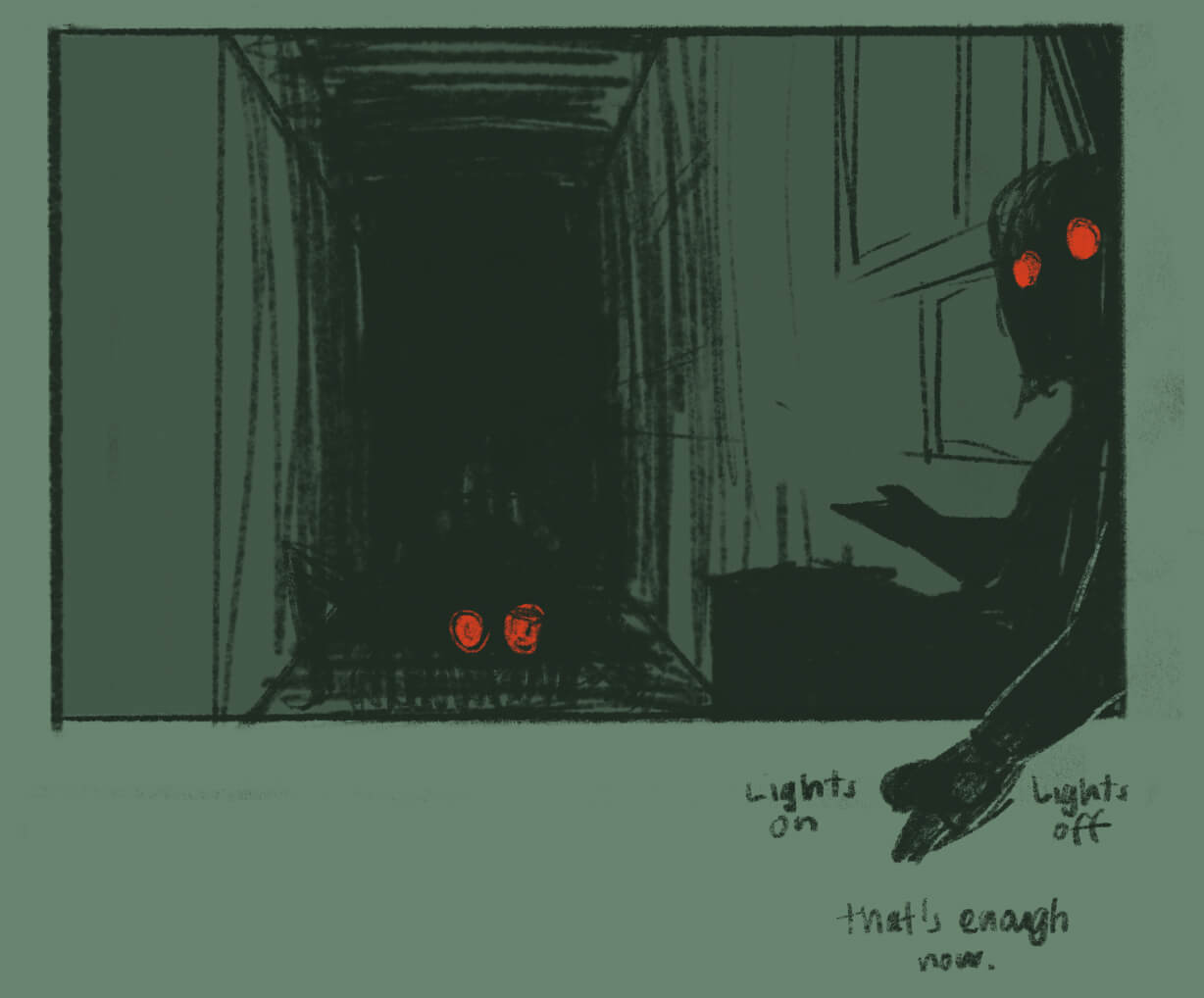
The idea fell into place. I tested this flow by animating it in Photoshop as a frame-by-frame animation. I wanted to see if flashing through the ghosts and then having my character turn on the last frame worked. Once I confirmed the concept held up, I moved onto drawing the actual artwork. And so, that was my second discovery.
Artwork notes
Most of the comic artwork is simple: a bunch of straight on shots of my character looking the same across multiple panels. Nothing new here! I finally draw something slightly more interesting in the last panel, which involves a bit of 1-point perspective.
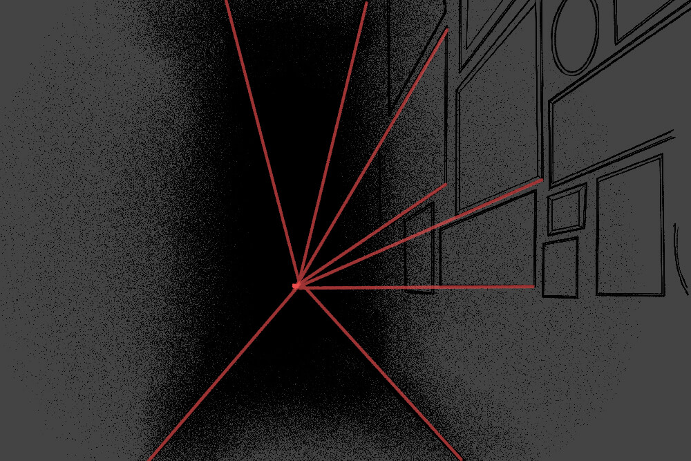
I intended the setting to play a larger role—for example, the picture frames on the wall were supposed to actually link to things—but after I figured out the light mode interaction, I decided that was it! That was my concept. Everything else could go in the garbage.
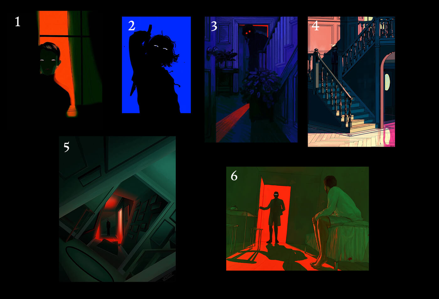
The final panel follows the pattern of scary eyes glinting in the dark, in an even spookier way than glasses-glinting-in-the-dark is. This was the limit of my scary artwork tolerance. Here’s a choice selection of inspiration:
During this process, I also read two volumes of Framed Ink by Marcos Mateu-Mestre, both of which are superb and inspiring.
Technical details
This was built the same way my previous comic homepage was—the artwork as various images absolute positioned within panels that had a fixed aspect ratio.
For example, suppose a panel has an aspect ratio of 2:1 and I wanted the artwork to be placed in the bottom right corner:
.panel {
  aspect-ratio: 2 / 1;
  position: relative;
}
.panel__artwork {
  bottom: 0;
  right: 0;
  position: absolute;
  width: 50%;
}
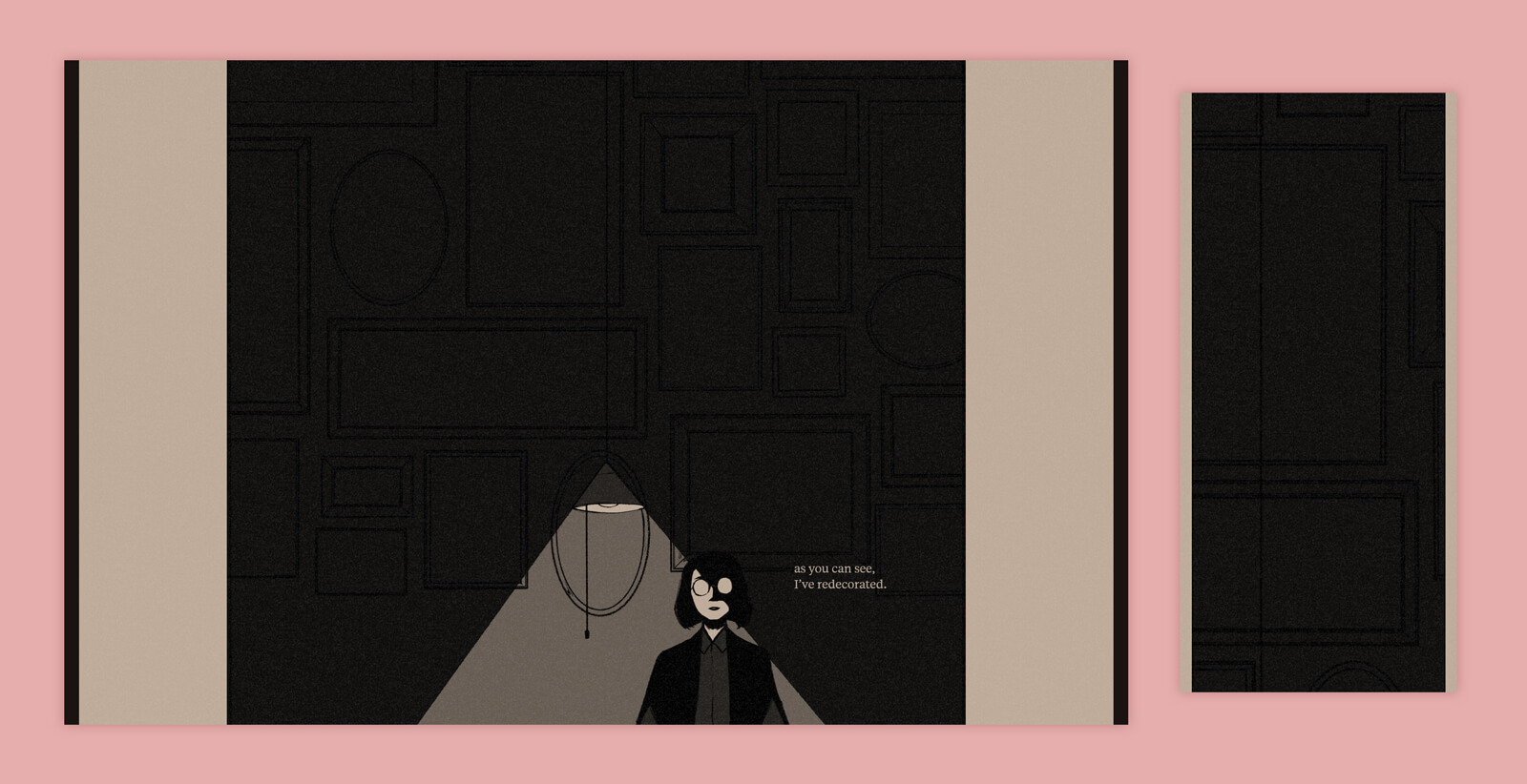
I adjusted the aspect ratio of panels based based on two arbitrary breakpoints: 800px and 500px. The clearest example of this is in the I’ve redecorated panel. It’s meant to be a large panel that fills the screen.
On ‘desktop’ it’s 1:1—it takes up a lot of space. As the viewport gets more narrow, it gets taller. At <800px, it’s 2:3; at <500px, it’s 1:4.
That 1:4 sizing is the most dramatic. You have to scroll an entire screen’s worth of height to get to the bottom of the panel, which is meant to emphasize the shadows that engulf my character.
Light mode was initially a traditional light/dark mode toggle, but I changed it to a <button> because I didn’t want to build a toggle switch.
Positioning the button required a bit more thought. In my sketches, it’s floating in empty space, but this would look awkward on the actual page. It needed to be offset from the right edge so that the hand angle would work, but just having it float there looked weird.
So I moved my navigation links out of the site footer to sit right below the comic, so that I could stick the button at the end and have it fit in better.

I also considered styling the button to look like one of my nav links, so it would be an actual surprise if you chose to click on it. However, I decided I wanted everyone to click it more than I wanted it to be a true easter egg, and I think it looks conspicuous enough that it invites a bit of curiosity.
Idea graveyard
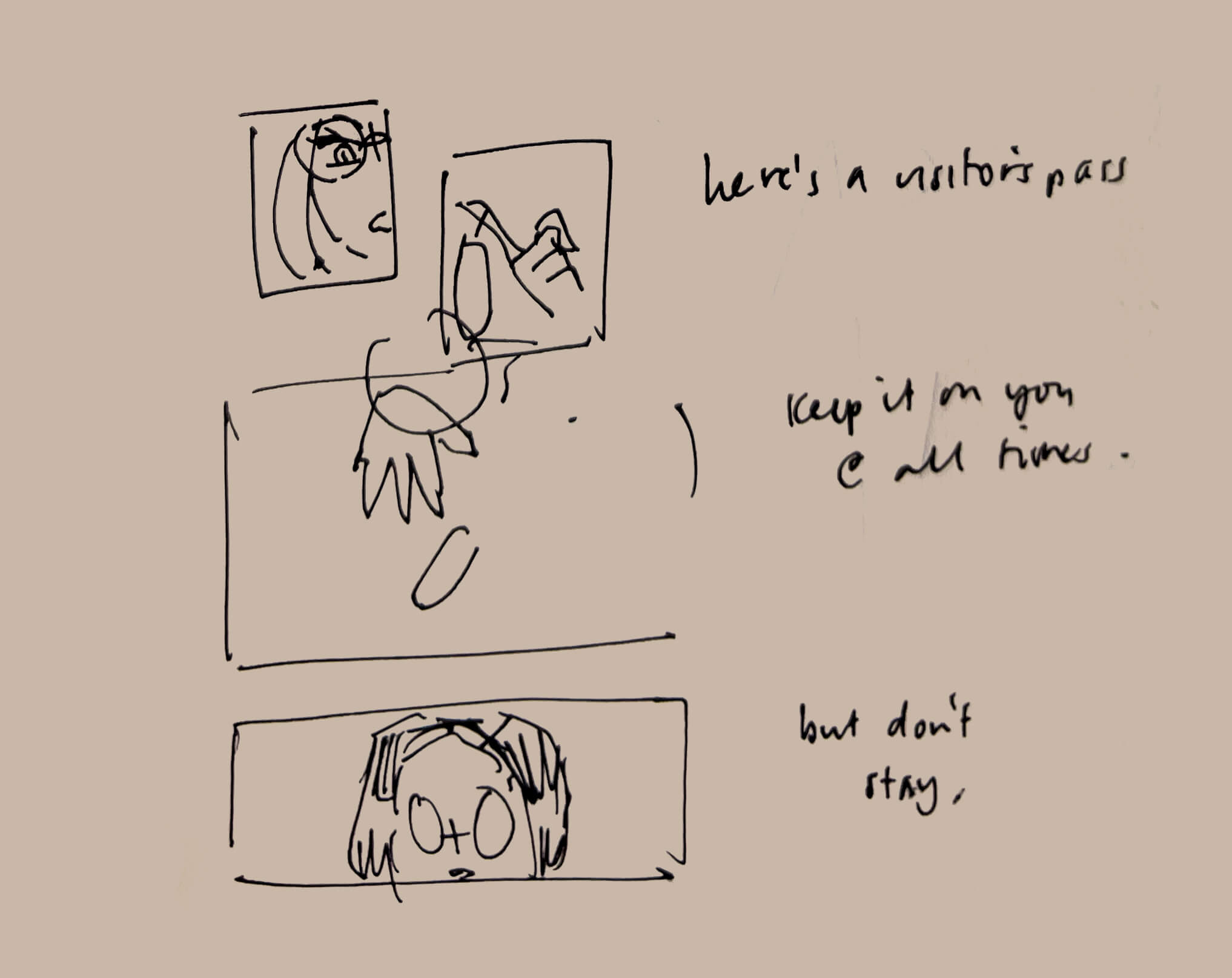
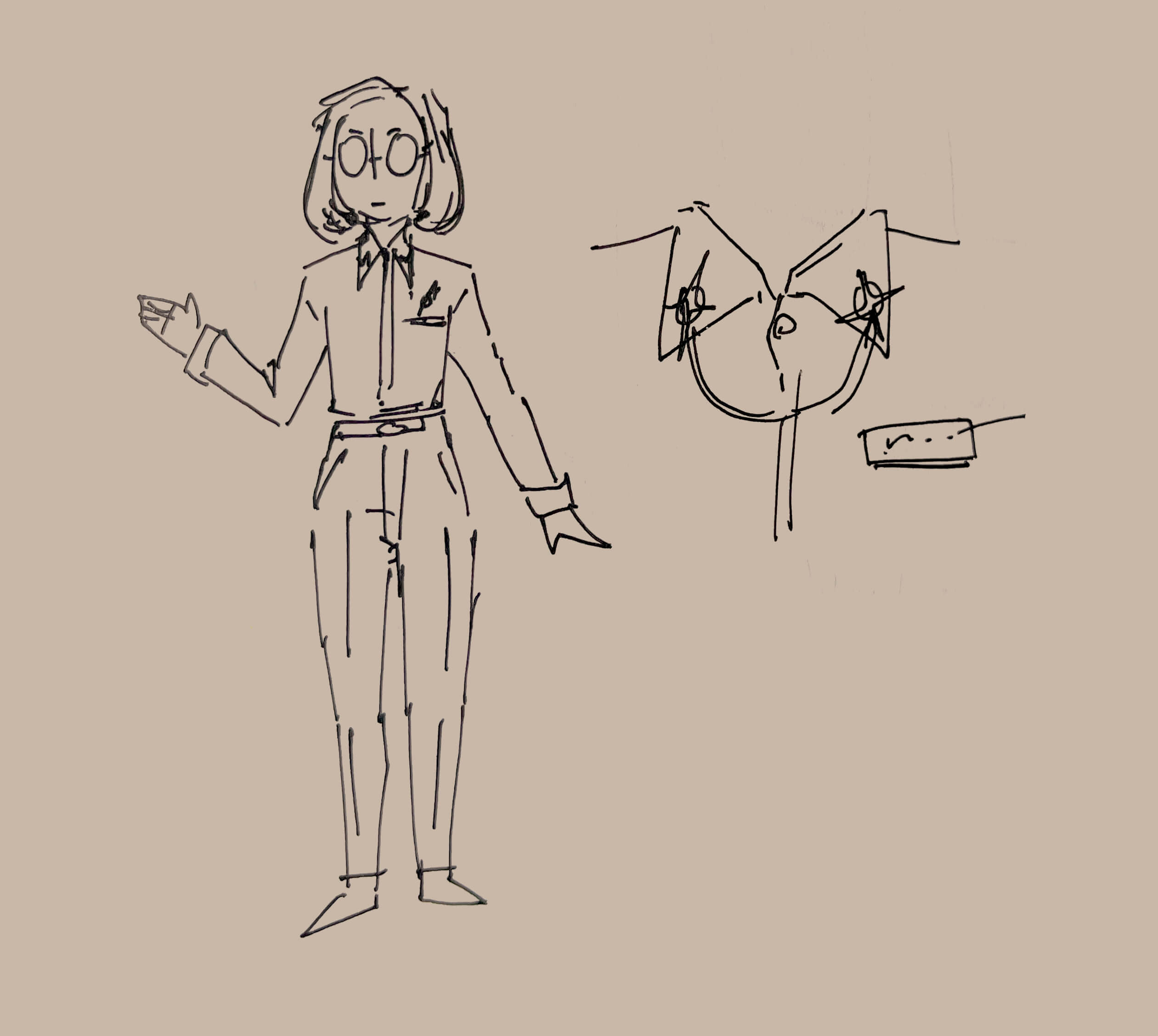
I also spent an embarrassing amount of time trying and failing to figure out some kind of clever wordplay involving ‘hotel’. I bet if I did have a fun pun, I would have pushed the hotel setting more, but alas.
Conclusion
When I look back at all my ambitions and plans from the start of this, I feel like I gave up on so many things out of a lack of skill. Taking a nebulous idea through to execution is the entire point, and it feels disappointing to fall short.
But I also feel proud of where this ended up. My favourite parts of this—the light mode switch, the flashing ghosts—emerged from the drawing process. I had a moment where I realized huh, that’s interesting about the artwork. Even in my tiny, unsophisticated project, it was through that meandering that something surprising came about. (I know this isn’t groundbreaking, but it was a good reminder to myself!)
I feel my artistic shortcomings very acutely when drawing comics. They require so much skill—in the most technical, artistic sense with character art and environments and composition, and then with skill in writing, and then the pacing and flow of it all. It’s very humbling, and it’s exciting to be a beginner and have so much I can improve on. I’m excited to make my next thing, whatever it may be.