Small headings
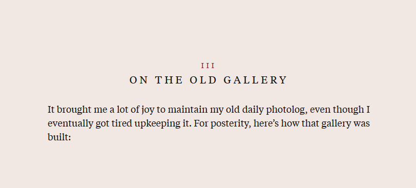
A standard heading: large, eye-catching text. It announces a new topic, organizes your writing, helps the reader skim.
A small heading: it blends into the text. It says, rather than announces, that here is a new topic.
An example
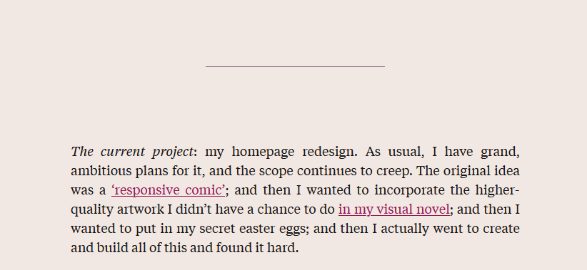
Last week, I wrote the post Status update, where my topics were separated by horizontal rules and I introduced them with italicized text.

I was thinking about how this is a pleasing way to go about more lowkey posts. The post was meant to be a casual note, rather than a more organized article, and using my default heading style didn’t seem to suit it. Using a heading feels like it lends authority or polish to the writing, which is not what I wanted for a quick note, especially since my current styling is quite fancy.

I wrote my latest site redesign post in this manner too. It’s quite long, but it’s quite disorganized. It was easier to write by simply writing what I wanted to say as it came to me, instead of trying to organize it in a way that made sense, and I wanted to just have it done and published. So—the less polished nature.
I didn’t use headings at all, and separated topics by horizontal rules, and it meanders enough that even labeling each section would be hard, but—this process of writing casually is freeing, and I would rather write this way and publish more. So, I was thinking about how these small headings feel more suited for this unpolished content.
In practice
Semantically, <h2> tags are useful, and I probably should use them? Stylistically, I would want the headings to be understated.
Actually making this work in markdown is…well, annoying. Part of the appeal of casual writing is having as little markup in my markdown as possible, and there’s no straightforward way of doing custom h2 styling
No wait, literally as I typed that above paragraph I realized I could apply a custom style to the entire post based on frontmatter parametres. Wow, writing is thinking.
Example below: adding a custom class to every h2 heading, in addition to writing out the h2 html tag, would be annoying.
<h2 class="sm">A small heading</h2>

And then your paragraph text goes here.
But! Less annoying: setting a custom style once in the frontmatter and proceeding as normal:
---
title: Title goes here
smol: true
---
in which customStyle applies smol.css, which overrides the default styling.
In the <head> tag of layout.liquid:
{% if customStyle %}
  <link rel="stylesheet" href="/css/{{ customStyle }}.css">
{% endif %}
So for example
This above is what my smol heading 2 looks like. It’s lowercase, italicized, with a trailing em dash for aesthetics. It’s not the inline text of my status update example, but I couldn’t figure out a way of making the text display as inline and I don’t feel like digging further into it at the moment. So this is what I’ve got.