Website version 6 redesign
⚠️ Note: I wrote most of this post in February 2024, to talk about my December 2023 redesign. Then I never finished it. I’m dragging it back out now to publish in my digital garden as an incomplete post. It remains largely unedited since I wrote it, so please excuse any mistakes.
I redesigned my website a couple of months ago last year, and here are some, uh, disjointed notes on it.
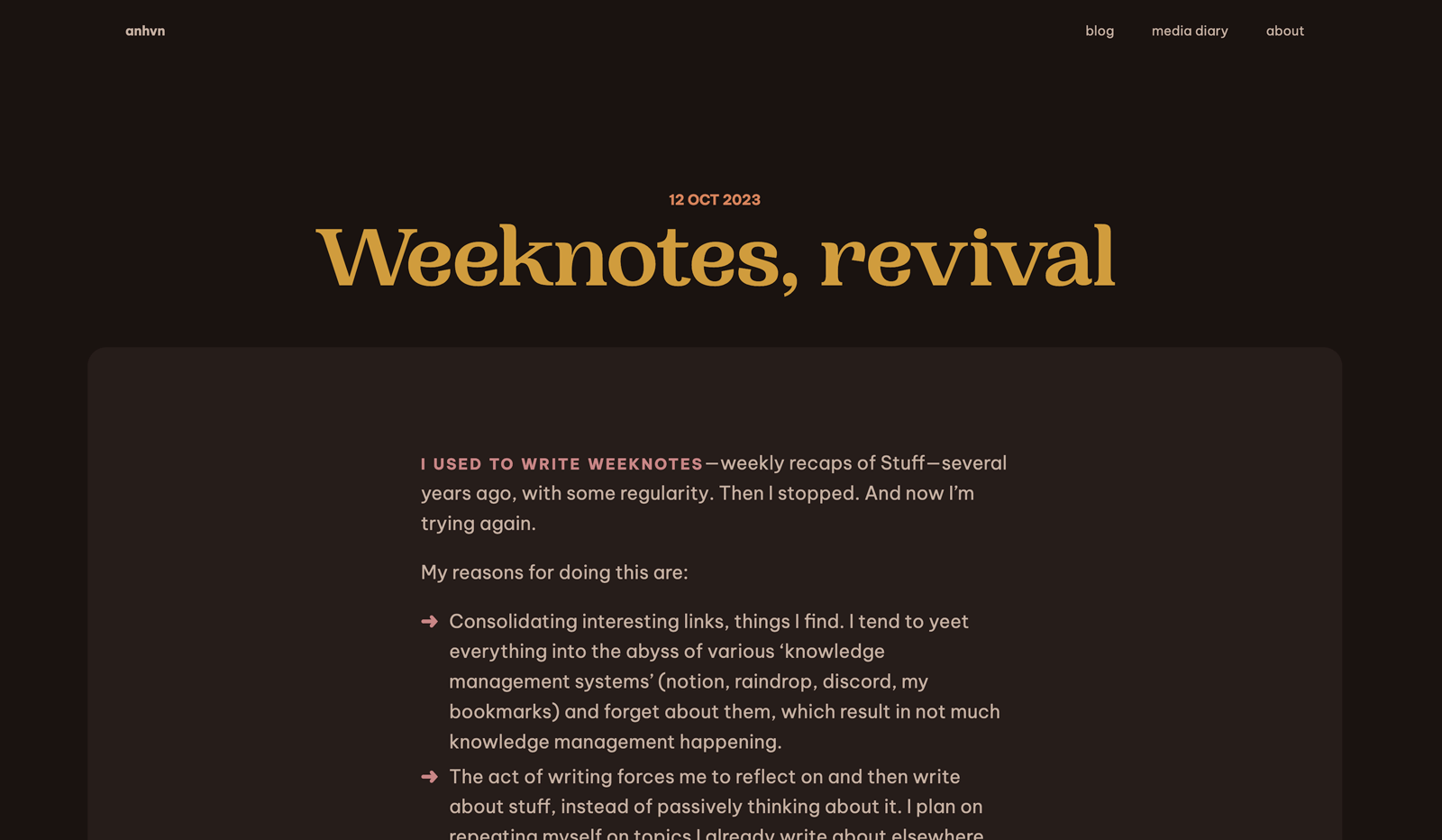
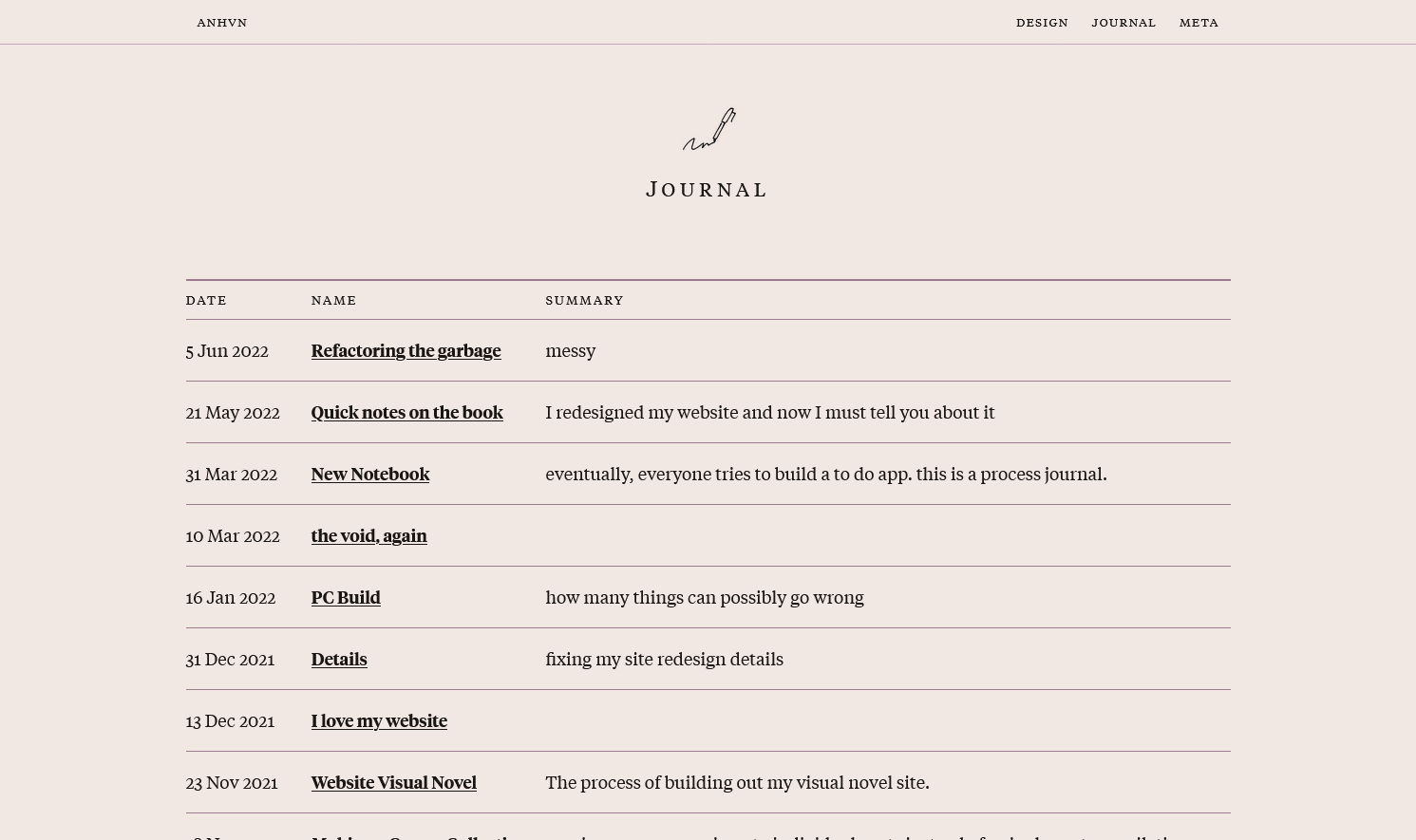
But why

Early attempts
More seriously: I was tired of my site design, which I had been using since May 2022—a mere 1.5 years, but I mess around with my website so often that I quickly tire of how it looks.
Note: I’ve previously written about these early stages in Weeknotes 7; I’m rehashing it a bit here.
Attempt #1
My very first redesign attempt ended up terribly uninteresting. I often fall back on familiar patterns, picking colours and styles I’ve used before.
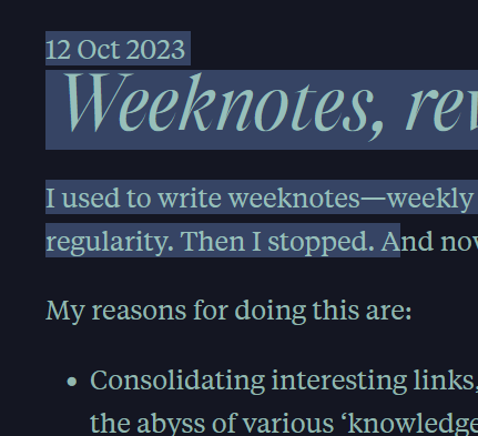
Attempt #2
Well, thanks to Sfizia not working out, I swapped it out for Woodland, as well as the body font for Be Vietnam Pro. Since these are much rounder and cuter, and the name ‘Woodland’ implies, well, cozy woodland cottagecore vibes, I updated the colour palette to be all browns and autumn tones.
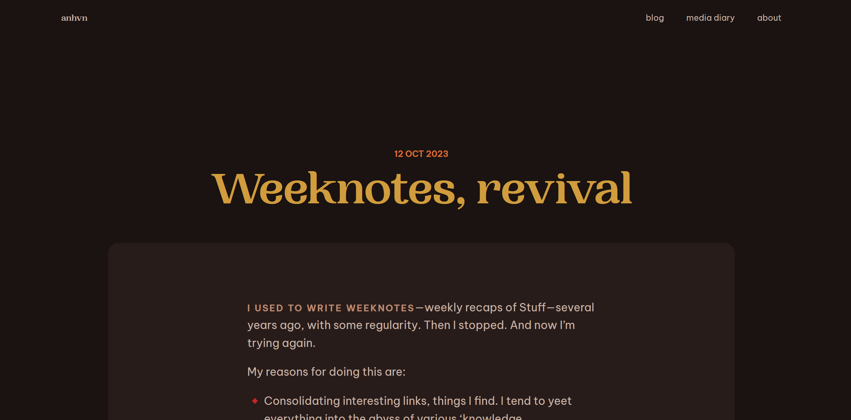
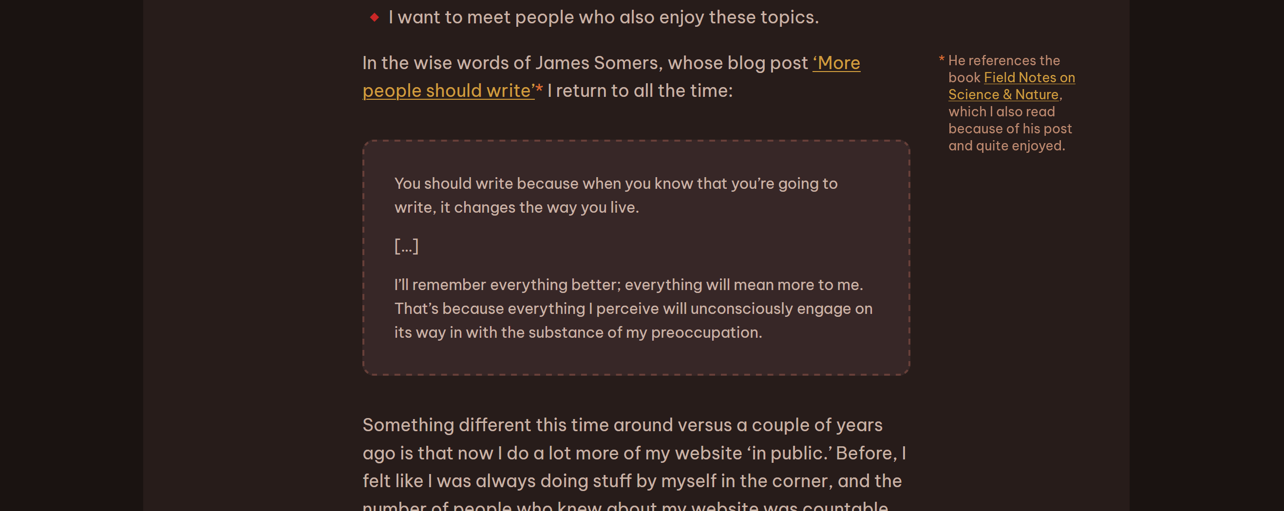
Typography
One of things I really wanted this time around was to have good typography on my blog posts. I think V5 was pretty ok, but there were some glaring issues that I just never got around to fixing.
I tried to pay particular attention to:
- Whitespace: the space before and after elements, like headings, figures, lists…
- Hierarchy: how stuff looks next to each other
- Details like list markers (arrows for
<ul>!), links, the asterisks on my asides
I think I’m maybe 90% of the way there. Even now, I’m still fiddling around with spacing values, because stuff keeps looking off to me when I revisit it a week later, or I find edge cases that I need to adjust.
Fonts
The new site fonts:
- Body: Be Vietnam Pro by Lâm Bảo, Tony Le, and ViệtAnh Nguyễn
- Title: Woodland by Pangram Pangram
- Monospace: Space Mono by Colophon Foundry
I adore Be Vietnam Pro and used it a couple of redesigns ago. It’s round, pretty, and made by Vietnamese designers.
Interlude
The hard part about redesigning my website is that I have so much content that I’ve taken too much joy in customizing, which now comes back to bite me in the ass.
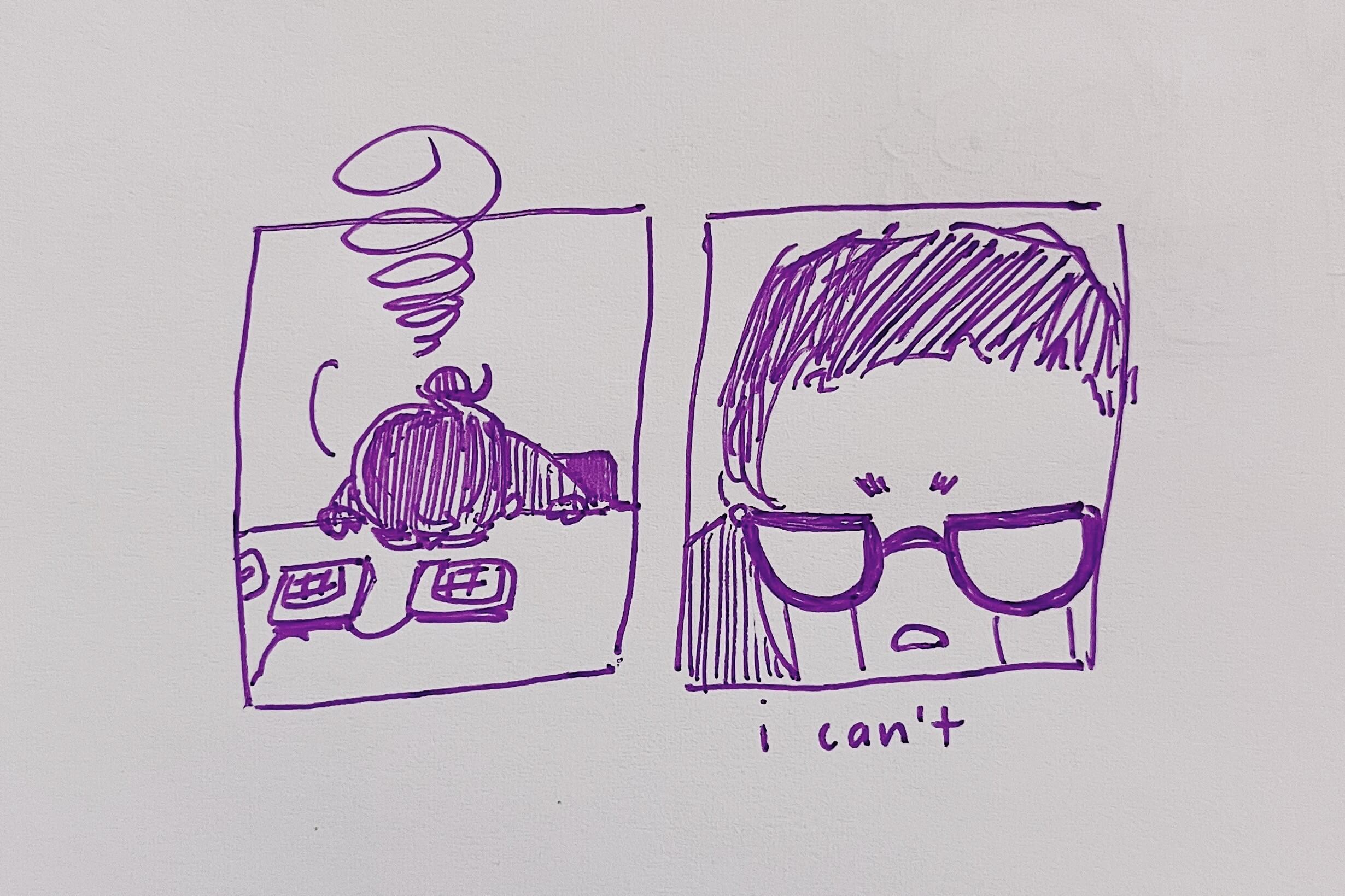
Media Page
My media page went through a few iterations. My first couple of attempts were terribly uninteresting.
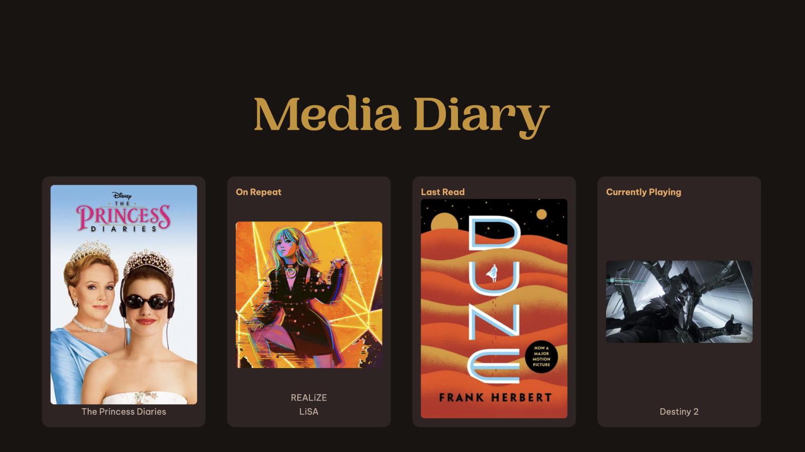
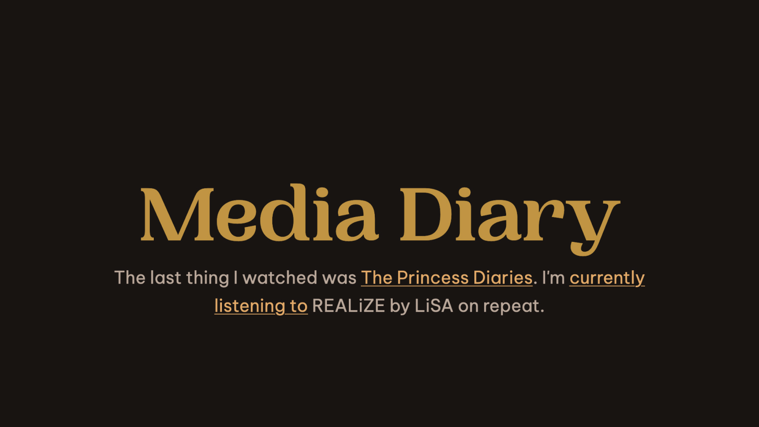
I kind of liked the text version, but it felt too formal/stiff. It also took away the images. Then, because I am a one-trick pony, I realized I could reuse my chat bubble styles to keep the energy of the text version, but in a more informal way:
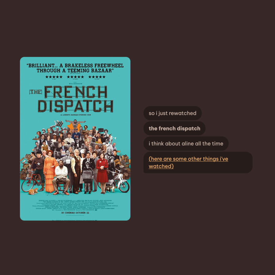
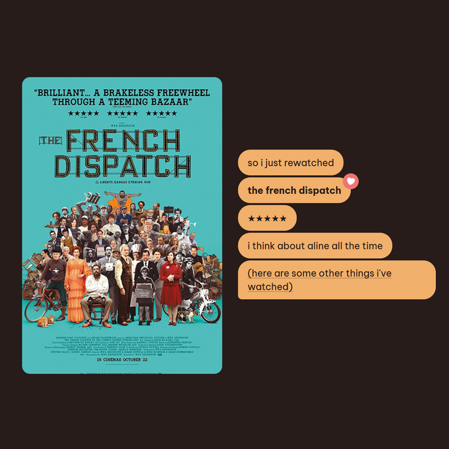
as I tooted at the time:
the idea, increasingly, is becoming, ‘how would i talk about this if i were talking to a friend?’
I adjust the chat bubble text depending on my watch status; i.e. the latest entry could be about something I watched, rewatched, or am currently watching.
{% if item.rewatch %}
  <li>so i just rewatched</li>
{% elsif item.status == "currently watching" %}
  <li>so i'm currently watching</li>
{% else %}
  <li>so the last thing i watched was</li>
{% endif %}
Other updated page layouts
Here are some other disjointed notes on updated layouts.
Blog archive
I made everything bigger, and most posts have a preview image. This is less skimmable than the last layout, which was a neat table, but perhaps this is more interesting to peruse.
I also don’t necessarily want the old posts to be resurfaced. idk, they’re bad, their formatting is all whack, I’m fine burying them more. You gotta work for it (i.e. scroll more) if you wanna read them.
Sketchbook
Each collection now shows a preview image, all displayed in a grid, instead of being a text-based list.
Digital Garden
Kept table of items because unlike the blog posts, I didn’t want to bury any particular entry
Watchlist
I kept the same grid format, though eventually I want to make a more compact layout that allows filtering/sorting. One day!
I also added a new ‘favourite’ designation, which displays a heart, and defined my rating system on the page instead of having it buried in a blog post no one will read.
Games collection
I added images to each game to showcase their art. I’ve taken screenshots for a lot of games I’ve played, so it’s nice to be able to display them more prominently. For games where I didn’t have a screenshot, I took them from official game images.
One issue is that not all my game entries have content; e.g. my Tears of the Kingdom entry is completely empty. I just added it so it would be included in the collection. It would be nice to style the empty entries differently (or I guess, go back and write stuff for them, which is harder).
I also removed the ‘currently playing’ section, because that changed too often aside from the mainstay of Destiny 2.
Admittedly, this layout still isn’t ideal—I’d like to eventually add a way of sorting/filtering, a more compact layout option, and also highlighting new entries. (I guess I am reinventing Letterboxd here.)
Backend structure stuff
I reorganized a bunch of files, because it was getting quite cluttered.
- Created subdirectories for old versions
- E.g. my V5 (titled ‘book’) header file would get saved in
/_includes/book/header.liquid. Before I would simply just overwrite my old versions, but I want to keep them around this time. I still have public archives of my older homepages, and those have header/footer content specific to their designs. - Same with CSS, I have a
/css/book/style.cssetc.
- E.g. my V5 (titled ‘book’) header file would get saved in
- Threw everything for the current design into a single CSS file, because I was overengineering it otherwise. A big stylesheet is hardly the most offensive performance thing on my website. (That’s the images. I’m sorry.)
- Organized my messy files, like old archive content and images.
Meta
I tracked progress on this:
- FigJam
- Mastodon toots
This tracking is nice for when I work on something over a long period of time—I’ll forget what I was doing, and it’s helpful to be able to see my own notes about it in FigJam. As I write this post now, which I started two months ago, I need to refresh my memory by reviewing what I’ve posted on Mastodon about this redesign.