Building the listening room
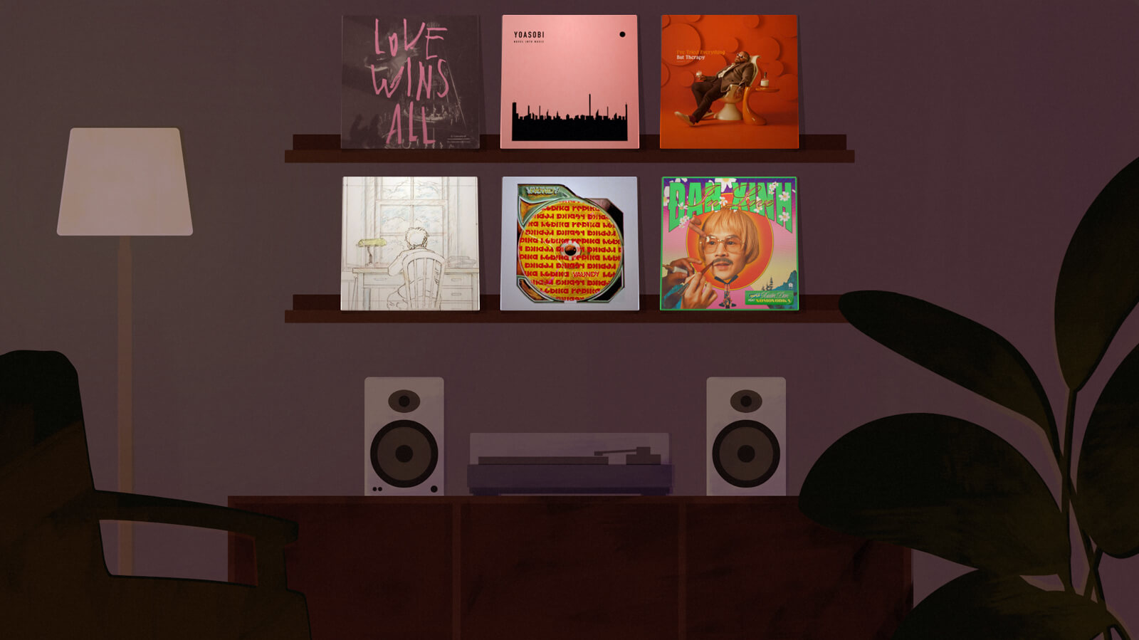
Last weekend I built a page that I’m calling the listening room. It showcases the six latest songs from my ‘on repeat’ music list in a fun little room setting.
I had been wanting to do something new with my music list for a while, and I had an abandoned project along these lines—place SVGs and images together—that I could reuse. That concept was more complex, as it was isometric and had far more objects, but I was tired of working on it.
Hence this simpler version: a flat perspective so it was easy to draw, scoped to just my music albums, made the same methods as that WIP room. I wanted to start and finish it in a weekend, instead of languishing in complexity.
Summary
tl;dr this room is composed of:
- A bunch of SVGs and PNGs, which are absolute positioned and sized with percentage units
- Album covers, taken from the six latest entries in my music list
- Lots of colour adjustments, slapped on top of everything
Here’s the process.
Drawing the SVGs
It went like this:
- Draw rough sketch in notebook
- Draw shapes in Illustrator
- Copy and paste shapes into Figma
Copy as SVGfrom Figma- Paste as inline SVG into the HTML
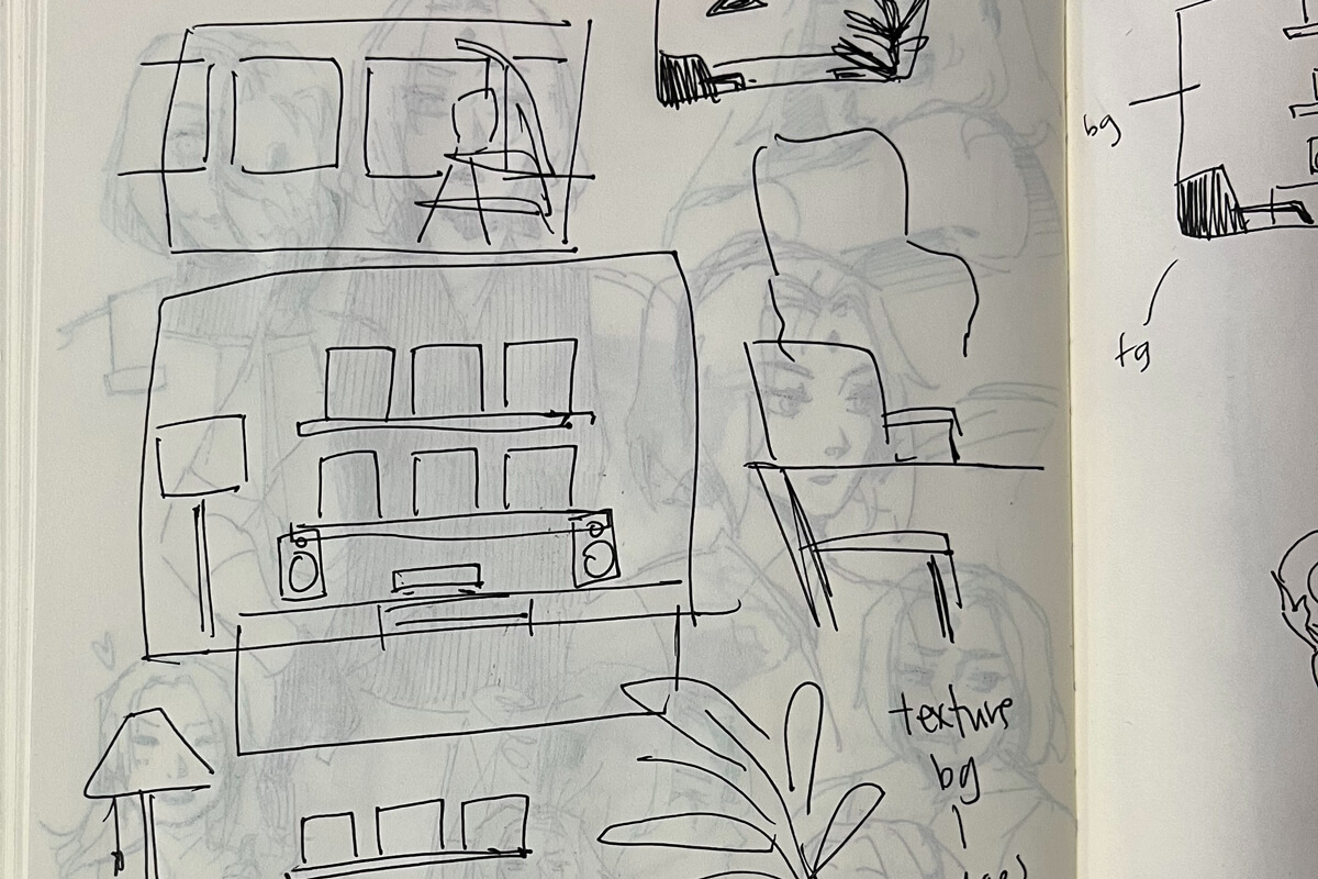
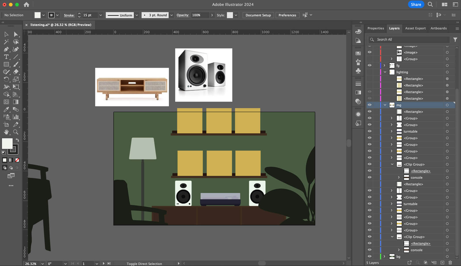
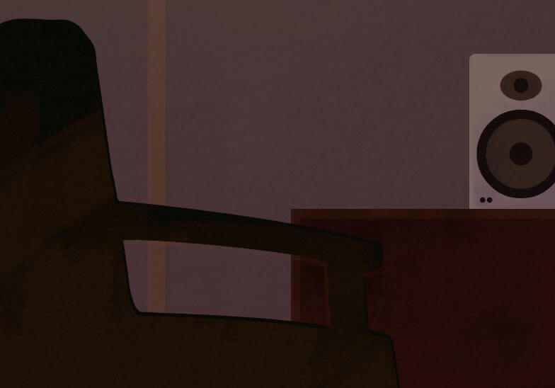
I kept the composition simple. Everything is a one-dimensional object. In the interest of efficiency (i.e. laziness), I reused the plant and the chair shapes from my previous project, with slight adjustments.
Painting textures
I added a bunch of brush textures on top of the SVG objects, because I like textures and they spruce up my amateur SVG drawings.
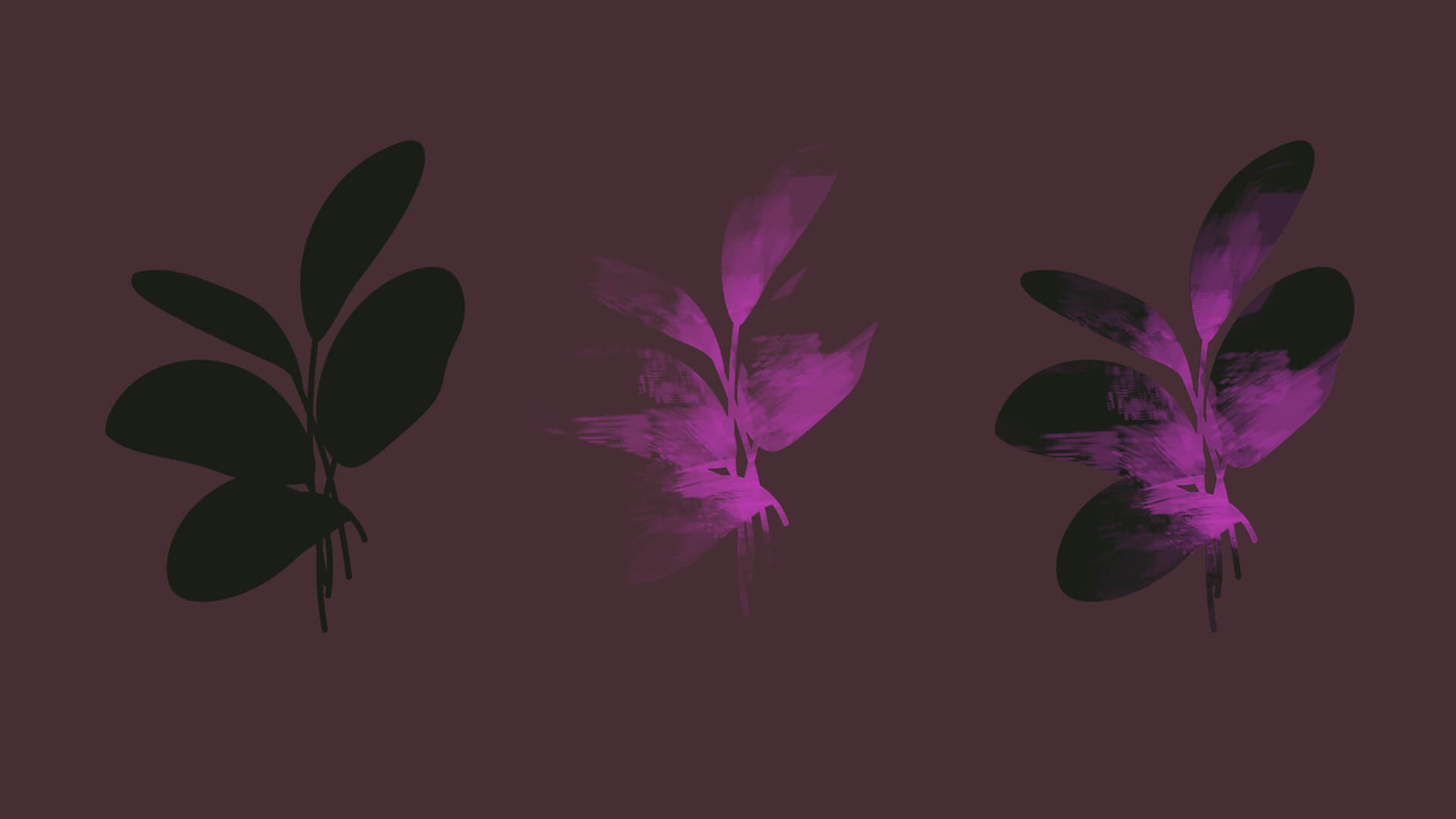
To make the texture, I used the SVG as a mask and shaded it in Photoshop. The process is kind of like—use a brush with low opacity (say, 20%), and start painting and layering brush strokes. Take an eraser, also low opacity, and erase where it’s too strong. And keep doing this until it looks sort of interesting.
CSS positioning
Everything is sized and absolute positioned inside a .room div with percentage units. The room itself has a fixed aspect ratio of 16:9.
Whether the window is 1600px or 500px wide, items will always be sized and positioned the same way within the 16:9 room.
Textures are positioned and sized the same as their respective SVGs, so that they overlap. To add visual interest, I offset the textures by a couple of pixels, so that the edges would be visible. The inspiration here is chromatic aberration and the like.
.room {
  position: relative;
  aspect-ratio: 16 / 9;
}

/* Example: the plant */
.plant {
  position: absolute;
  right: -11%;
  bottom: -20%;
  height: 100%;
}
.plant-texture {
  right: calc(-11% + 1px); /* 1px offset */
  bottom: -20%;
  height: 100%;
}
This has the added benefit of blending in other imperfections—I’m not going for pixel perfect, so where things are unintentionally wonky, I can get away with not fixing them. (Example: the shadows on the album covers are a pixel or two off, but it’s all good because that’s the aesthetic.)
Colour & lighting
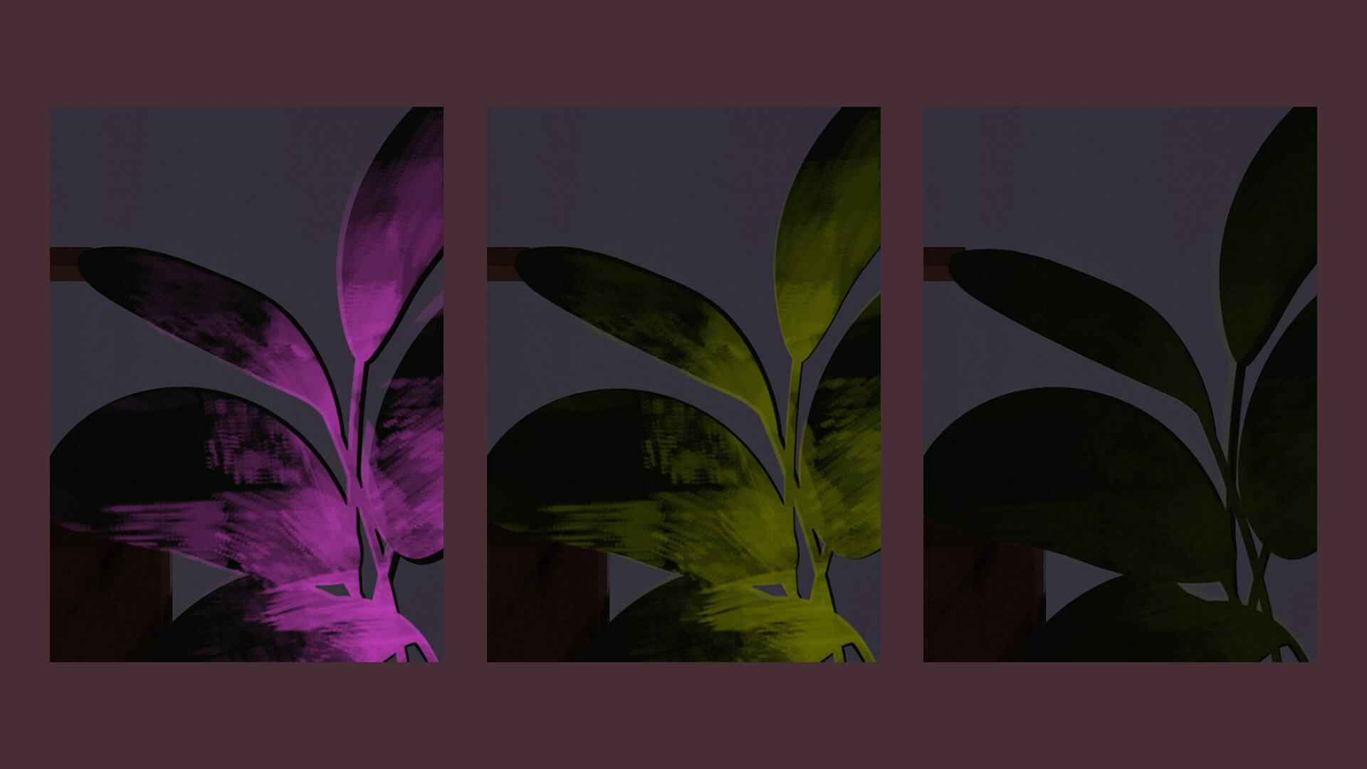
I knew I was going to throw a whole lot of colour adjustments and filters on top of everything. The textures were done in fuchsia because I selected it in Photoshop on a whim, and I knew I could change it afterward in CSS.
So for example, the plant texture:
filter: hue-rotate(130deg)to change it to greenopacity: .15to soften it. Another method could be adjustingmix-blend-modewith something likesoft-lightorscreen.
Lighting the entire room
In addition to all the texture adjustments, I added colour on top of the whole room.
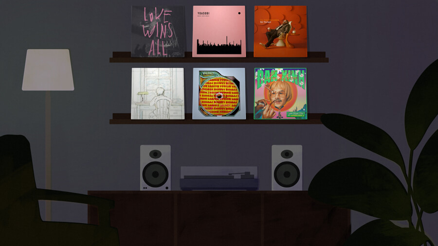
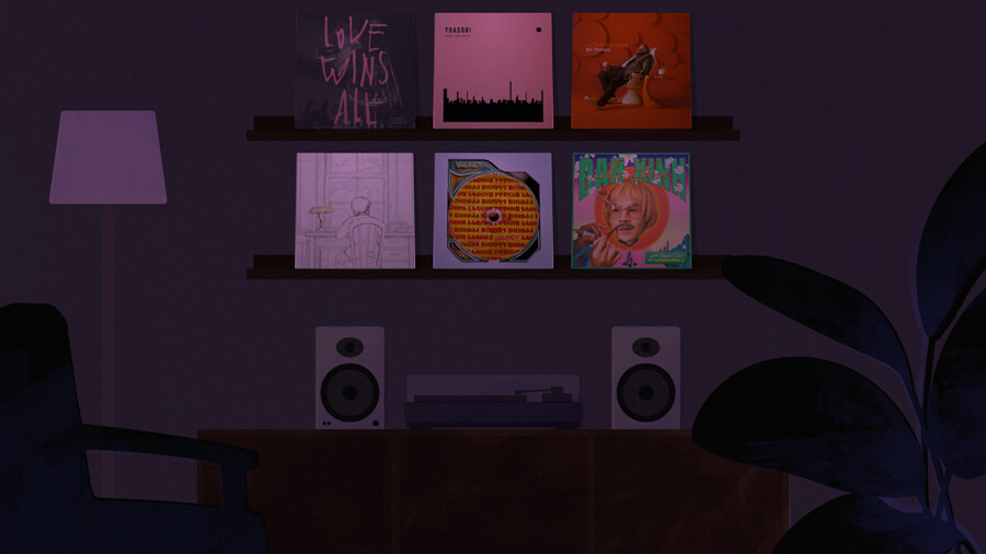
By default, the room is kind of cold. For ‘lights on’ mode, I added a reddish orange overlay; when the lights get turned off, the overlay is purple.
This colour adjustment is made with a pseudo element that covers the entire room:
.room::before {
  /* positioning the pseudo element */
  content: '';
  position: absolute;
  left: 0;
  top: 0;
  width: 100%;
  height: 100%;
  z-index: 20;

  /* the colour adjustment - lights on ver. */
  background: #ba725c; /* terracotta orange */
  mix-blend-mode: soft-light;
  opacity: .6;
}

/* for lights off ver. */
.room.lightsoff::before {
  background: #671d6d; /* purple */
  mix-blend-mode: multiply;
  opacity: .6;
}
For lights off mode, in addition to the whole room getting a purple overlay, I also adjusted some textures to be blue with a new hue-rotate:
/* Example: the plant */
.lightsoff .plant-texture {
  filter: hue-rotate(300deg); /* change from 130deg */
}
Animation
There are a couple of moving parts: the turntable arm (just barely) and the plant leaves. These are CSS animations.
For the plant:
- Each leaf is a separate
pathin the SVG - Each leaf animates independently: they’re all rotating 1-3 degrees at varying speeds
- The texture on top stays still, so the two layers are distinct. Again, the visible mismatch is the point.
For example:
@keyframes breathe {
  0% { transform: none; }
  100% { transform: var(--leaf-transform); }
}

.plant__leaf--1 {
  --leaf-transform: rotate(-2deg);
  transform-origin: bottom right;
  animation: breathe 6s infinite alternate linear;
}
.plant__leaf--2 {
  --leaf-transform: rotate(1deg);
  transform-origin: bottom right;
  animation: breathe 7s infinite alternate linear;
}
Etc.
The rest of the page is straightforward. I used a new font for the title—Sfizia by atipo foundry, which I bought a while ago but had yet to find a project for. I got to put a little fancy swash on the ‘R’ in ‘Room’ (font-feature-settings: "ss01").

The album covers are pulled from my music collection (an Eleventy data file) and positioned to sit on the shelves. I added a slight tilt to them and some shadows with pseudo elements.
Below the room is the full title and artist info for the albums. This all links to my full music list, which is just a grid of songs.
Closing thoughts
I feel like a broken record when I say—there is way more that can be done here, and I would like to do it in future attempts. I’m held back primarily by my own artistic shortcomings; the technical web aspects of this are straightforward and the art is really where it’s at.
I think the correct process for me is to do as much artwork as possible using a pen/stylus. I am—regretfully—limited by my tools. If I can only draw rectangles labouriously, by pointing and clicking my mouse, then I will draw as few rectangles as I can get away with because of this friction, and the whole piece will suffer as a result. So, next time, I should draw more with the tool I am strongest with: a pen.
But in any case, I’m happy I managed to finish this over the weekend. It feels good to publish a concept I’ve been kicking around for months, even as a stripped down version, and also change up my music list, as was one of my goals from my Media 2023 recap.
Thanks for reading!