New Notebook
I started building a to do app, which is really more of a journaling app. I’ve reached the point of getting tired of the build process though, so I’m switching to writing about it to reboot my brain.
This post is intended to be a public notes dumping ground that I’ll continually add to and edit as I work on this.
✨ Visit: the published app
Note: Desktop only. I’m continually updating this. As I add and change things, things may work weirdly.
The origin story is that I was going to follow the tutorial How to Use Local Storage with JavaScript by Tania Rascia, which is a very excellent tutorial on building a simple to do app in your browser using localStorage. Then I thought it would be fun to make a digital version of journaling à la Midori Traveler’s Notebook, and it’s growing into this.
My priorities for this are:
- Learn how to use the browser’s
localStorageand generally practice my JS (which I am a beginner at). - Make a fun, aesthetic journaling app that emulates the art journaling trend.
- Make it passably usable. I’m not too concerned about general UX here (sorry!!!) because in the interest of time, I’m prioritizing spending time writing JS instead of designing. I’ll think about it, but like, not too much.
Notes
Planned Features
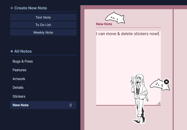
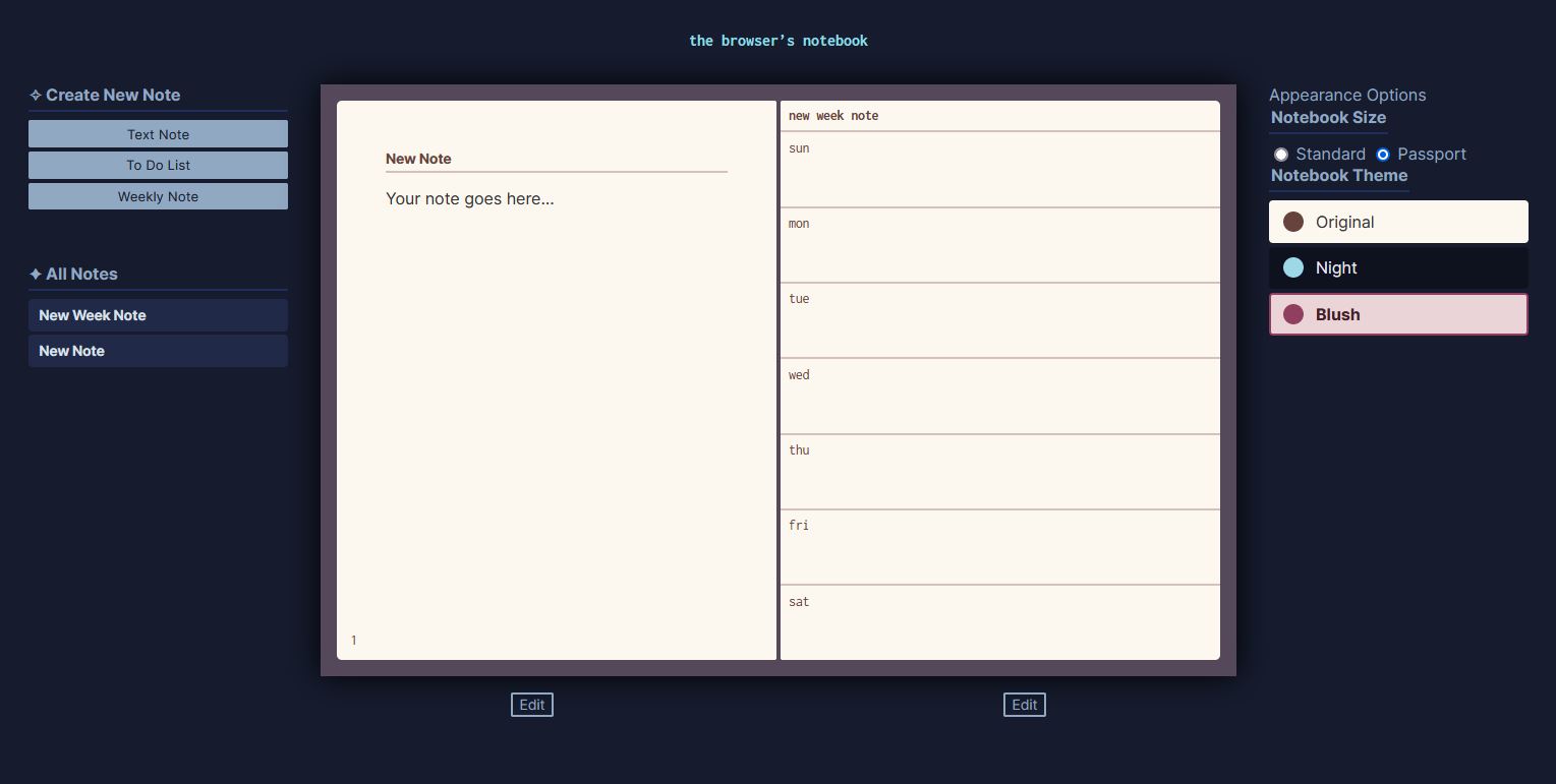
- Note templates: text note, to do list, weekly template, monthly template
- Annotation tools: stickers, stamps, tape, post-it notes. This is for the fun element of this.
- Organization tools: bookmarking, delete/restore
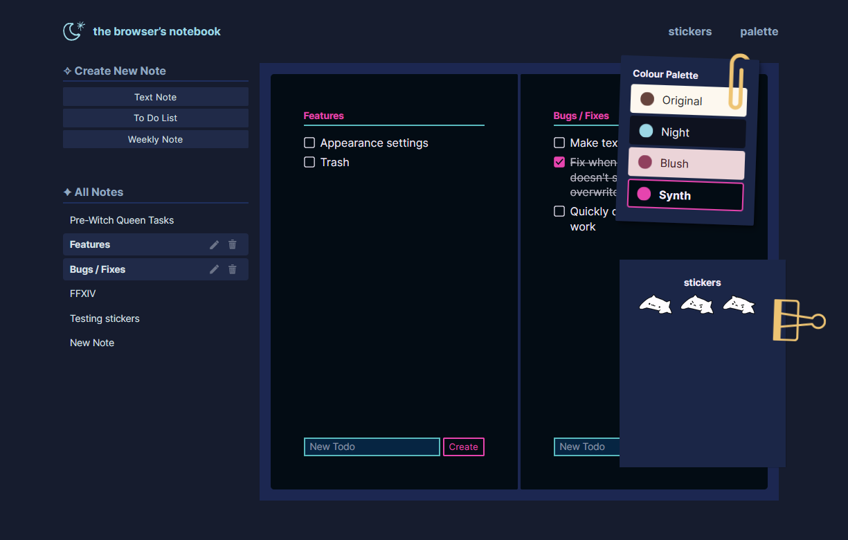
- Appearance options: notebook size, colour themes
General Thoughts
- For the first time, I’m working with data/storage. I’ve done rudimentary DOM manipulation before, but this is new to me. It’s interesting!
- I’m constantly writing and rewriting functions, which is showing me that I need to plan more and think of the whole system.
- It’s a struggle to accept that this is a learning project and therefore not beholden to perfection. I always feel like I have to impress the abstract professional software developer person that might see this and therefore I have to write a professional, presentable app, instead of allowing myself the space to learn and experiment and not get it right all the time. It’s hard!
Progress Updates
Here’s where I’ll dump my progress updates and notes as I make this. I would like to finish and publish this in a week or so, just to keep the scope from creeping up and out infinitely. I was tweeting this, but I think it’d be good to store those thoughts somewhere more permanent and findable.
Apr. 6
Some guiding questions, as I get stuck in thinking of what to do next:
- Why am I not using this? What is it about the UX or UI that makes me not want to use it?
- Does it look nice? Aesthetics is a core part of ~art journaling~ so I want to make sure I like looking at my app. Having a half-polished UI doesn’t spark joy or inspire motivation to work on it.
I’m trying out using HSL colours along with custom properties, to better manage my colour themes. It’s based on this technique from Jhey Tompkins, for individually manipulating H, S, and L variables. (In the tutorial, it’s used to switch light/dark mode, and I’m extrapolating here to use it for adjusting shades.)
It doesn’t work as well as manually picking colours, but I was trying a lot of different colour tints and it’s much faster to change the hue of something to generate a new palette.
For example:
.dark {
--h: 100;
--s: 15%;
--l: 95%;
--card-bg: hsl(var(--h), var(--s), var(--l));
--card-border: hsl(var(--h), calc(var(--s) - 15%), calc(var(--l) - 40%));
--card-text: hsl(var(--h), var(--s), calc(var(--l) - 70%));
--card-bg-alt: hsl(var(--h), var(--s), calc(var(--l) - 5%));
--card-selection: hsl(var(--h), var(--s), calc(var(--l) - 7%));
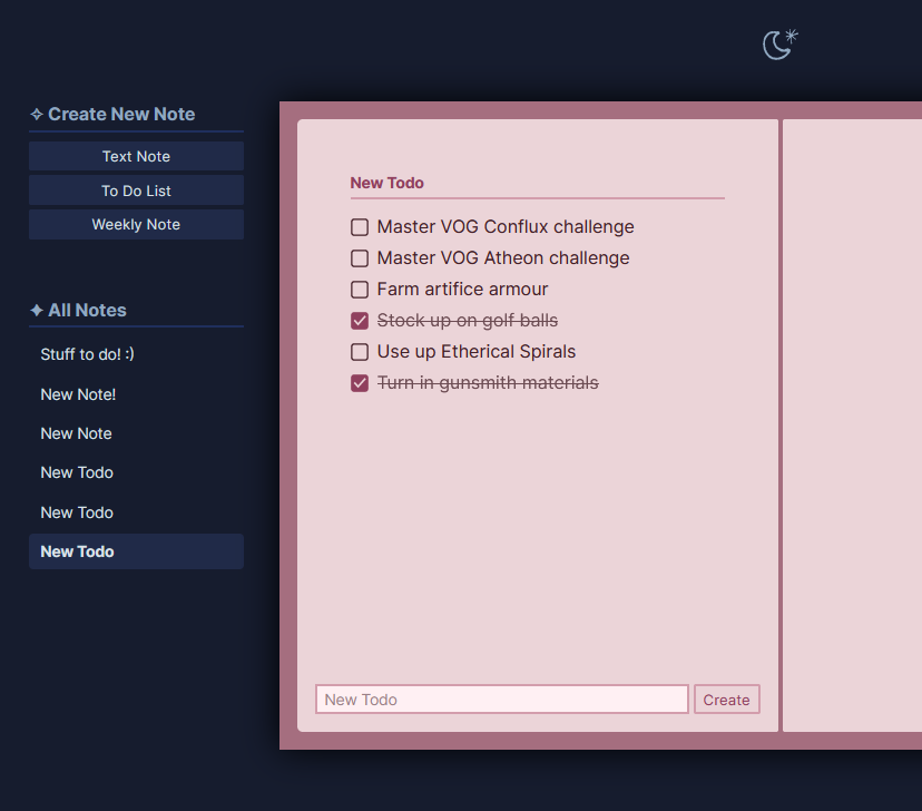
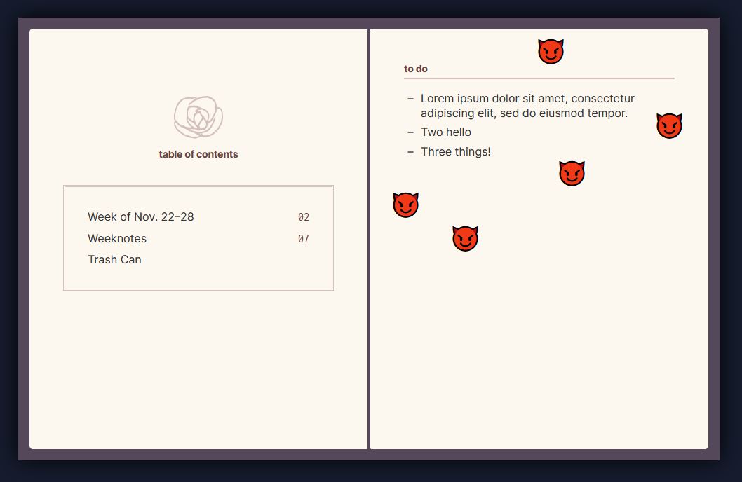
}I also added a Trash feature that lives in a little card with a slide-out animation. Personally, I dislike animation in web design, because I dislike things moving around. But I’m doing it here because…I can? It seems to work for my notebook
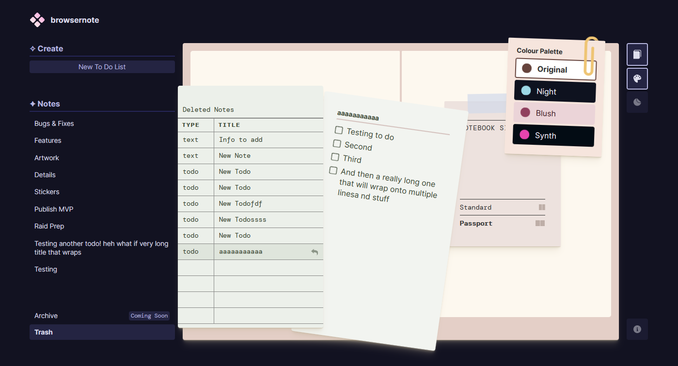
I’m thinking of adding an Archive feature as well, which would work in the same way.
Apr. 1
I decided to come back to this to update the UI, which I’m not satisfied with.
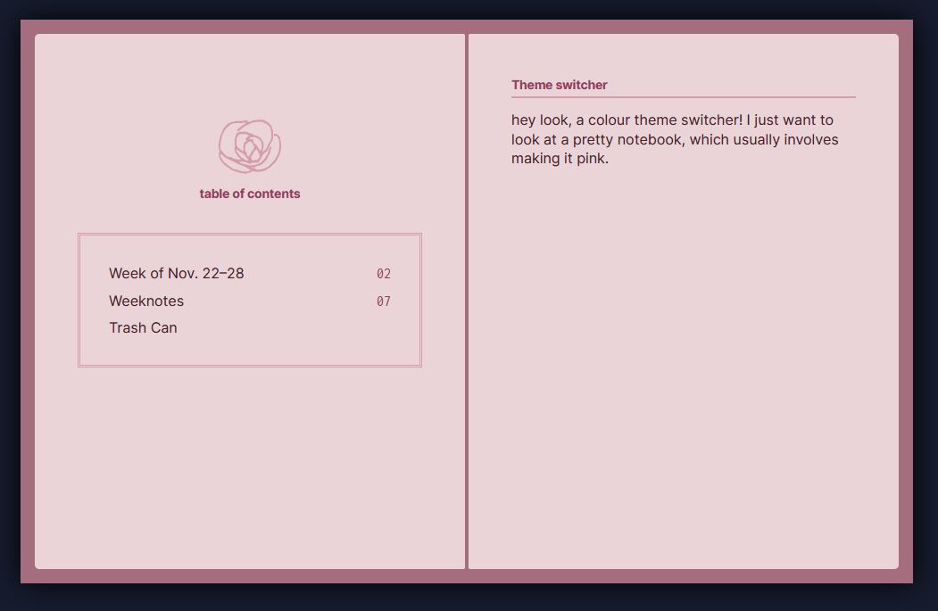
Previously, I had a few different colour palettes to choose from for the notebook. The webpage itself had only a dark mode theme.
I think it’d be nice to have a light/dark mode for the page, so that if your notebook is light then the entire page is light, and vice versa. I also want the theme to complement the notebook, so say the primary colour of the Original notebook theme is beige/brown, so the page theme will also be tinted beige/brown, or something complementary.
I think I’ll use this opportunity to try out some kind of colour themeing system that’s a little less manual than me picking out every swatch. This would involve messing with HSL and manipulating the variables, which I haven’t done before, so it should be interesting.
Mar. 16
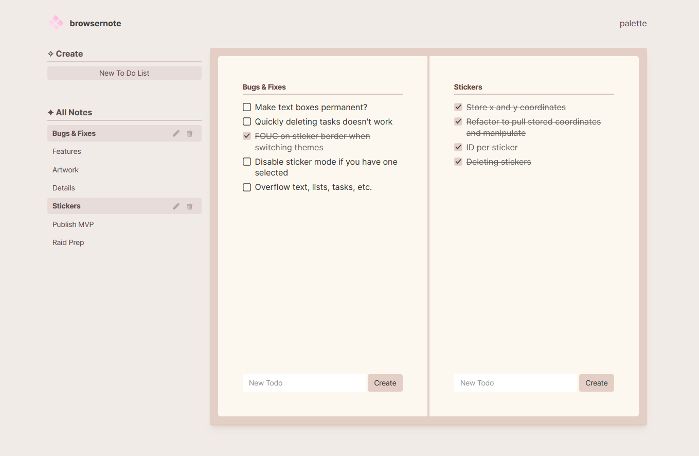
I decided to publish a stripped down version of this, where I removed all the features that were half-built and left only what was complete. This meant:
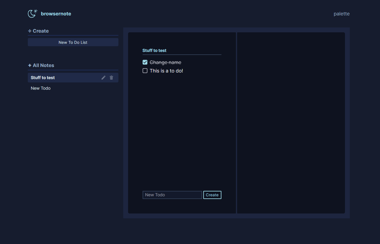
- Note type: to do notes. Removed: text notes or weekly notes.
- Tools: colour palette changer. Removed: stickers/stamps.
I got tired of looking at it and wanting it to be more than it was and keeping myself from publishing it until I was satisfied. I’ll never be satisfied! I need to be more comfortable with publishing and iterating.
Feb. 24
Adding stickers. Currently it’s click to select and click to place, and click + drag to move; I’ll have to update this. At some point I’m going to have to actually draw a collection of stickers, which I’ve been putting off.
Feb. 17
Fun with overlapping elements! I’m also animating how they transition in.
Feb. 14, 2022
I took a long break from this. My interest was waning and I was getting stuck in my poorly written code. I decided to spend some time making it look nicer since the in-progress state of visual disarray was not sparking joy.
Dec. 10
Dec. 2
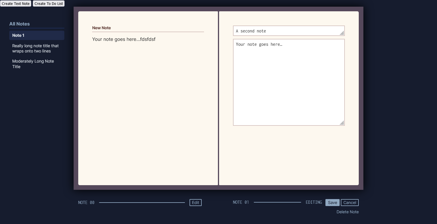
I, unfortunately, made no progress on this for the past week, and am depressingly aware of my failed ‘let’s publish this in a week!’ goal. I put together some braincells to reorganize some things and work on the edit function.
- Having two notes open at a time, each with independent edit functions, is showing me that my code isn’t modular enough. I knew this when I initially wrote it and I am now suffering the consequences and have to go back to fix it.
- Apparently,
align-items: baselineworks differently for Grid items between Firefox and Chrome. (It works in Chrome? but not in FF? hence my below screenshot of non-vertically aligned elements.) - I don’t like the editing UI, but I don’t feel like expending more energy into figuring something else better at the moment.
- I started creating the To Do template.
Nov. 25
I stared at this project for about ten minutes, resigned to the fact that I now have enough features to require thinking about my page design, which I don’t really want to do. I’m a designer and I like designing things! But right now I just wanted to mindlessly build stuff.
In my overdramatic despondence, I switched to writing this post.
Nov. 24
- Created a table of contents template
- Added a sticker/stamp function. I’m using emojis here as a placeholder, but I’m planning on drawing my own artwork for it.
- Added a
Deletefunction, so you can yeet your notes into the trash! - Added a couple of alternate colour themes.
- Drew a little flower as a placeholder icon. I’ll probably do something in this style for my ‘stamps.’
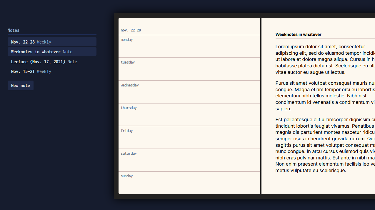
Nov. 21
How it started: