1 Jan 2022
Details
I published this site redesign last month knowing it was imperfect, and I’ve finally returned to it to fix all the little details that weren’t great.
Typography
I changed up my typography with the redesign, which was cool and fun at first, until I realized some problems:
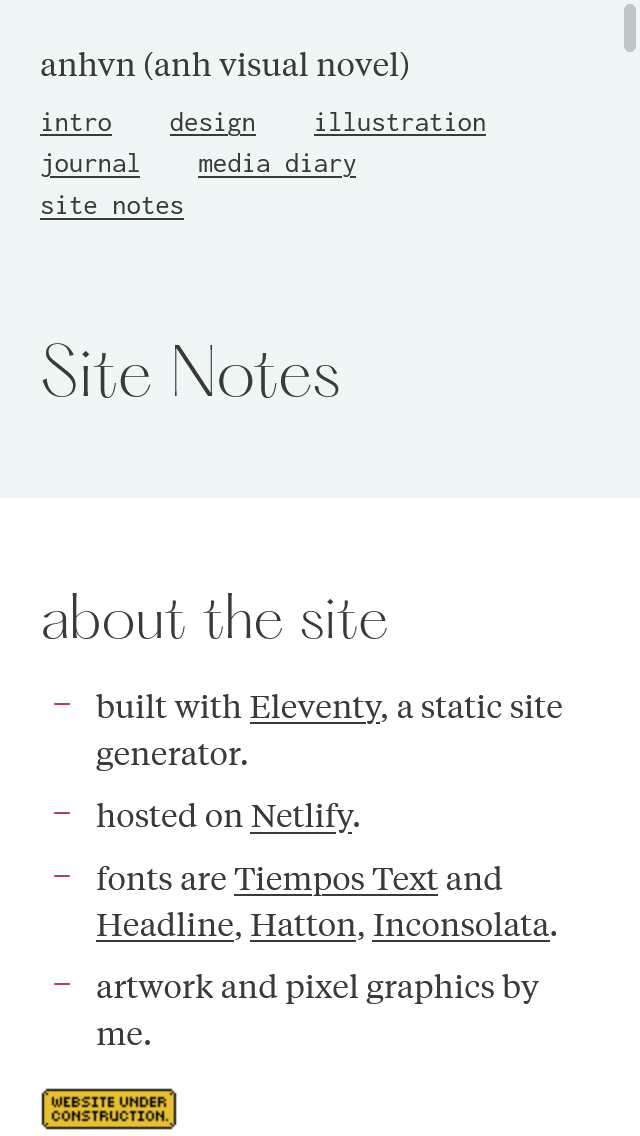
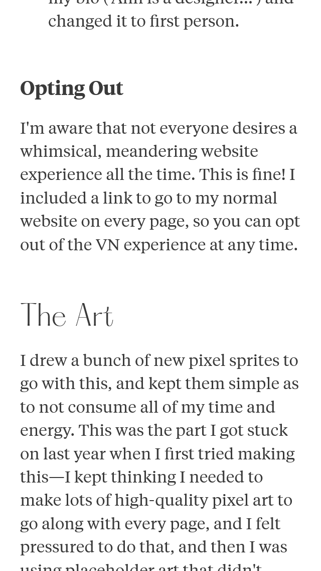
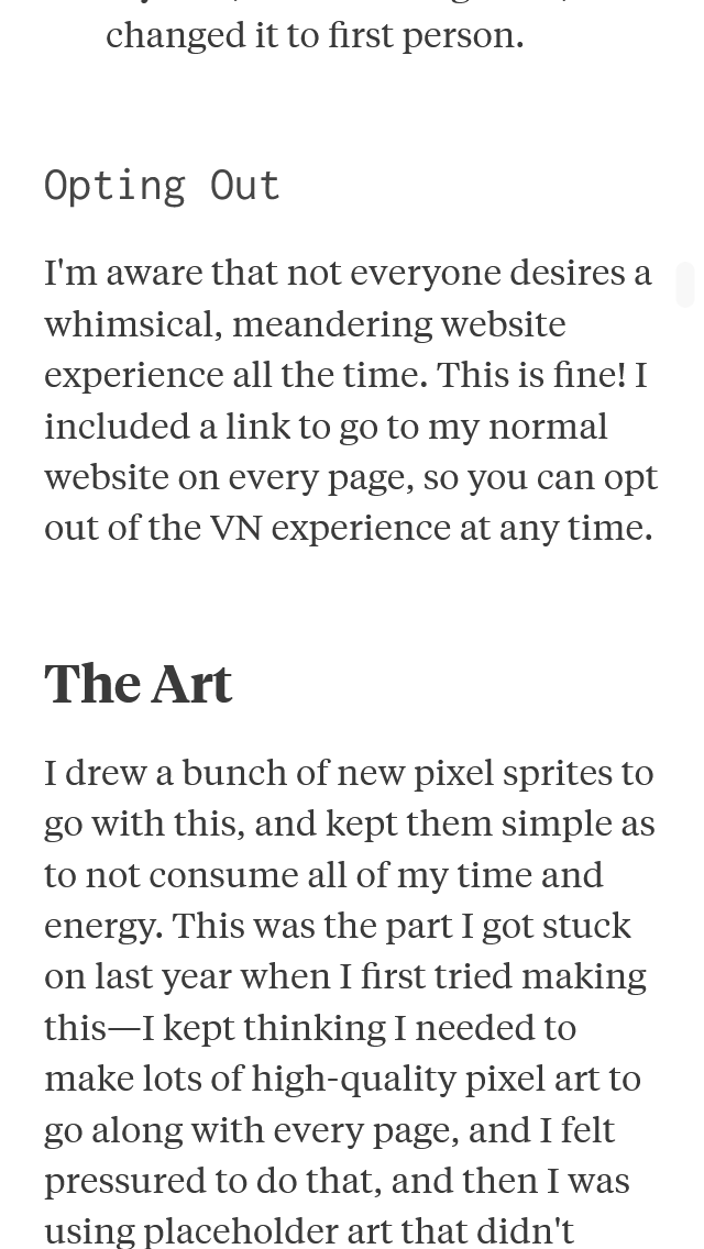
- The visual hierarchy among H1/H2/H3 was off, especially on smaller screens.
- Hatton, my title font, didn’t look good at smaller sizes because of how thin it is.
- Using Hatton for two heading levels felt too much, like using an accent colour too many times.
Changes
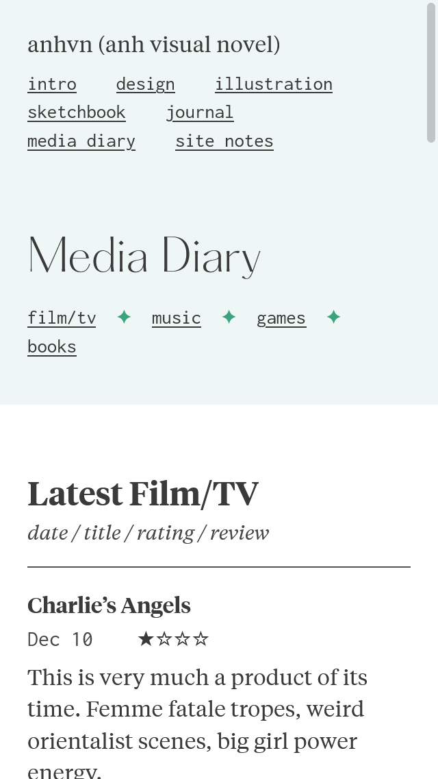
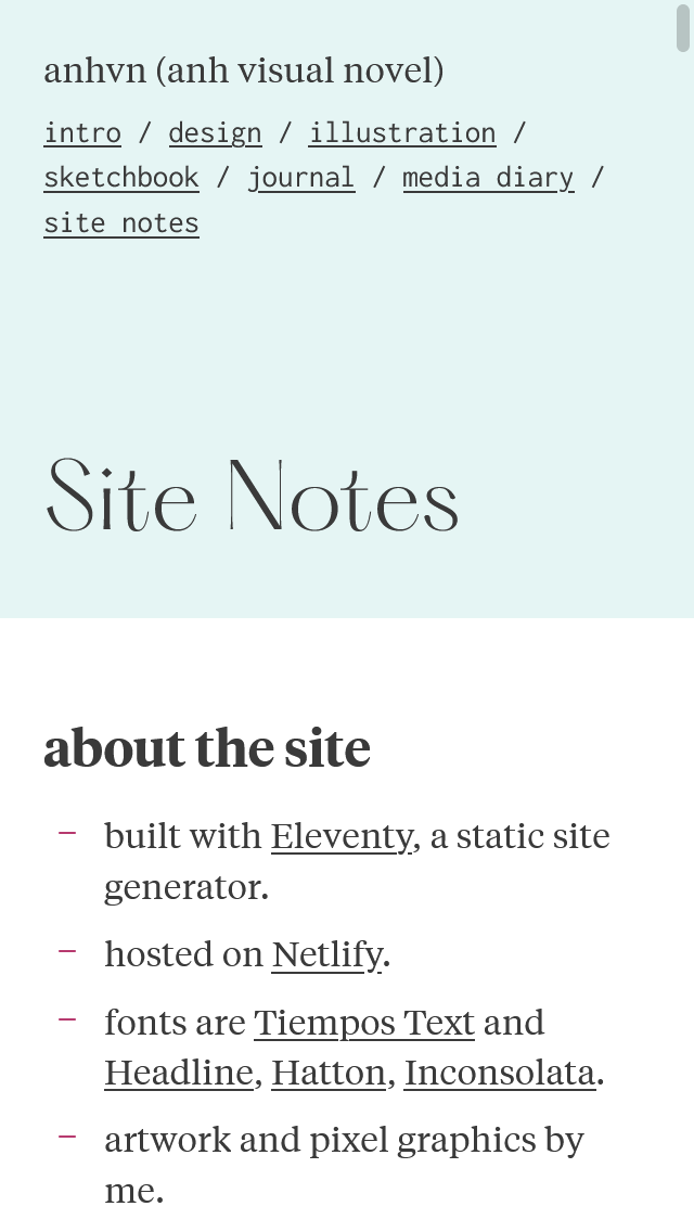
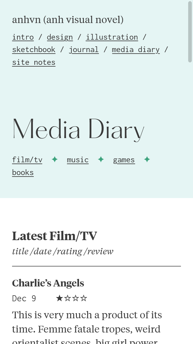
- Use Hatton only for H1 page titles, and shifted all of my heading styles up a level.
- H1: Hatton
- H2: Tiempos Headline
- H3: Inconsolata
- H4: Tiempos Text, italic + bold
- Use the variable font file for Hatton, and adjust the weight depending on font size. Smaller font size → heavier weight, to compensante for the reduced readability of its size.
- Larger screens:
font-weight: 200 - Smaller screens:
font-weight: 250
- Larger screens:
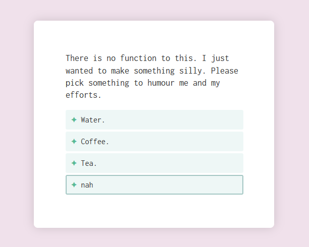
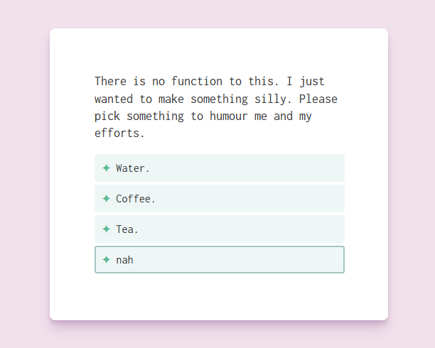
Drop Shadows
I discovered this post by Josh W Comeau on creating better shadows with CSS box-shadow a while back, but didn’t get around to implementing it until now. It’s wonderful.
